Your One-stop Guide to a Mobile-friendly Website
Mobile devices, smartphones, in particular, have become an indispensable tool of modern life that you simply can’t leave home without. Ignoring how your web design functions on a mobile device, is to ignore the user experience of more than half of your potential customers.
Quick Links
Its always about customer experience, and a seamless mobile experience translates to a happy customer. A mobile-friendly site speaks volumes for your site. It exudes professionalism and quality. It can have a positive impact on your brand and increases your sites overall value, not just traffic.
Pay attention below and I can help turn your visitor’s smartphone visit into a new mobile customer.
Mobile-friendly Tips at a Glance:
- Flexible, Responsive Layout
- Keep it Simple
- Readability – Use Large Fonts
- Make it Easy to Navigate – Make it Finger-Friendly
- Optimize your Pages and Images – Speed it Up!
- Keep Forms Short and Simple as Possible
- Include a Search Function
By the Numbers
Still having thoughts on making your site mobile friendly? Check these numbers:
In 2018, 52.2 percent of all website traffic worldwide was generated through mobile phones, up from 50.3 percent in the previous year. Mobile currently accounts for half of all global web pages served. statista – The Statistics Portal
Nearly 40% of people search only on a smartphone in an average day as they look to meet immediate needs. As a result of this shift, more Google searches are happening on smartphones than computers. Here are some themes that are most likely to be searched for on mobile. Think with Google
On Cyber Monday, phones accounted for 47 percent of traffic to online stores and 36 percent of sales — big increases from last year, Adobe said. Total sales through phones on Cyber Monday hit $2.2 billion, up from $1.4 billion a year earlier and hitting a record that was set just days earlier on Black Friday. Black Friday became the first day ever to reach more than $2 billion in online US sales coming from phones. Cnet.com
1- Flexible, Responsive Layout

Just like you and me, smartphones, tablets, or any of today’s myriad of mobile devices come in different shapes and sizes. And when optimizing your website for mobile use, the ability of your site to adjust to these differences is critical.
But it’s not just about screen size. A simple flip of your phone and your screen goes from portrait to landscape. Your website design should be responsive. It should automatically detect these changes and make the necessary adjustments.
Flexible web design allows entire pages to automatically scale up or down depending on screen size and orientation. It is designed to use flexible layouts that enable users to browse and navigate the site seamlessly.
Pro Tip: Design your website with WordPress. It’s hard to find a WordPress theme that isn’t responsive by default these days.
2- Keep it Simple

When it comes to designing your mobile site, simpler is better. The limited amount of screen space makes it a lot more difficult to design a website complete with all the bells and whistles.
Keep your content short and simple. Use buttons and images for easier navigation. Since large amounts of text could not be displayed in a single page, use well-placed links or buttons to help visitor switch to another page.
Images and buttons don’t only make it easier for visitors to navigate but also makes your site easier on the eyes.
3- Readability – Use Large Fonts

Given the limited amount of real estate space available on your mobile device, your visitors must be able to digest your content in small, easy to read portions.
This can be done by breaking down content into smaller portions. Use headings to emphasize important information or get their attention. Using bullet points instead of lengthy paragraphs makes for easier reading.
People tend to skim through web pages by picking those that catch their attention. Your ability to sell catchy headlines, bullet points, and eye-grabbing images is an essential strategy for getting your messages across your readers.
With lesser texts needed to convey your message, you can now accommodate bigger fonts which are easier on your visitor’s eyes. Smartphones are all about convenience. It makes getting information simple with a few swipes or taps on the phone.
4- Make it Easy to Navigate – Make it Finger-Friendly

Smaller real estate also means lesser space to navigate. A carefully planned website layout is essential. Buttons and dropdown menus are important in helping visitors easily switch pages.
Placing your “About Us” section or “Contact Us” page under a dropdown menu, for example, saves you space that can be used for highlighting your services or products.
Make it easier for visitors to locate the homepage button. Navigating through the various pages can already be difficult. Having the homepage button easily visible makes it easier for visitors to resume or restart their search.
By limiting the amount of content in each page, you could also make your buttons larger making it easier to click even for those with big fingers. How often have you been frustrated with clicking the wrong buttons or dropdown menus just because these were too-small or too-bunched together?
5- Optimize your Pages and Images – Speed it Up!

Poor loading times can have a negative effect on the visitor experience. Mobile devices can perform almost any task your desktop or laptop can do but still pales in comparison to pure computing power. And this might be the reason why your site might not have any problems on a laptop but almost moves like a snail on your smartphone.
Make your site mobile friendly by improving loading times. Save on computing power by compressing anything that takes space and drags loading time. Factors that affect loading times include high-resolution images, javascript, and CSS.
Pro Tip: Use websites like Pingdom or Google’s Page Speed Insights tool to help figure out what is slowing your website down.
6- Keep Forms Short and Simple as Possible

Completing an online form may not be a big concern for desktop users. But when you’re asking your visitors for information via a smartphone or mobile device, a poorly designed form may be the quickest way of driving them away.
Think of online shopping, wouldn’t you want a mobile site with simple forms that make shopping seamless?
Put yourself in your visitor’s shoes. Check each line and make sure that these are relevant. Keep it as simple as possible and ask for information that is necessary to make that sale. A long and complicated check out process is a major reason why your online customers abandon your shopping cart regardless of how attractive your offer may be.
7- Include a Search Function

Drop down menus and large buttons are great, but you could make it even easier for your visitors to navigate your site with a search bar.
This is especially true for sites with several pages or thousands of products for sale. Having a search bar is very useful given the small amount of screen space available on a mobile device. Having all this information would be difficult and impossible even on a desktop.
Elevate your customer experience by giving them the option of finding your product by simply entering the information on your search bar.
Why Make Your Site Mobile-friendly?
Increase site traffic. If you’ve been living under a rock for the last couple of years, then you haven’t realized the potential of mobile device users as a source of additional traffic and income generation. You don’t have to look far, just ask yourself where you spend most of your time searching or browsing.
Improve browsing experience. Faster loading times, readability, and easier navigation are the cornerstones of a successful mobile site. Its all about customer experience and if you can’t even provide this then prepare to say goodbye to your visitors.
Get on the good side of Google. What happens on your mobile site has a direct effect on your Google rankings. The rise of the mobile user has not gone unnoticed. And in the eyes of “Big G,” mobile-friendly sites score big points in its searches.
About The Author
 Rodney Warner heads the team at Connective Web Design and is also a musician, outdoor enthusiast, and ice cream connoisseur.
How to Use AI-Powered SEO Tools for WordPress eCommerce
SEO is a critical factor in the success of any e-commerce WordPress store. As competition…
0 Comments11 Minutes
Why Short-Form Videos Are the Future of Content Marketing
Your Instagram customers spend over 50% of their time watching short-form videos and reels. Rather…
0 Comments12 Minutes
The Role of Digital Marketing in Business Growth
Online marketing touches every aspect of a business, whether it is initiating the idea or for an…
0 Comments3 Minutes
AI Meets Authenticity: Balancing Automation and Human Touch in Content Marketing
Is your brand starting to sound like a robot? In a world where algorithms write faster than any…
0 Comments8 Minutes
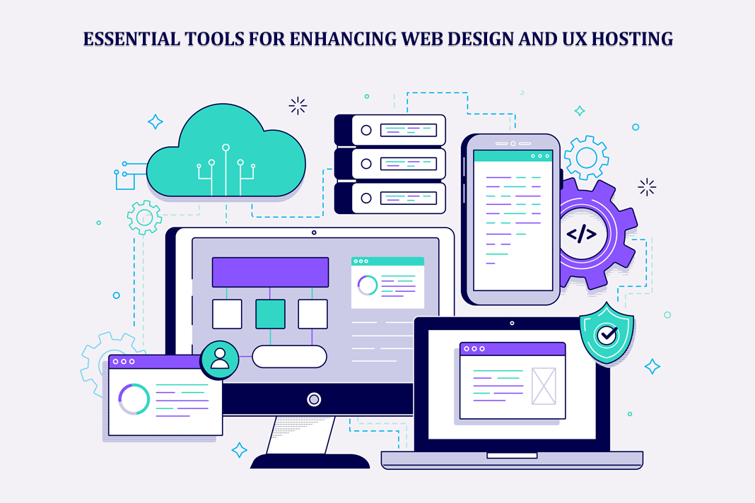
Essential Tools for Enhancing Web Design and UX Hosting
Have you ever visited a website that felt slow, clunky, or confusing? A website that is poorly…
0 Comments11 Minutes
How a Mini Cart Transformed My Store’s Shopping Experience
Okay, real talk—running an online store is hard. You think you’ve got everything figured out, you…
0 Comments9 Minutes
Balancing Your Security Initiatives With Industry Compliance Requirements
Managing a business today comes with a number of daily battles that need to be fought. Resources…
0 Comments11 Minutes
Best plugins to enhance the customer shopping experience
Customer experience is a key part of every online store. A good experience helps customers find…
0 Comments7 Minutes


