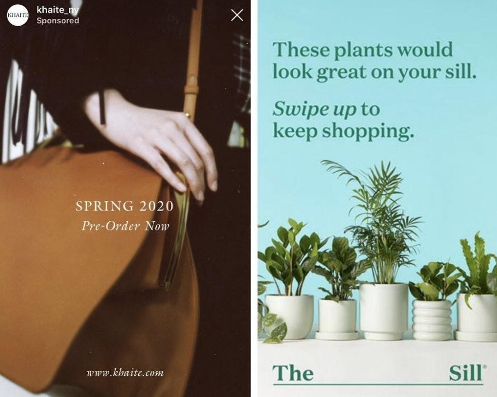
Can you imagine social media without pictures and visual content? It sounds inconceivable now, but during the early days of social media photos weren’t as ubiquitous as they are today. Everything about visuals, from web design to graphic design and photography, have earned their prominence on the internet, especially for marketers seeking to elevate their brand image online through storytelling.
Quick Links
According to an industry report by Social Media Examiner, 80% of marketers use visual assets in their social media marketing. 32% of them also ranked images as the single most important type of content for their business overall. With that in mind, it’s no wonder they’re always on the lookout for great photos to inspire—or incorporate into—their social media strategy. Here’s how to make sure those photos are yours.
1 Take Photos to Fit an Image or Lifestyle
A common strategy that brands use on social media to attract potential customers is by tailoring their feeds to incite aspirational feelings. It isn’t enough to just take photos of products—now, brands on social media like Instagram sell experiences and lifestyles. Lifestyle photography draws attention and user engagement, which in turn can improve cross-sell by 22%.
Pro-Tip- You can also use tools like Instagram marketing tools, Facebook marketing tools for best results on social media marketing.
If you’re a photographer who wants their work to be appealing to brands, you need to communicate these aspirational qualities when planning your shots. Here are a few tips for doing just that:
- Get emotional. 95% of purchases are based on emotional factors, and lifestyle photos use that to create a bond between the viewer and the image. Happiness, sadness, fear, and anger are common emotions expressed in photography—don’t be afraid to present that in your body of work.
- Show don’t tell. Brands want photos that can convey their message with minimal explanation. If your subject is doing an action, make that visible and clear.
- Be authentic. Don’t be too strict with poses and prop placement.
2 Pay Attention to Subject Demographics
What kinds of brands do you want to work with? To attract the right clients, understand who they work with and for. One of the best ways to lend authenticity to a brand’s image is by reflecting customers visually.
For a photographer, this means you need to diversify the scope of your subjects. You don’t want to come across as distancing yourself from the people looking at your photos on social media—relatable images work best. Endeavour to create a portfolio of work that contains a variety of locations, looks, and subjects (race, age, and gender).
There is still room to express your own signature aesthetic and composition style—just don’t box yourself in when it comes to other matters.
3 Remember Appealing Composition
If a client purchases your image, there’s always the chance they’ll tweak it a little bit in post-processing or incorporate it into other graphic design materials. If you want to cater to this set of people, think about composition.
Images posted to social media channels are restricted to specific image resolutions and dimensions. To appeal to a social feed, keep that in mind. Dimensions for the most popular networks, in order to retain their quality are:
- Facebook – 820×312 for cover photos, 1200×630 for feed photos.
- Twitter – 1500×500 for header photos, 440×220 for feed photos.
- Instagram – 1080×1080 for feed photos (square resolution), 1080×1920 for stories photos.
- LinkedIn – 1536×768 for company page headers, 1104×736 for feed photos.
There’s a way to keep the full size of your image while making it attractive to use on social. It’s all about composition. Think about the way your photographs could possibly be cropped, then place your subjects accordingly. Some composition techniques that work well for this are:
- Rule of Thirds – Placing the subject just slightly off-center, along one or more main lines if you divide a photo into a 9 x 9 grid.
- Centered/Symmetrical – Keeping the main subject right in the center of the frame. This works especially well for Instagram, as marketers can easily plan which sections of an image to crop.
- Leading Lines – Walls or patterns in the image can be used to draw the eye towards the main subject. They also act as a guide for potential clients, who can then use the leading lines to plan how they can incorporate your photos into layouts.
Final Thoughts
Selecting photos for a creative marketplace means your work needs to stand out.
Does this catch people’s attention? Will people be able to relate to this photo? If I saw this on my own feed, would I stop and give it a like? To take great photos, put yourself in your customers’ shoes by showing them what they want to see—in high definition quality.
If the answer to all this is yes—that’s a start.
AUTHOR BIO:
Denise Langenegger is part of the team at Instasize – a content creating tool kit for anyone editing photos and online content on mobile.

