What Design Practices Are Increasing Bounce Rate On Your Site?
It is a world dominated by sites. And in such a universe, a low-quality site will be detrimental to business health. Web traffic that appears but does not stay long enough is going to actively destroy any chances the online portal might’ve had to succeed and bring in more clients. However, as we set out to find what exactly aids in this disaster, we found out that the modern web design process is more often than not the main culprit behind low page interaction.
Quick Links
How is design diminishing the nature of site impact? What does it take to alleviate the damage? Let’s discuss the matter!
Villainous Design Practices
Following trends is an important thing for all sites, in fact, it is undeniable. However, there are times when blindly following the trends can create small issues, which in the future can have bigger and more problematic effects on the site performance.
Here is a peek into six of those design culprits and ways to decrease bounce rate to mitigate the damage.
-
The Non-Existent Speed
How long are you going to wait for the website to load?
Well, the opinion varies when it comes to this question. However, the normal load time for sites in 2020 is 4.7 seconds on desktop and 11.4 seconds on mobile. But wait! Before running off and trying to count the seconds, there are a few other things to comprehend.

Source: https://www.machmetrics.com/speed-blog/average-page-load-times-for-2020/
Speed here is not a time metric. It is not a simple matter of “this page loads in x seconds”. It is an evolving metric that depends on determinants such as device, user, internet speed, and many others. And that’s why rather than treating it as a race, treat it as a quality metric, optimized to match the requirements of individual users.
So besides doing the obvious, such as shrinking images, pay close attention to the target demographic, and what kind of devices are being used. Based on factors specific to the users, optimize the design to decrease bounce rate on the website, and engage the users from the first moment they discover the page.
-
A Flavorless Aesthetic
None of us like bland things.
A good design is supposed to invoke different feelings among users. Whether it is excitement, intrigue, or suspicion, this response is what keeps them on the site, exploring more to satiate that primary feeling. And if the web design process fails to imbibe that sense of emotional wonder on the design, visitors will turn away without a second glance.
This subject of bland design is not just about following trends unquestionably, but also about the practice of using familiar layouts and grid-based designs. Various easy to use programs have made it easy to create a site within minutes, with common enough style.
Let me reveal something about this kind of web design and development process- everyone else is doing the same!
It is not uncommon to discover more than one site applying the same layout when looking at a specific division of the market. So, rather than taking the easy way out, invest in design a bit more. At least consult with an expert web design agency, preferably situated in New York, who can unravel the unique design requirements for the site and take it to the top of the market, if not the world.
-
Inconsiderate Ads
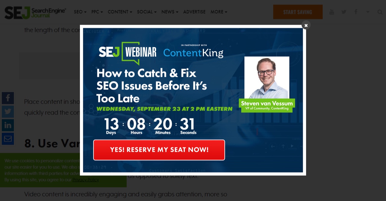
The. Days. Of. Pop. Ups. Are. Over!
The common web design strategy today dictates that it is alright to hold the content hostage while the site negotiates with the visitor on various attractive offers. However, those annoying ads give the users an instant urge to leave that page forever.
How do I know that? Because, I’ve endured it firsthand.

Source: https://www.searchenginejournal.com/reduce-bounce-rate/258613/#close
Using this element on the site can be helpful though, but only when done with the utmost sensitivity. Do not bombard the visitor with multiple ads simultaneously, and do not make it hard to close those ads. And of course, be mindful of the languages used in the ads. A lot of times the language on these ads can be a little aggressive, and that only contributes to page abandonment.
-
Low-Level Accessibility
Assuming all users will meet the site in the middle is childish. Visitors are not going to compromise when it comes to experience. These days’ users want receptiveness, efficiency, and support. And maybe your site is failing to provide just that.
Whether it is a design element or a simple slip up by the website redesign services, a lot of things because the accessibility of your site to drop and increase page abandonment numbers. Imagine a person with visual issues trying to look for a pet grooming product, and they encounter a site, with extremely hard to read texts.
Will that person stay on that site for long? Not really, no.
Accessible design is a matter of human touch. Considering the users and their issues will guide the website redesign process to be more humane, and help users to perform any action on the site. So for anyone planning on increasing site engagement through design, pay heed to the matter of site approachability.
-
Too Much Dilly Dallying
Users never examine the content of the entire page!
Users in general don’t have a lot of time. So expecting them to scan the entire page and understand the reason for that page’s existence is going to be a little far-fetched and because the bounce rate to increase. So don’t delay getting to the point. Just say what you want to say in clear, concise words.

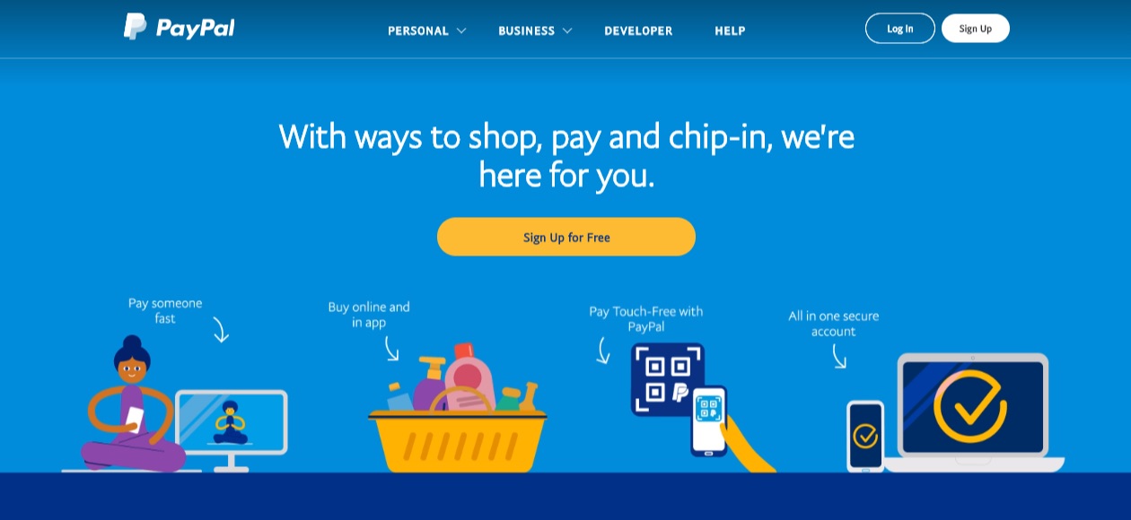
Source: https://www.paypal.com/us/home
Paypal always hits the right note when it comes to expressing the message in a precise manner. The banner, containing a short header message and a CTA really gets the point across and helps the users to decide within minutes whether it is worth the effort to engage or not.
Using short and efficient content will boost the website redesign strategy. So don’t create fancy prose about what the site does, write it simply. Users will appreciate that more.
-
Irresponsibly Non-Responsive
Not making the site responsive is equivalent to going for skydiving without a Parachute.
But in all seriousness, in an age where mobile traffic on the internet has taken over the desktop traffic, not having responsive web design strategies is the sure way of demolishing the business. It will single-handedly quadruple the bounce rates on the site and bring down the reach.
Visitors will disappear immediately if the site does not match the device. Having a full-size site that does not render the content of the page according to the device is going to create numerous site issues, like low accessibility, decreasing site velocity, and many more. Be responsible in making design decisions. Increase the impact of the site with a responsive web design and development process.
This Is Just The Design Side Though!
All the things discussed here are about the design effects on the high page abandonment numbers. There are many other aspects of the entire web design process that needs attention in order to make the site more appealing. However, design often happens to be the first thing visitants notice. So before making any rash design decisions, pay attention to the bounce rate matters.
How to Use AI-Powered SEO Tools for WordPress eCommerce
SEO is a critical factor in the success of any e-commerce WordPress store. As competition…
0 Comments11 Minutes
Why Short-Form Videos Are the Future of Content Marketing
Your Instagram customers spend over 50% of their time watching short-form videos and reels. Rather…
0 Comments12 Minutes
The Role of Digital Marketing in Business Growth
Online marketing touches every aspect of a business, whether it is initiating the idea or for an…
0 Comments3 Minutes
AI Meets Authenticity: Balancing Automation and Human Touch in Content Marketing
Is your brand starting to sound like a robot? In a world where algorithms write faster than any…
0 Comments8 Minutes
Essential Tools for Enhancing Web Design and UX Hosting
Have you ever visited a website that felt slow, clunky, or confusing? A website that is poorly…
0 Comments11 Minutes
How a Mini Cart Transformed My Store’s Shopping Experience
Okay, real talk—running an online store is hard. You think you’ve got everything figured out, you…
0 Comments9 Minutes
Balancing Your Security Initiatives With Industry Compliance Requirements
Managing a business today comes with a number of daily battles that need to be fought. Resources…
0 Comments11 Minutes
Best plugins to enhance the customer shopping experience
Customer experience is a key part of every online store. A good experience helps customers find…
0 Comments7 Minutes


