UX Design Process: How to Do It Right
Providing a beautiful user experience (UX) design isn’t enough.
Quick Links
All design elements on the page, from layout to buttons, have to make sense in the scheme of things. This way, users can browse it seamlessly and lead them down the right path, whether filling out a website form or clicking an app button.
However, achieving this is impossible unless you have a solid UX design process in place, which is a component of the digital customer experience of your brand as a whole. In this post, we’ll discuss the critical phases of designing apps and websites, as well as the best practices in each.
The goal is to understand these phases and what you must do to develop personalized solutions to unique problems. From here, you can provide users with the best possible design and layout guaranteed to exchange their experience in using your platform.
Stage #1 – Product Definition
Before you can begin with the UX design process, you must know what the product is about. Having a clear idea of what your product is and the problems it solves will lay down the foundation for designing its UX.
At the same time, the process varies depending on the purpose of your product. For example, designing a corporate business website is widely different from brainstorming design ideas for a dating app. While the steps may remain similar or identical, the approach to building each one is different.
To proceed with this, you must talk to stakeholders and ask them questions about their product. Take this opportunity to pick their brain in the hopes of getting unique insights about the product that will help you come up with UX design ideas.
After talking with them, you should find out more about the product’s value proposition. This is important because learning what makes the product different from similar products allows you to determine its target audience.
Stage #2 – Research
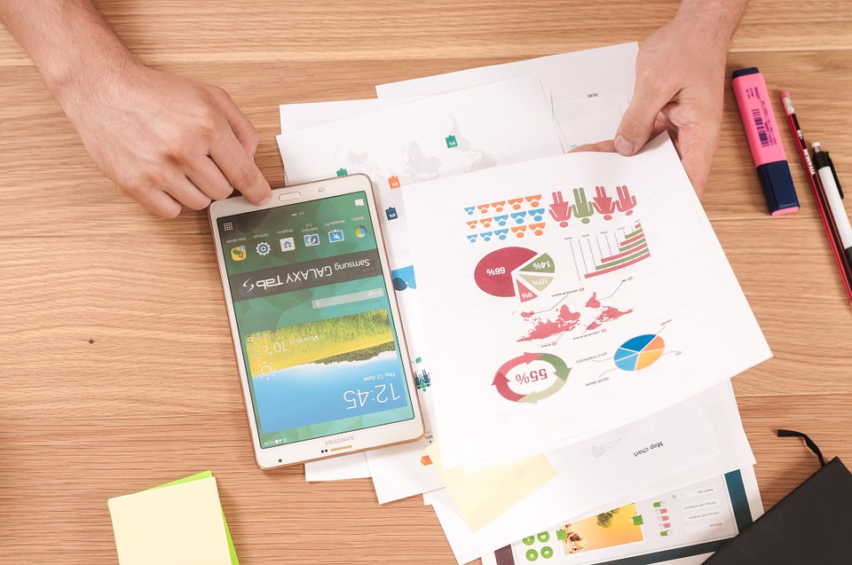
Image source: Pixabay
The first stage involves a bit of user research. However, this stage doubles down on learning more about your target audience and the market in general. This is the most fundamental stage of any product development process that is discussed before we introduce some best digital marketing tools.
Aside from interviewing stakeholders, consider interviewing actual people who comprise the target audience of the product. You may launch focus group discussion initiatives and survey them for design-related questions regarding the product. By learning about their browsing habits and design pet peeves, you can develop a product UX design that they’ll be able to navigate easily.
If you can’t conduct interviews with your product’s core audience, you can reverse-engineer the process via competitor research. Look at the site and app layouts of your best-performing competitors and analyze why users love them.
Check the technical aspects of their respective UX designs and take the best elements from each. Implement the design ideas on your product with the chance of getting the same excellent results as your competitors.
To help you make sense of the designs, you can listen to what people say about them on social media. Using monitoring tools like Mediatoolkit, you can search for mentions of branded keywords and phrases related to your competitors and find out what people are saying about them.
For example, people can’t stop talking about a specific UX design element in your competitor’s app. While you may think the element is good, the sentiment about it on social media is negative. Therefore, you may want to reconsider using that element when building your product’s UX design.
Stage #3 – Analysis
Taking the information you gathered from the previous two phases, the analysis phase is where you synthesize the data to help you develop a buyer persona. It will comprise different demographics such as age, income, job, hobbies, interests, etc. You can then conceptualize UX design using this data optimized for that specific buyer.
You could also unearth data from your audience specific to the UX design. For example, since colors can help improve conversions, you could find out which colors most of your users respond to.
You then want to develop user stories to help your audience reach their goals and aspirations using your product. This process puts you and your designers in the shoes of actual users.
You have to sympathize with their plight and the obstacles blocking their way in meeting their goals. And by breaking down the story step by step and introducing your product as a means to an end, you can come up with a UX design that complements what your product does and how users can put it into action.
To help you effectively flesh out uses stories displaying the different use cases of your product, you may need to resort to storyboarding. By visualizing the story, you and your designers can bring the story to life, which could help translate into better UX designs.
Stage #4 – Design
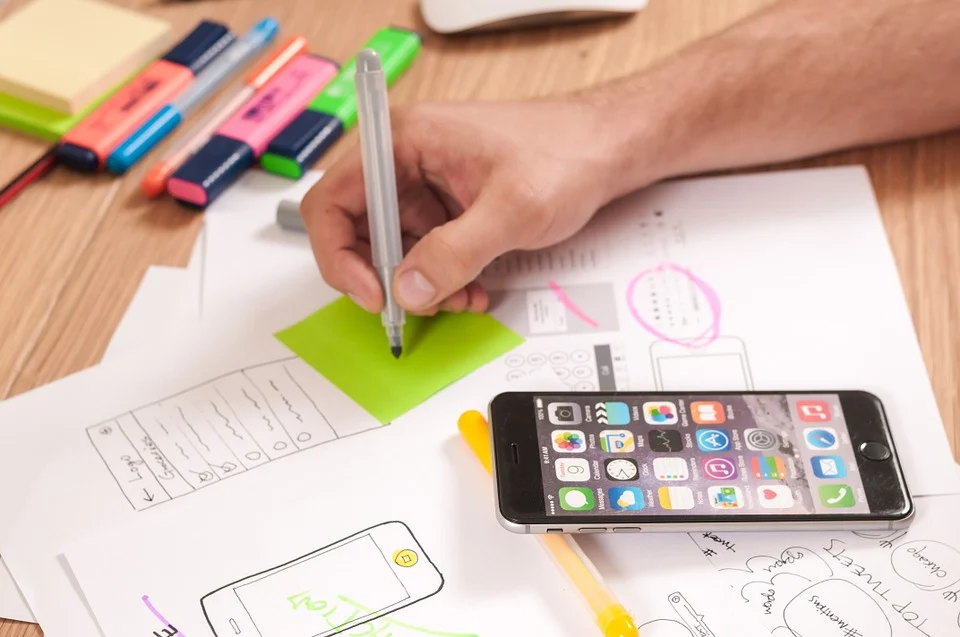
Image source: Pixabay
Once you have enough design ideas and concepts from the analysis stage, it’s time to move on to the design phase. This is where you organize the information architecture (IA) and the user interface (UI) layout for your proposed product.
At the end of this phase, you should have a prototype for your product. As mentioned, the design should make sense to users. Concerning biosemiotics to design, you want your elements to serve as visual cues for what users must do on the page. For instance, buttons and important links should use contrasting colors that pop out of the screen and make it evident that users click on them.
Also, while it is not the final product just yet, it will lay the groundwork for how your app or website design should and can become. You can make iterations later on, but that’s reserved for the next phase.
Here, you need to identify which design techniques to implement that will help you come up with a UX design faster and more effectively.
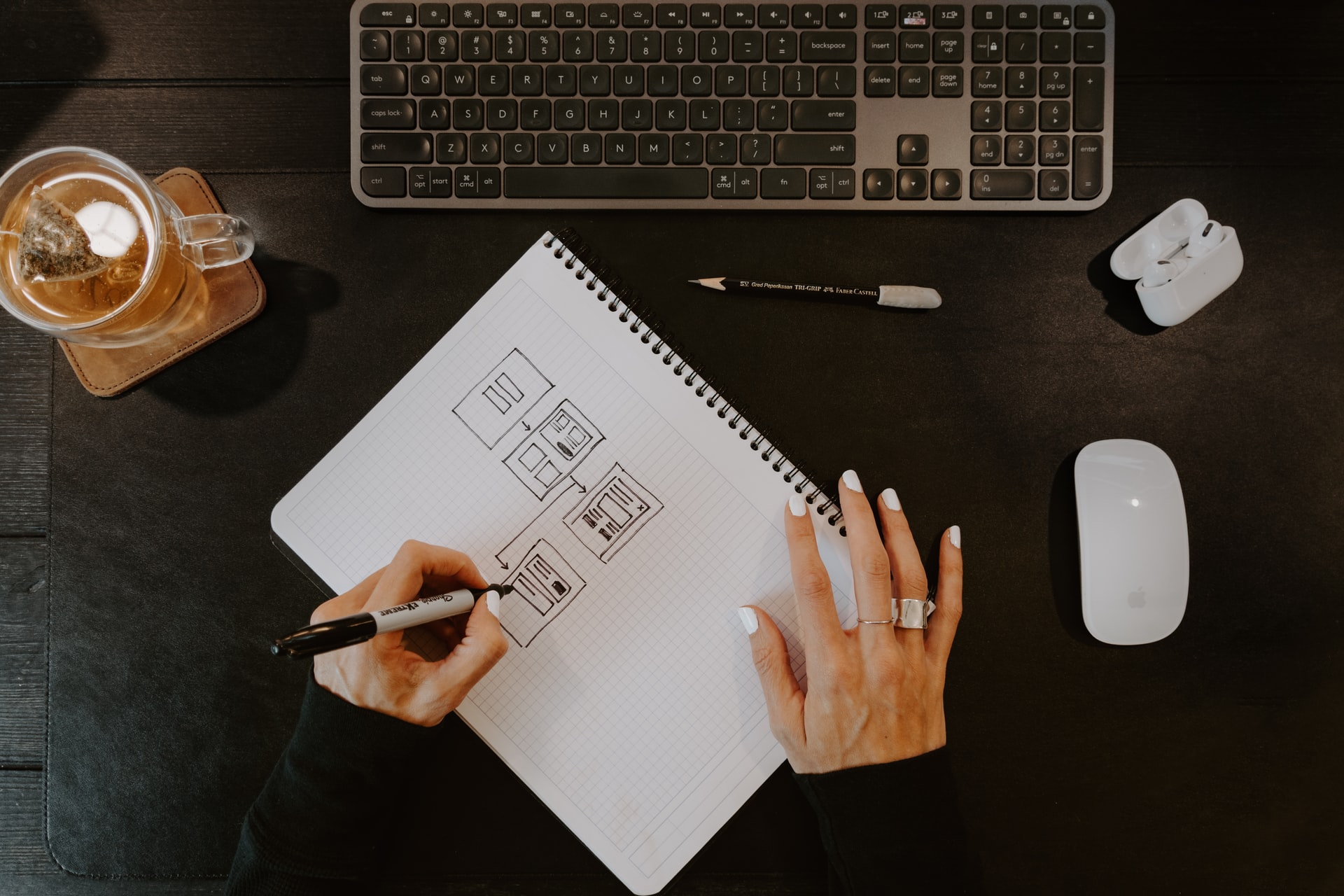
Most processes start by sketching out the design to help your designers flesh out ideas and put them into paper. You can use concepts from your storyboard and go from there so you can put your previous data into good use.
You can also conceptualize the design using wireframes. Unlike sketching, wireframes give you the closest approximation of how your app or webpage will look once you’re done with all the phases. You can drag and drop design and layout elements on a canvas to help you build the design quicker.
Also, if you’re building a UX design for a large app or site, you would need to develop a design system of styles, elements, and patterns. Designers can just pick from the system you want to include in their respective designs from the system.
This helps speed up the process and maintain consistency by using the same elements across all design ideations.
Finally, when working with the design, make sure to include your in-house dev team or the web development agency you’re working with. Design and development go hand in hand, so any decisions you make on the design level impact how the dev team will integrate it into the site or app.
Stage #5 – Validation
Once you have settled with a UX design, in comes the validation phase. This is where the UX design is put through the wringer to determine issues and make suggestions for any upcoming iterations you will have on the design.
In the previous phase, the design team runs tests to ensure that the UX design operates smoothly and meets your product definition and research specifications. Here, however, your stakeholders and users will be the ones to take the site or app out for a spin.
The input they have here is critical to developing your product’s UX design because they are your target market. What they feel or think about the design matters just as much as what you think about it.
In a way, the UX design process is akin to contract lifecycle management. You have to collaborate and negotiate with your principals regarding the direction of the design once an agreement is formed.
In this case, you can track and monitor their user activity via analytics to help you cross-reference user and stakeholder feedback. You can see which elements or buttons they interacted with the most, how long they stayed on the page, and other metrics pertinent to developing your design. Aside from user testing, you can also gather heuristic testing based on qualitative insights your stakeholders may provide.
From here, you have the necessary information to redesign your website or app and develop an even better UX design than before.
Conclusion
Fulfilling all the design phases above, you should have a UX design that balances the best design practices and what your target audience wants to see from your product. This results in a seamless experience, potentially leading to higher sales and revenue for your business down the line.
How to Use AI-Powered SEO Tools for WordPress eCommerce
SEO is a critical factor in the success of any e-commerce WordPress store. As competition…
0 Comments11 Minutes
Why Short-Form Videos Are the Future of Content Marketing
Your Instagram customers spend over 50% of their time watching short-form videos and reels. Rather…
0 Comments12 Minutes
The Role of Digital Marketing in Business Growth
Online marketing touches every aspect of a business, whether it is initiating the idea or for an…
0 Comments3 Minutes
AI Meets Authenticity: Balancing Automation and Human Touch in Content Marketing
Is your brand starting to sound like a robot? In a world where algorithms write faster than any…
0 Comments8 Minutes
Essential Tools for Enhancing Web Design and UX Hosting
Have you ever visited a website that felt slow, clunky, or confusing? A website that is poorly…
0 Comments11 Minutes
How a Mini Cart Transformed My Store’s Shopping Experience
Okay, real talk—running an online store is hard. You think you’ve got everything figured out, you…
0 Comments9 Minutes
Balancing Your Security Initiatives With Industry Compliance Requirements
Managing a business today comes with a number of daily battles that need to be fought. Resources…
0 Comments11 Minutes
Best plugins to enhance the customer shopping experience
Customer experience is a key part of every online store. A good experience helps customers find…
0 Comments7 Minutes
