Personalization has been around for quite some time. There is no doubt that marketers have been rooting for it since long, but a large percentage still seems struggling with personalization. The foremost problem is implementing this strategy in a smart as well as scalable way.
According to a survey conducted by Evergage & Researchscape International, 98% of marketers agree that website personalization improves their relationship with customers.
But when businesses fail to meet expectations, consumers feel disconnected, disappointed, and dissatisfied. Another challenge that companies face is shorter purchasing cycles of consumers. If a customer won’t feel attached to a website, cart abandonment, bounce rate, and future website visits are sure to be stopped.
Big brands like Amazon, Netflix, Asos, etc. keep improving their websites in terms of personalization. And, there are many reasons for that.
Here we bring you four reasons why you should include personalized experience in your website design ideas to attract your customers.
1. Because search engine giant Google does it!
Do you know Google receives over 3.8 million searches every minute? It’s what makes the search engine giant the most visited site on the Web. But what is the one thing that adds to its mountainous success? Without a doubt, the reason is putting customers’ needs first. Be it local searches using generic keypad or voice search; Google is nailing it in the best way. It’s the future of search engine optimization because it customizes all its strategies around users.
2. Because you understand your audience best
One of the many reasons to give your website a personalized experience is it helps you know your customers best. It also lets you sort them into your customized funnels. Placing CTAs (call to actions) is one of the many ways to know what industry your prospects work in along with other vital details. Based on their entered information, you can segregate your customers to severe different sides of your website.
It’s critical to generate improved lead qualification mechanisms that will ultimately boost conversion rates. Of course, you would not like to sell an enterprise version of the solution to a particular proprietor based in a specific location. Rendering a personalized experience on your website can prevent such incidents.
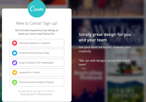
Take for an example of Canva. It does personalization brilliantly. You will find a CTA in the mid of browsing their homepage. It asks you how you aim to use its product.
Once you enter the information, you are taken to a particular template. This template is statistically most probable to convert. Nowadays, websites are adopting this strategy to make sure their audience sees the most relevant and meaningful content possible.


3. Relevant and appropriate product recommendations
What is the most annoying thing when you shop online? Perhaps it’s, being bombarded with irrelevant and stupid product recommendations. There is not only futility but irritating strategy involved when a website tries to compel consumers to buy something that they don’t want or have already purchased.
To leverage personalization, you don’t need to cause that kind of annoyance to your users. Use the data that you collected to render recommendations. Such recommendations will always appear relevant. It will boost your customers’ loyalty too.
Amazon does it the best way. The website makes most out of its vast marketplace and data to render relevant recommendations. For example, if you need a home theatre, and have searched it on its site, you can log in your account and see what Amazon has to provide. It suggests you best home theatres.
The same goes for Netflix. Their recommendation game is lit! Once it knows what genre or type of movies you like, it brings you a personalized list of the same. It not only saves your search time but also brings you something you usually want.
4. Better CTAs that convert
If you think CTAs are for just initiating a buying process, think again. They are used to do a lot of things than encouraging users to buy. A good call to action can incite a user to read a specific blog or participate in a survey. It also entices a user to subscribe for a free trial or go through a demo before watching or using the final product.
Apart from what kinds of call to actions you use, it is essential that you personalize it beforehand. According to research, personalized call to actions do 202% better than common or generic CTAs. This makes sense too. For example, is a user visiting your website is already a subscribed user, you wouldn’t want to drag a form in front of him asking to sign up for one more time.
You would better incite such users for different actions— product demo, survey or something else.
Personalization and paying attention to detail are highly helpful. The stats clearly show that personalized CTAs go a long way. They improve your conversion rates and user retention too.
Conclusion
Marketing is getting better and efficient every day so as the competition among marketers. The influx of various marketing channels and ideas has crowded the competitive market sphere. Also, it has made it harder for marketers to stand out and get customer attention.
In such a situation, it becomes essential that you turn yourself into a unicorn. You can do it by rendering a personalized experience to your customers. There are many personalization tools that you can use to customize your website as per a customer’s needs.
Collect user data in any form and use it to form an experience that will help your audience feel connected, valued and understood.
Author Bio
Alice Jackson is a business consultant, blogger, social media enthusiast, online market analyst, amateur designer and an avid author at Designhill. She has written on several topics including social media marketing, SEO, content marketing, startup strategies and e-commerce. When she’s not writing, she loves spending her time reading romantic novels, creating new online tshirt design. Connect with her on Twitter: @jackson_alice1

