The Year 2021: UI/UX Design Trends
The only constant of modern times is change. Every 24 hours bring new events and processes of the overwhelming scope so that in the morning people wake up in a completely different world. Due to the growing digitization of social and economic realities, UI/UX design is on the front line of this flow of innovation.
Quick Links
That is why keeping an eye on updates and trendy practices in UI and UI/UX design services becomes a matter of urgency for business owners and their product teams.
Let’s take a look at where this racehorse is headed and how not to fall out of the saddle.
Transformations in UI/UX design speed up: why and how?
The science of digital product design with all its constituents evolved since the origination of cybernetics and computer engineering. However, in the last several years’ changes in this realm became especially noticeable.
There reasons for that include:
– new technological breakthroughs in data storage algorithms and network capacity, including advanced cloud computing solutions, the spread of 5G Internet and optic-cable providing, and, going forward, graphene-based ultra-high-density HDDs. This allows designers and developers to include new advanced features previously neglected for being too resource-consuming;
– ongoing striving for making the user experience of any product more convenient and friendly compared to competitors;
– outbreak of COVID-19 pandemics and subsequent lockdown that enormously increased demand for virtual services and communication/collaboration environments. This evoked a grand infusion of additional resources and energy into the realm of digital design, hence inducing acceleration of its developments.
UI/UX design trends in 2021
1. Craving for space.
Although this trend did not emerge just yesterday, it deserves to be put first. It is perhaps the only feature common for any well-designed SaaS product regardless of their market and user focus.
In 2021, people still enjoy the vastness of negative space surrounding both visuals and copy. Columns of text become more and more narrow, contemplative pauses between sections – longer, and, as a result, the overall length of pages – bigger.
For example, this is how the latest version of Medium’s home page looks like when you land on it for the first time.
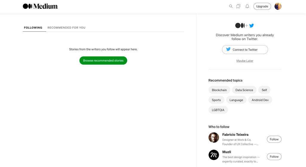
Source: medium.com
This is not surprising. The science of design shows that much of space makes the user experience more convenient and cognitively light.
2. Mobile-centered design process.
The tendency towards mobile-centric user experience continued to gain momentum in 2021, and its dynamics will most probably grow further in the next years.
As people progressively rely on their smartphones in private and professional activities, including social networking, banking, shopping, studying, and even working, UI/UX design adapts on the fly.
Yesterday it was a good tone to develop a mobile interface and/or a mobile app for smartphones in addition to the main desktop interface. Today, it becomes vice versa: many product teams seriously think if they need a computer version of their platform at all.
Of course, it is a big question if mobile-only SaaS will be mushrooming in 2022 and thereafter, due to a lot of the negative customer feedback on their limitations. Yet what is really true is that UI/UX design for the mobile component is a top priority in the digital world of 2021.
3. Minimalism.
It is nothing new compared to previous years, but still trendy and highly requested by users. The intensity and density of the informational environment grow in the geometric progression year by year. Therefore, a customer feels deep appreciation and sympathy when facing a simple and tempered interface without distractions and friction points.
The very minimum of colors, fonts, visual elements, and lines of text –everything set within a clear and streamlined design system, – this is what defines the UI of any digital product that takes time to understand the real needs of its users.
4. Simplified onboarding.
Designers of the best SaaS projects continue to outperform themselves in striving to make onboarding even quicker and simpler than possible. They are very inventive in this endeavor, by resorting to such trendy life hacks as:
– reducing onboarding to the signup process, while the required elements of instruction and encouragement are subtly and unobtrusively embedded at the landing and pricing pages;
– combining traditionally distinct UI/UX aspects within one element. For example, in 2021 you can often see that a CTA button is coupled with an email or phone number field so that you pass an immediate registration simultaneously with responding to the call to action;
– implementing visual and biometric verification techniques in place of (or as an alternative to) a standard password authorization.
5. Video and animation.
With the skyrocketing rise of the popularity of digital video marketing in 2015-2020, today more and more platforms embed different forms of video recordings, short cartoons, and gifs throughout their customer’s journey.
For example, when visiting rising startups in 2021, you can often find yourself watching a video right after getting to the landing page. Footages are also used as the background for a homepage, creating a 3d atmosphere of a distinct universe.
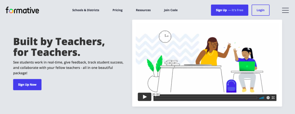
Source: formative.com
With the development of animation technologies, designers also implement bouncy visuals in place of static elements. Such a technique allows to show-and-tell customers about the product’s essence and features even without directing them to special education resources.
6. Copy.
The tendency to flip through information continues to replace close reading in 2021, and UI/UX design further accommodates this new paradigm of human cognition.
Therefore, lengthy pieces of copy vanish even from places where they traditionally rightfully prevailed (About Us page, FAQ section, etc). They get diluted or replaced with videos, charts, infographics, and other formats of data representation that are easier and faster to digest compared to solid text.
For example, this is the section from the About Us page of the number one of LinkedIn’s top startups – 2021.
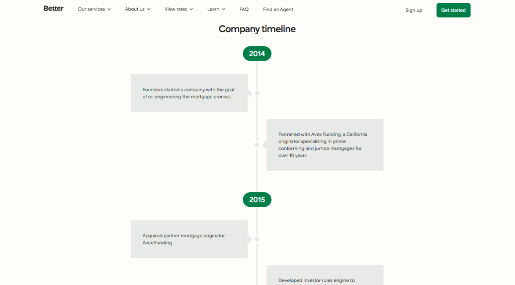
Source: better.com
This trend becomes especially relevant under the influence of mobile-focused user experience, with its natural lack of room in user interfaces.
At the same time, small pieces of helpful microcopy, popups, and tooltips gain popularity in the continuous effort of designers to make UX even more intuitive and reduce any friction points.
7. Smooth gradients and emotive graphics.
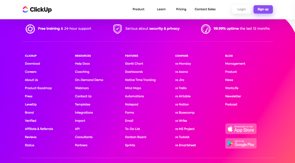
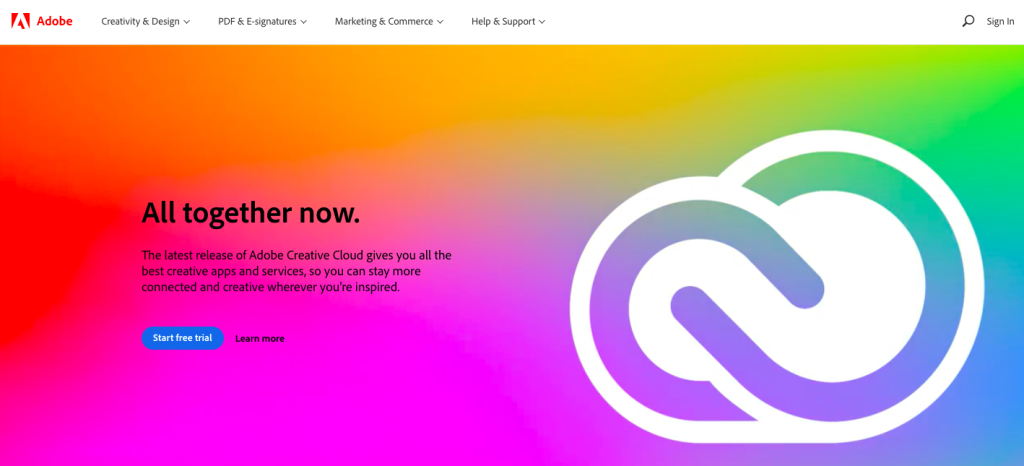
In 2021, adherence is minimalism, simplicity, and flat design get balanced with emotionally meaningful UI devices. In the heat of competition for every piece of the market, product designers realize that creating a good mood can play a decisive role when a user hesitates between several choices.
Source: clickup.com
Source: adobe.com
Therefore, gentle gradients and vivid illustrations with a good portion of fun are coming into fashion, even for serious B2B SaaS platforms.
Conclusion
As you might have noticed, the trends of UI/UX design are guided mainly by the concerns of user experience. This means they focus on making the customer journey the most convenient possible, even at the expense of aesthetical beauty and originality.
That is why, some other popular patterns in modern design were not highlighted, such as neumorphism, a dark mode, or 3d illustrations. Although such cute-looking techniques are trendy indeed, they do not suit every industry and audience, as well as complicate user experience in some cases. Therefore, you won’t find them implemented in most of the leading SaaS products.
If you like to see the real examples of successful implementation of the cutting-edge UI/UX design trends in 2021, take a look at the case studies of real products accomplished by a professional design team at Cieden company.
Why WooCommerce is the Best Choice for Your Online Store?
WooCommerce stands out as a top option for anyone looking to build an online store. This platform…
0 Comments8 Minutes
How to Use AI-Powered SEO Tools for WordPress eCommerce
SEO is a critical factor in the success of any e-commerce WordPress store. As competition…
0 Comments11 Minutes
Why Short-Form Videos Are the Future of Content Marketing
Your Instagram customers spend over 50% of their time watching short-form videos and reels. Rather…
0 Comments12 Minutes
The Role of Digital Marketing in Business Growth
Online marketing touches every aspect of a business, whether it is initiating the idea or for an…
0 Comments3 Minutes
AI Meets Authenticity: Balancing Automation and Human Touch in Content Marketing
Is your brand starting to sound like a robot? In a world where algorithms write faster than any…
0 Comments8 Minutes
Essential Tools for Enhancing Web Design and UX Hosting
Have you ever visited a website that felt slow, clunky, or confusing? A website that is poorly…
0 Comments11 Minutes
How a Mini Cart Transformed My Store’s Shopping Experience
Okay, real talk—running an online store is hard. You think you’ve got everything figured out, you…
0 Comments9 Minutes
Balancing Your Security Initiatives With Industry Compliance Requirements
Managing a business today comes with a number of daily battles that need to be fought. Resources…
0 Comments11 Minutes


