The Top Websites with Excellent UI Design
When working through websites, all users want to experience an excellent user interface. It enables them to complete their works.
Quick Links
Features of a good UI
A good UI should be efficient. Computer science help online experts are sure that UI should enable users to finish their work in a good time.
A memorable website is good for users. It enables the users to use them with ease in the future when they log back in.
A website with a good UI should let its users correct an error. The website should have the least chance of error to occur.
The interface of the website should be satisfying to users. Interaction on the website should be enjoyable.
The UI should be easy to use for users.
The following are the top websites with excellent UI Design:
Dropbox
It has a simple interface. The organization of files and folders in Dropbox makes it easier for any user to learn. The user only needs to either drag and drop files into it or import from the menu options. It helps the users complete tasks and in a timely way. The User Interface of Dropbox is all-round. It is consistent, contains high creativity, and it turns out very experimental.
Medium
It is an online platform for reading and publishing articles.
The website has a proper spacing of the lines, the right amount of color, and good typography. The user meets a blank white sheet to write on once logged in. It encourages the user to set his/her mind straight into content creation.
Medium estimates the read time of the articles. It also enables the users to write their opinions or comments on each article.
Virgin America
It is among the first websites to make booking flights an easy process. Once logged in, the users meet a box enquiring where they want to travel to. Therefore, the user begins the process of booking flights immediately.
The users don’t have to recall the options they take. It is possible since the previous choices are visible at the beginning of the screen. The website worked on ensuring the users only to focus on completing the tasks at hand.
Airbnb
The Airbnb site links users to places that offer accommodation services. It hooks up the service providers to potential clients. It has simplified lots of tasks for users to book accommodation in different places right from the comfort of their homes. The site shows all the features of the places. The site also has a well laid out checkout page. You can communicate with the host of the accommodation place too. The page uses images and videos to attract users. It also ensures that trust exists between the guests and the hosts.
Semplice Labs
The site is a portfolio for WordPress. The page transitions of this site are smooth. There are also cool animations. The cool graphics in this site makes it alluring and memorable to the users.
Boosted Boards
Once the user has opened the website, they come across an informative video clip of the commodity. There is a “shop now” action button at the heart of the screen. Once you click the button, you will meet all the details of the boards. The details range from the prices, shipping, the image of the commodity, and the speed.
When you are quite not familiar with the commodity, there’s a “learn more” feature. By clicking on it, you find all the nitty-gritty about the boards.
Simplicity, styling, and frictionless User Interface pulls the users’ interests. So before creating a website, you should research the guidelines for the delivery of a good UI.
Why WooCommerce is the Best Choice for Your Online Store?
WooCommerce stands out as a top option for anyone looking to build an online store. This platform…
0 Comments8 Minutes
How to Use AI-Powered SEO Tools for WordPress eCommerce
SEO is a critical factor in the success of any e-commerce WordPress store. As competition…
0 Comments11 Minutes
Why Short-Form Videos Are the Future of Content Marketing
Your Instagram customers spend over 50% of their time watching short-form videos and reels. Rather…
0 Comments12 Minutes
The Role of Digital Marketing in Business Growth
Online marketing touches every aspect of a business, whether it is initiating the idea or for an…
0 Comments3 Minutes
AI Meets Authenticity: Balancing Automation and Human Touch in Content Marketing
Is your brand starting to sound like a robot? In a world where algorithms write faster than any…
0 Comments8 Minutes
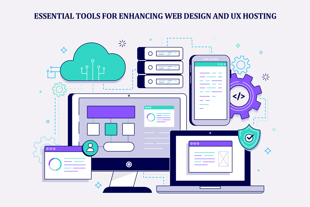
Essential Tools for Enhancing Web Design and UX Hosting
Have you ever visited a website that felt slow, clunky, or confusing? A website that is poorly…
0 Comments11 Minutes
How a Mini Cart Transformed My Store’s Shopping Experience
Okay, real talk—running an online store is hard. You think you’ve got everything figured out, you…
0 Comments9 Minutes
Balancing Your Security Initiatives With Industry Compliance Requirements
Managing a business today comes with a number of daily battles that need to be fought. Resources…
0 Comments11 Minutes
