The most comprehensive guide to optimizing Facebook Ad Relevance in 2021
This guide helps you optimize and improve your Facebook ad relevance while enhancing your overall ad value and return on investment.
Quick Links
Overall, Facebook is really great at telling you what to improve in regards to your ads. Just see the picture below.
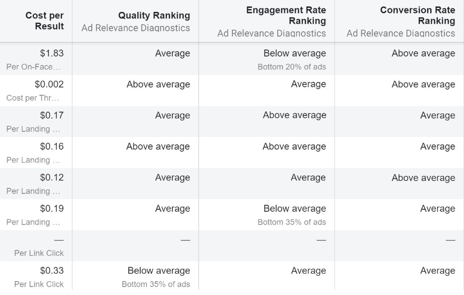
As you can see, the 3 overall parameters for optimizing Facebook Ads are:
- Quality Ranking
- Engagement Rate Ranking
- Conversion Rate Ranking
And that’s great. But a crucial thing is missing, and that is actionable advice on how to improve it. The answer to this question is what this blogpost is all about.
Let’s dig in.
How to improve Quality Ranking
The Quality Ranking parameter is an estimate of your ad’s quality compared to ads by your competitors.
Keep in mind that the goal here is to create ads that are better than your competitors.
You can easily achieve this by following this simple advice:
Create high quality creative assets
Quality Ranking is all about quality. As a result, you should focus your energy into creating compelling, creative and stylistic designs that resonate with your target audience.
This, of course, includes proper design theory and well-thought-out storytelling.
Take a look at the example below. The first image is a great creative asset, while the second is very bad.

As you can see, the image to the left has very little text. This creates an elegant and sleek design, catching the eye of many potential buyers out there.
In opposition is the yellow, almost “toxic” image to the right. This image will surely create associations to “low quality products” and might even come across as a scam attempt.
In other words: Don’t do the right thing. Do the left thing.
How to improve Engagement Rate Ranking
Engagement Rate Ranking is a parameter checking for customers’ engagement with your ads. In other words; Do customers read your copy, watch your video, click your ad, like, comment, or share?
Or do they simply scroll past your ad?
To improve engagement you must grab the customers’ attention. And that is a tall order, especially since the average attention span of modern consumers is drastically decreasing.
However, by following this simple advice you can effectively secure the attention your target audience:
Make ads interesting by putting the consumer first
The best way to grab a person’s attention is surely by talking directly to their interests and needs. Generic ads and content never really do this.
As a result, you must be creative and put yourself in your consumer’s shoes. Take a look at the example below.
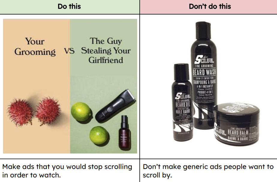
The ad to the left effectively makes you stop and reflect. The ad is humorous, creative and colorfully superior. It actually makes you think about your own grooming, thus effectively grabbing the person’s attention and hopefully sending them further down the purchase funnel.
In contrast, the ad to the right is merely a boring stock photo eliciting nothing but consumerism. The colors are awfully dull, reminiscent of marketing from a former millennium.
In other words: Don’t do the right thing. Do the left thing.
How to improve Conversion Rate Ranking
Conversion Rate Ranking is a parameter calculating the probability of customers completing your optimization goal.
Conversion Rate Ranking is an estimate of what’s to come, and not a true result of what’s been achieved.
At any rate, the single best way to increase the performance of your conversion rate and customer engagement is better call to actions (CTAs).
Follow this advice to create better CTAs:
Create compelling and easily understood CTAs
A CTA prompts the customer to do something. If your CTA is ambiguous, it will be very difficult for your customer to actually do anything but scroll past your ad/copy/video etc.
Consequently, you must deliver a clear and concise CTA. This way your customer is more likely to do the thing you want them to do (e.g. sign up for a newsletter, download a whitepaper, buy a product, etc.).
Take a look at the image below for a good CTA and a bad CTA:
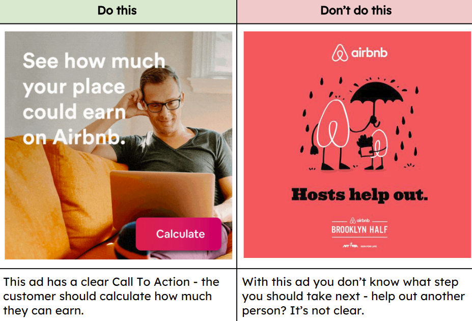
A person seeing the ad on the left will surely understand the premise of the CTA. It’s clear and concise, and it directly speaks to the interests of the reader. That is, calculate the amount of money you could earn by partnering up with Airbnb.
Thus resulting in a successful conversion.
In contrast, the ad on the right will confuse the reader. What is the next step here?
The ad is pretty and all, but as a reader you are left bewildered as to what action should be taken. The consequence is, of course, that the target audience will see the ad, and not know what to do next — thus resulting in zero conversion.
You know the drill about now; In other words: Don’t do the right thing. Do the left thing.
Want more tips to improve your Facebook Ads?
Did you find these tips relevant and useful for your Facebook Ads?
You can find a lot more actionable tips on how to improve the overall performance of your Facebook Ads by heading over to Confect.io and downloading the eBook — free of charge.
How to Use AI-Powered SEO Tools for WordPress eCommerce
SEO is a critical factor in the success of any e-commerce WordPress store. As competition…
0 Comments11 Minutes
Why Short-Form Videos Are the Future of Content Marketing
Your Instagram customers spend over 50% of their time watching short-form videos and reels. Rather…
0 Comments12 Minutes
The Role of Digital Marketing in Business Growth
Online marketing touches every aspect of a business, whether it is initiating the idea or for an…
0 Comments3 Minutes
AI Meets Authenticity: Balancing Automation and Human Touch in Content Marketing
Is your brand starting to sound like a robot? In a world where algorithms write faster than any…
0 Comments8 Minutes
Essential Tools for Enhancing Web Design and UX Hosting
Have you ever visited a website that felt slow, clunky, or confusing? A website that is poorly…
0 Comments11 Minutes
How a Mini Cart Transformed My Store’s Shopping Experience
Okay, real talk—running an online store is hard. You think you’ve got everything figured out, you…
0 Comments9 Minutes
Balancing Your Security Initiatives With Industry Compliance Requirements
Managing a business today comes with a number of daily battles that need to be fought. Resources…
0 Comments11 Minutes
Best plugins to enhance the customer shopping experience
Customer experience is a key part of every online store. A good experience helps customers find…
0 Comments7 Minutes


