The Importance of Colours in Data Visualization on Websites
Data visualization is a popular and recognized element of data storytelling. Brands and businesses of all kinds are leveraging the power of colour to generate multiple effects and improve their ROI in any possible way.
Quick Links
Since vision is one of the most important human senses that helps us process information, the way we shape and present our data and content will highly influence our conversion rates in both the short and long run. Branding is an essential component that any business needs to carefully look after, and colour in data visualization is one of the key factors that shape the message of a powerful brand.
The main purpose of data in storytelling is to communicate a complete and precise image of the company’s culture, values, and products. Just like car drivers follow subconscious directions, a well-designed data visualization plan can make your traffic follow similar directions:
- Red means that you must “STOP”
- Yellow means “Be careful!”
- Green means “Go for it!”
When people are approaching business decisions, even if it comes to buying that TV or not, they’ll be influenced by a multitude of factors. One of those factors is the colours that they interact with.
In today’s post, we’ll analyze several reasons why colours are extremely important in data visualization and why you should immediately implement a data visualization strategy for your website as soon as possible. Pay attention and let’s go!
Colour Evokes Emotions
If you want to communicate in the most effective manner, especially with an online audience, you must learn how to evoke feelings through emotions. This is basically the psychology of colours, which says that each colour is linked to one or more specific emotions.
Think about it, and start feeling. If you imagine a dark sky, what type of feeling are you experiencing? What about green land? What about grey clouds accompanied by rain?
To communicate through emotions, you need to leverage colour in data visualization as frequently as you can.
If you want to take it further, I’m advising you to study the most effective colours that drive prospects to make the purchase decision. There’s a psychology behind CTAs (calls to action) that many successful brands are currently leveraging to improve their conversion rates only through the use of specific colours.
Lastly, you can leverage colours to evoke emotions in your communication with your target audience. When you post stuff on social media, make sure that you use the colours that are perfectly fit for the message that you want to send. Also, use colours in emails to drive more engagement and communicate more effectively.
Colours Create Neuro Associations
I think you agree when I’m saying that most of the people – including you and me – associate certain things, foods, topics, locations, brands, and other types of objects with colour.
Red can make you think of a rose, of a feeling, and so much more. Blue makes you imagine the sky, the sea, and maybe the eyes of a loved one. Black symbolizes death while light symbolizes birth and peace.
If you learn to use colours properly, these neuro associations will help you convey information to your target audience in a quicker and more effective way. By leveraging the colours of your country when selling a product in the local market, your prospects will immediately associate the love for their country with your product or service.
You can (and should) play with colours until you figure out the best colours that help you create bridges of connection between your target audience’s positive representations and your products’ value.
ChamberofCommerce.org is a digitally connected organization that helps bring free and relevant reports, guides, and informational roundups to small business owners and entrepreneurs in hopes of helping them through common (and uncommon) hurdles faced through the journey of small business ownership.
Aside from helpful guides to help through complications COVID has brought, ChamberofCommerce.org often gets queries on fundamental issues: stumbling blocks that come along early in the journey.
Many of these relate to marketing, and, in particular, the colours one should choose to constitute their branding. Sure – Netflix chose red and black, Home Depot chose orange, and McDonald’s went with yellow. But why? This Guide to Color Psychology in Marketing is a concise, yet deep dive into the psychological world of colour in marketing, and how choosing one colour over another may greatly benefit business owners in the long run.
Colours Emphasize the Most Important Parts of Your Message
Colours in data visualization are a great tool. However, they cannot complete the entire picture. Generally, visual elements are making the information that you want to send more powerful. Basically, you need to publish great content and pack it up with the right visual elements.
Most entrepreneurs and marketers are failing to understand that in order to emphasize a message, the content’s quality needs to be super high. For data visualization techniques to work, the content that you publish on a day-to-day basis must be properly written.
If you’re not a great writer, I’m highly advising you to leverage professional writing services and leave the writing for the writers. Some professional academic writing (good writing) platforms that I’ve personally worked with are:
After you’re sure that your content provides a lot of value, you can start focusing on the most impactful “parts” of your content. By focusing I’m talking about leveraging colour in data visualization.

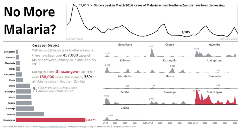
In this example, the creator of this infographic is using the colour red to emphasize the contrast between the metrics. In this example, Sinazongwe, a place that is located near many bodies of water presents the highest malaria rate in comparison to the other districts. The owner of the infographic keeps the rest of the places grey and creates a huge contrast between rates.
Colours Tell Ideas

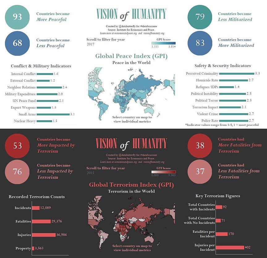
In this example, the maker of the infographic uses colours to change the context of his presentation and to provide a logic that can be followed by any viewer.
Blue represents the positive side of things while red represent s the negative side of things. Quite simple and extremely effective!
If we take the extreme opposite, using the same colours through a representation, an image, or a sales page will keep the reader bound to the same emotions and mood.
Final Words
Colour in data visualization is one of the most subtle yet effective ways to improve the power of your message. Whether you do it to encourage sales or to provide value, it really doesn’t matter. Colours are present everywhere you go – on websites, videos, images, graphics, and so on.
If you learn how to leverage them properly, your brand’s strength will immediately skyrocket and your results will suddenly look much better than they do now. Take into consideration what you’ve learned today and start taking action!
BIO:
 Michael Gorman is a small entrepreneur, freelancer, and resume writer at probably the best essay writing service in the UK. While he was in college, he started his professional writing career at a local coursework writing service and continued at a fairly new essay writing service. In a matter of a few years, Michael was prized as one of the best professionals and recognized by the Best Paper Writing Services Reviews. In his free time, he travels across the world.
Pic 2 source: https://thumbor.forbes.com/thumbor/960×0/https%3A%2F%2Fblogs-images.forbes.com%2Fevamurray%2Ffiles%2F2019%2F03%2FNo-more-malaria.jpg
What Is WooCommerce Product Slider and Why Your Store Needs It
Why Do Product Images Matter So Much in Online Stores? When someone visits an online store the…
0 Comments9 Minutes
How to Streamline Your Customers’ Shopping Experience?
The goal for any online store is to make shopping as smooth as possible. When visitors move…
0 Comments8 Minutes
Strengthening Brand-Customer Relationships Through Gamified Loyalty Programs
Creating lasting connections with customers has become increasingly vital as the marketplace grows…
0 Comments6 Minutes
How to Use SEO and SEA Together in Search Engine Marketing
In digital marketing, search engine marketing (SEM) plays a critical role in improving online…
0 Comments10 Minutes
Content Marketing Growth Hacks: Real Shortcuts to Drive Traffic
Are you still lagging in content marketing? Sticking to these old strategies seems…
0 Comments10 Minutes
How to Build a Strong Local Following Using Social Media Marketing
In the days of likes, shares, and stories, local businesses have a golden opportunity to create…
0 Comments9 Minutes
Why WooCommerce is the Best Choice for Your Online Store?
WooCommerce stands out as a top option for anyone looking to build an online store. This platform…
0 Comments8 Minutes
How to Use AI-Powered SEO Tools for WordPress eCommerce
SEO is a critical factor in the success of any e-commerce WordPress store. As competition…
0 Comments11 Minutes
10 Comments
Comments are closed.


information valuable and excellent design as share good stuff with good ideas and concepts lots of great information and inspiration both of which I need, thanks to offer such a helpful information here. <a href="https://www.devrycourses.com/" ACCT 251 FULL COURSE LATEST
concepts lots of great information and inspiration both of which I need, thanks to offering such a piece of helpful information here.
Very clever strategy, I hope it will bring success
Thanks for this great. I am wondering if you were planning of publishing similar articles to this one. .Keep up the excellent posts!
Love it!!! Thanks All.
thanks for sharing this really helpful post for new comers
Good stuff with good ideas and concepts shared as valuable information and excellent design
. The use of color will help you to highlight the most important aspects of your message and simplify complex graphs. When comparing two data sets, you can simplify data by using contrasting colors, like blue and orange, to help viewers get an overall picture.
Hey. Very nice web site!! Man .. Excellent .. Wonderful .. I’ll bookmark this web site and take the feeds also…I am happy to locate so much helpful information here within the article. Thanks for sharing…
Your blog website provided us with useful information to execute with. Each & every recommendation of your website is awesome. Thanks a lot for talking about it. Star Wars Andor Outfits
hello