The Best Minimalist Website Design Examples To Get Inspired By
Though it began as an art movement back in the 1960s, today minimalism is one of the biggest trends and most popular concepts in web design.
Quick Links
Web designers like in the Ramotion web design agency use it to create simple interfaces and facilitate easier navigation to improve user experience.
Read on to:
- Learn the difference between minimalism and simplicity
- Discover the elements of minimalist website design
- See some of the best examples of this web design trend in 2020
Minimalism vs. Simplicity
While many use these two terms interchangeably, minimal can be simple but simple doesn’t necessarily have to be minimal.
Let’s take a look at the definitions of these two nouns:
- Minimalism denotes design with a lack of decoration.
- Simplicity is the condition of being uncomplicated and simple.
When you refer to something as simple, you imply that is not complex.
And when you say that something is minimal, you imply stripped of the non-essential.
To sum up, minimalism is all about something uncomplicated including only the most essential components to achieve the desired outcome.
Thus, when designers create minimalist designs, they use simple elements that are necessary to deliver maximum effect.

[Source: Google]
The goal is to avoid clutter and make sure the user can focus on the content.
Minimalist design has become popular in web design, where simple, clean designs are often more effective than busy or over-the-top designs.
Users are drawn to minimalist website design because it is easy to scan and don’t require a lot of effort to understand.
On the other hand, simplicity is not always about being minimal.
For example, you could have a very simple design that is not minimalist. Simplicity is more about having a focus on the essentials, whereas minimalism is all about stripping down to the bare essentials.
From the standpoint of web design, simplicity is often about using fewer design elements to create a cleaner and more user-friendly layout.
The Top 5 Elements Of Minimalist Web Design
Minimalism of today is all about customer-centricity. It is about guiding the user to the info they are looking for easily and quickly.
Here are the top five elements that web designers implement to achieve minimalism:
- Web designers at Globalgraphicswebdesign.com use negative or empty space to improve readability and comprehension but also to create a balance between images and text. When incorporated on websites, this technique attracts the visitors’ attention to the most important information or calls-to-action (CTAs).
- Colours: Minimalism is also characterized by the use of a limited number of colours. Some designers either use monochromatic colour palettes or some bold colour. While those who are not afraid to experiment use a wide spectrum of colours including neons and pastels but pay deep attention to their combination.
- Content: One of the primary goals of this trend is to highlight important marketing messages. This is why they combine different elements to keep the visitors’ attention on the content. Designers use fewer words to allow the promotion of products and services to stand out without making the reader spend a lot of time searching for important details. Make sure the copy is what you want with custom writings. If you are writing about academic subjects then you can often get quality from essay writings services such as EssayWritingService.
- Visuals: Similarly to colour usage, designers have different opinions on the usage of visuals. Some of them believe minimalist design doesn’t require employing images, while others think they are important for communicating ideas. However, those who implement them are quite picky and make a choice based on the principles of minimalist design which are big, bold and contrasting types of visuals.
- Typography: When it comes to this trend, the selection of font is of great importance to maintain simplicity. Thus experts pick clean and easily readable typography and focus on one or two fonts only. Bold headlines combined with small parts of text are very common.
Minimalist Website Design: 10 Outstanding Examples
Research shows that 94% or first impressions of a website are design-related.
And with such a huge competition, it is more difficult than ever to retain the visitors and make them take the desired action.
Minimalist website design is one of the best tools that businesses can invest in to promote their products and services successfully.
To help you get inspiration, we are giving you some of the best examples of minimalist website design this year:
[Source: Evoulve]
1. Evoulve
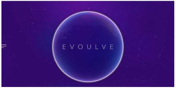
Evoulve is an innovative agency that creates digital products for the technology industry.
Their website design features simple navigation, bold headlines and minimal use of text to describe the services they offer shortly and concisely.
Their designers have used a limited set of colours and have perfectly combined purple and white to give the site a futuristic feel.
The homepage features no visuals except for a rotating globe and starry sky in the background.
[Source: Bouguessa]
2. Bouguessa
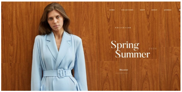
Bouguessa is a luxury fashion brand that mixes the classic and temporary to create clothing for women.
The brand’s website is another great example of minimalism that mixes bold and simple typography with minimal usage of written content.
They have simple navigation that allows users to easily move around the site and plenty of negative space that allows the images of their latest collection to stand out.
They’ve used different colours but white is dominating across all the pages.
[Source: Rouillard]
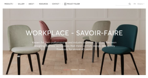
3. Rouillard
Rouillard is a Canada-based furniture design company that brings contemporary, innovative products to the market.
On their website, they’ve used plenty of black and white furnishing visuals that change colour once you click on them. This is a great example of how minimalist designers use photography and muted palettes to maintain the air of simplicity.
We can also see bold headlines, minimal usage of content, simple navigation and white space that allows you to feel the elegance of their products.
[Source: Frankly Steve]
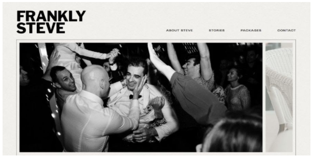
4. Frankly Steve
Frankly Steve is a photographer who gives us another take of imagery and smart use of colour (or lack of) in his minimalist approach to web design.
There’s plenty of white space and a clean interface that allows visitors to focus on the quality of his photographs.
The designer has used an unobtrusive monochrome colour palette and has mixed it with a symmetric block structure that gives a feeling of elegance.
The minimal content and bold headlines usage only add to the overall moderate appearance.
[Source: McKennaJones.]
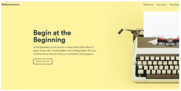
5. McKennaJones.
McKennaJones. is a UK-based insight, inspiration and ideas consulting agency.
Its website has been designed using minimalism principles and best practices and it can be a great inspiration for your next project.
We can see a combination of several bright and lively colours that highlight the bolded headlines and content.
There’s a font consistency across all the pages and limited usage of images that perfectly blend with the white space.
They also have a simple logo and effortless navigation.
[Source: Mogutable]
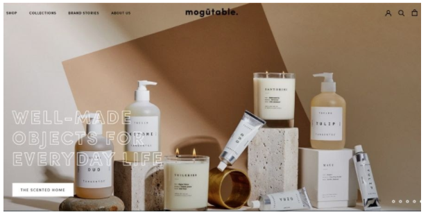
6. Mogutable
Mogutable is an online store that creates unique home decor and lifestyle products.
They have an elegant and clean website design with a simple interface and navigation.
We can see a usage of white space, soft pastel colours and symmetrical images.
Their web designer has incorporated different fonts, bolded headlines and minimal usage of text.
[Source: Kickpush]
7. Kickpush
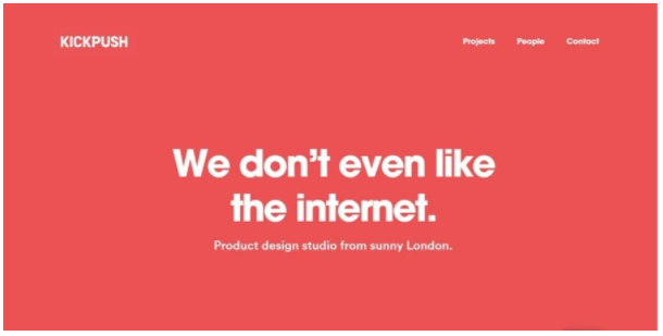
Kickpush is a product development company whose website uses a solid red background and bold large headings to highlight the content and convey different messages.
There’s a good deal of negative space and various sections with visuals placed from one side to the other.
They use the same font across all pages and we can see minimal usage of animation that makes this simple design a bit entertaining.
[Source: Leen Heyne]
8. Leen Heyne
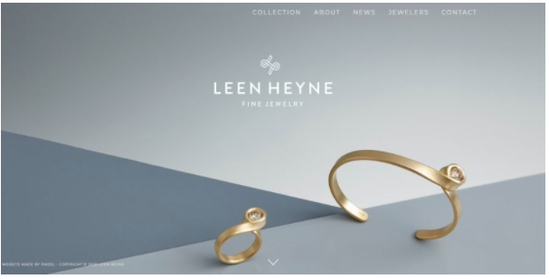
Leen Heyne is a luxury jewellery brand on whose website we can see simple design techniques that are eye-catching and incite a feeling of elegance.
The background is composed of three geometrically distributed shades of grey and bold white typography that creates contracts.
The simple navigation bar, monochrome logo and the negative space only add to the minimalist design that keeps the users’ attention on the products.
9. CB Website Design
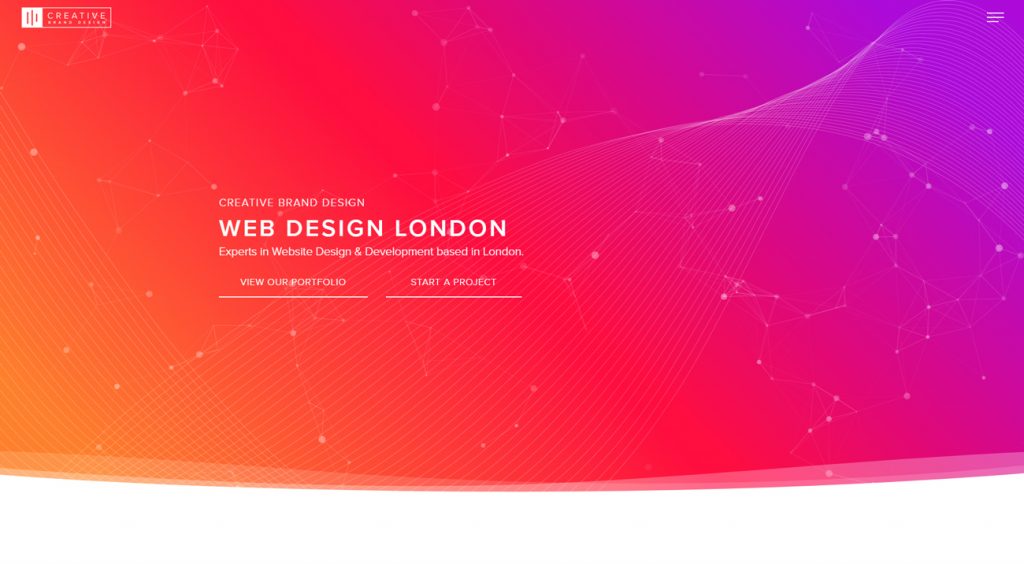
CB Website Design is a specialist web design and development company whose site makes use of impactful gradient colour schemes and subtle interactive design elements.
The fonts and colours are consistent across all pages but selected from a more fun and creative palette. Gentle loading animations guide the eye to key page info and suggest a natural journey and flow.
Areas of possible interaction are heightened for the user through motion, making it easy to understand what to do next.
Lastly, white space is used to sharpen and emphasise their inspiring colour story.
10. Startup Lab
Startup Lab is an early-stage investor for technology startups.
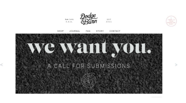
Their website is another great example of a minimalist design where we can see a combination of bold typography playfully embedded into imagery, using text as an element of design.
They’ve incorporated a limited number of colours and stencilled letters in their logo that adds a chunky but yet professional effect.
This website is also characterized by a usage of white space that allows for important elements to stand out.
The boldness achieved through colour, geometry and font gives the agency an authoritative and futuristic feel.
Takeaways
Today having a fully functional website is equally important as having an engaging UX and UI.
People want digital experiences and will not stick on your site long if they don’t find what they look for easily and quickly.
Minimalist website design is one of the biggest trends of 2020 because it allows important elements to stand out with the limited usage of written and visual content as well as negative space.
This contributes to a good user experience since the less clutter your visitors find the better they can navigate on your pages and get the answers or solutions they need.
However, the minimalist website design does not mean boring design. The examples we’ve provided are great proof that by using fewer elements your pages can look quite elegant, eye-catching and catchy.
Why WooCommerce is the Best Choice for Your Online Store?
WooCommerce stands out as a top option for anyone looking to build an online store. This platform…
0 Comments8 Minutes
How to Use AI-Powered SEO Tools for WordPress eCommerce
SEO is a critical factor in the success of any e-commerce WordPress store. As competition…
0 Comments11 Minutes
Why Short-Form Videos Are the Future of Content Marketing
Your Instagram customers spend over 50% of their time watching short-form videos and reels. Rather…
0 Comments12 Minutes
The Role of Digital Marketing in Business Growth
Online marketing touches every aspect of a business, whether it is initiating the idea or for an…
0 Comments3 Minutes
AI Meets Authenticity: Balancing Automation and Human Touch in Content Marketing
Is your brand starting to sound like a robot? In a world where algorithms write faster than any…
0 Comments8 Minutes
Essential Tools for Enhancing Web Design and UX Hosting
Have you ever visited a website that felt slow, clunky, or confusing? A website that is poorly…
0 Comments11 Minutes
How a Mini Cart Transformed My Store’s Shopping Experience
Okay, real talk—running an online store is hard. You think you’ve got everything figured out, you…
0 Comments9 Minutes
Balancing Your Security Initiatives With Industry Compliance Requirements
Managing a business today comes with a number of daily battles that need to be fought. Resources…
0 Comments11 Minutes


