The Anatomy of a Powerful eCommerce Website for Your Online Store (Checklist)
Not all online stores are created equal.
Some are enjoyable to browse but have little customer reviews. The result is most visitors hesitating and leaving.
Other stores have plenty of reviews but drive people away with design issues like long checkouts and slow loading speeds. Their owners have no idea how much they’re losing just because the website needs an overhaul.
Resolving customer experience and website performance issues is a must to keep customers satisfied and coming back. If your online store is up to this standard, it’s likely to rank higher and sell more.
If only there were a checklist of things to make that happen, right?
Well, guess what, you found it right here! Check it out below.
Online Store Checklist: Website Design & Customer Experience
1. Responsive Website Design
A lot of your customers are browsing products and/or shopping on mobile.
In fact, Google says that:
- 82 percent of customers start product research on mobile devices
- 34 percent make purchases on mobile.
If an online store isn’t optimized for mobile viewing, i.e. has non-responsive design, the shopping experience will be quite horrible. Super slow pages, huge menu sections covering the entire screen, and hard-to-find shopping carts are just some of the issues.
Together, these issues make customers work harder to get what they want. Most will decide to avoid that experience. This means lost sales!
So, the big question is:
Is your online store optimized for mobile?
If in doubt, use Google’s free Mobile-Friendly Test to find out in ten seconds. Should you find a lack of optimization, talk to a web developer immediately.
More tips on responsive design:
2. Product Pages: Related Items Section
You’ve seen this one before.
To encourage you to browse some more, online stores show related items on product pages. These sections are called “Related products,” “Similar products,” “You might also like,” etc.
Here’s how Amazon does it.
If you’re looking for an Instax camera, you’ll get recommendations to buy film and a case. Sounds like something people would buy with an Instax, indeed.
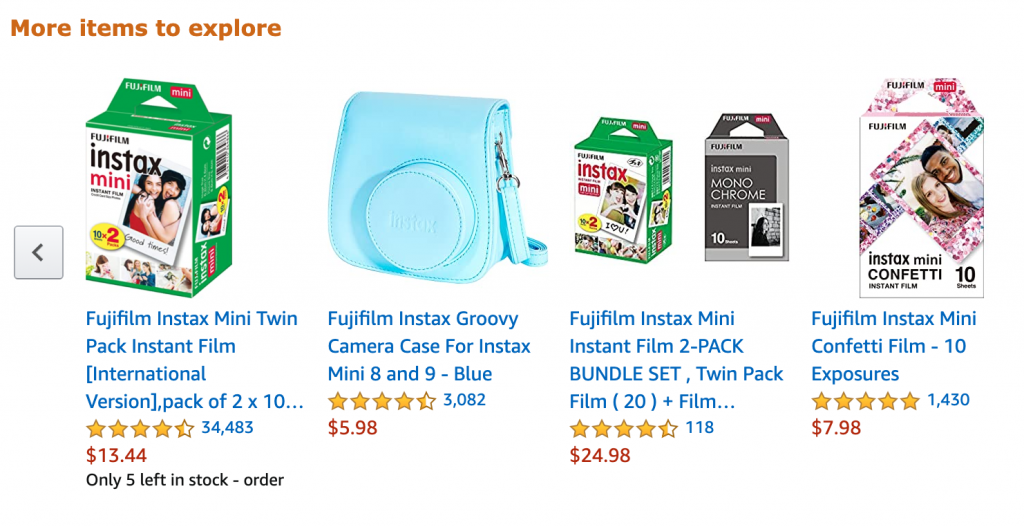
Source: Author’s screenshot, Amazon
Does it work for Amazon, you ask? Well, 35 percent of the company’s sales come from the recommendation engine. If that’s not a success, I don’t know what is.
Your store deserves success, too. Give your shoppers more options by displaying related products on product pages. If you’re running a WooCommerce shop, then you might find it as a part of store templates. Shopify, for example, provides instructions for building a customizable related product section.
Regardless of your online store platform, adding Related Products features is possible. And a must for more sales!
3. Product Pages: Customer Reviews
Customer trust reviews from other customers. In many cases, they even hesitate to buy if a product rating is lower than four stars.
But the worst thing is that people won’t buy if there are no reviews at all.
That’s why customer reviews are a must for product pages. They increase trust and encourage people to make purchases.
Here’s an example from Illy, a coffee seller.
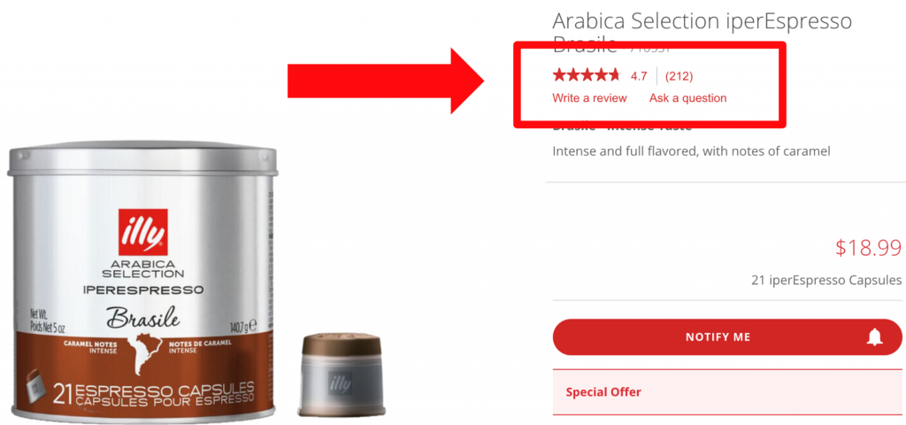
Source: Author’s screenshot, Illy USA
How is it done?
Add a review section on each product page and encourage customers to submit their experiences. Most B2C and B2B eCommerce platform providers have this functionality.
4. Live Chat Feature
How do people prefer to contact support on online stores?
Live chat is a winner, hands down. It has the highest customer satisfaction rate of 83 percent, says Forbes, meaning that most people rate their live chat experience positive.
That’s not surprising: live chat is the fastest way to get help from a representative. That’s why leading online stores have a live chat feature.
They add it to home pages, landing pages, product pages – wherever your customers might need some help of a support team.
Here’s a free live chat widget at a website of a Canadian clothing seller Sosken.

Source: Author’s screenshot, Sosken Studios
This way, Sosken lets its customers know that they’re ready to help right away, which is something customers appreciate and look for.
But there’s a long-term benefit, too! By offering quick assistance, your business can get more positive reviews and build great relationships with customers.
4. Checkout Page: Guest Checkout Feature
Guest checkout has one major benefit for customers:
The “boring” part of shopping takes less time.
That’s why many don’t want to create store accounts. In fact, 35 percent of abandoned carts occur because of the mandatory account requirements, says a Baymard survey.
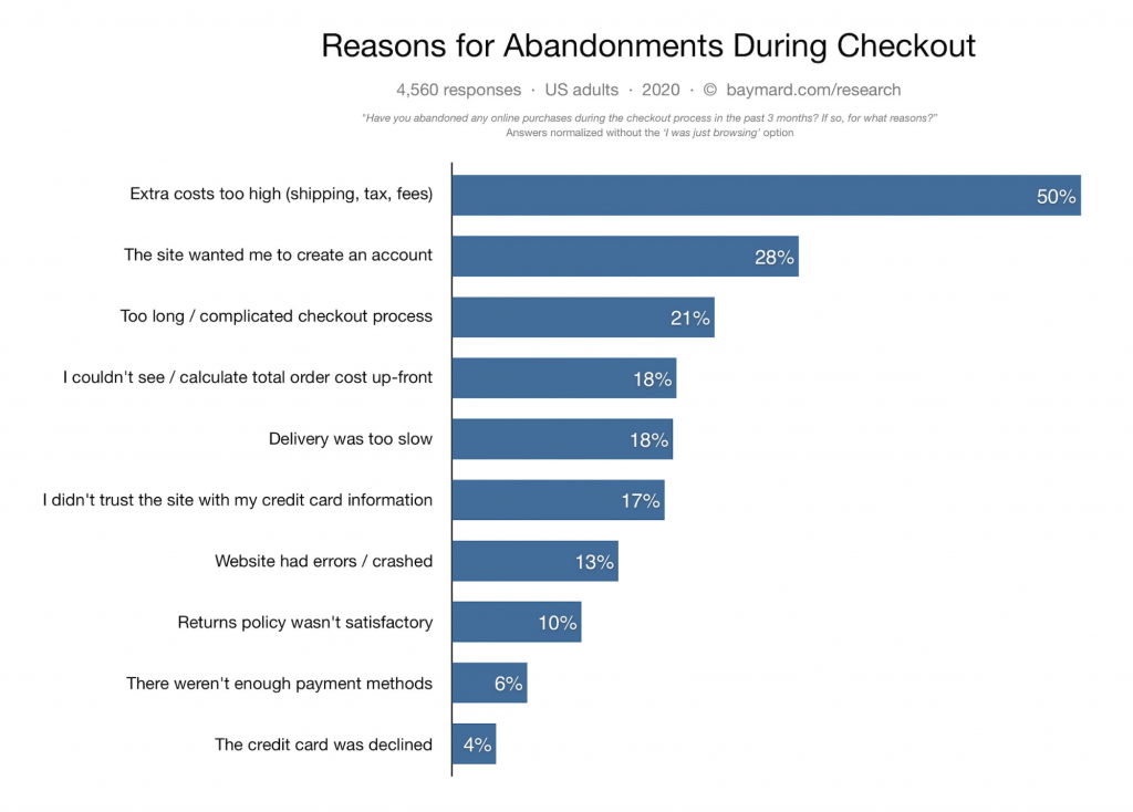
Credit: Baymard Institute
How to avoid that? Simple: stay out of the way.
In web design terms: add a guest checkout option to the checkout page.
Here’s an example from LEGO. Buyers have options on the checkout page: register as a new/returning customer and use guest checkout.
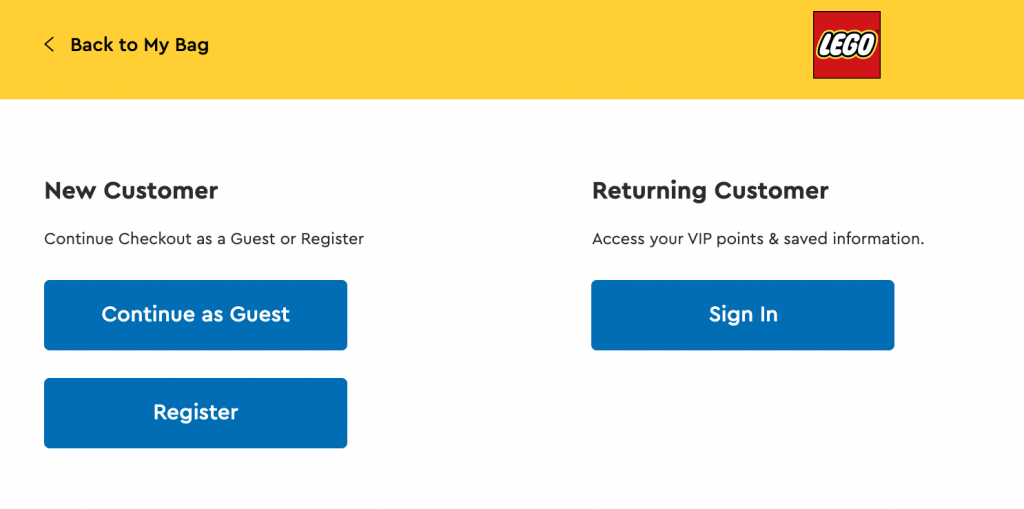
Credit: Author’s screenshot, LEGO
Get a guest checkout option like this, too. Most eCommerce platforms have this functionality, so getting this one done won’t be a problem. Your customers will thank you, for sure.
6. Product Page: Upfront Total Order Cost Notification
Unexpected shipping costs.
Another reason why customers leave after adding products in the cart. In fact, Baymard says that 18 percent of customers leave checkout because of it.
If you’re not ready to leave money on the table, you must be clear about the total order cost before the customer gets to checkout.
Adidas, for example, displays delivery costs immediately after a customer adds a product to the cart.
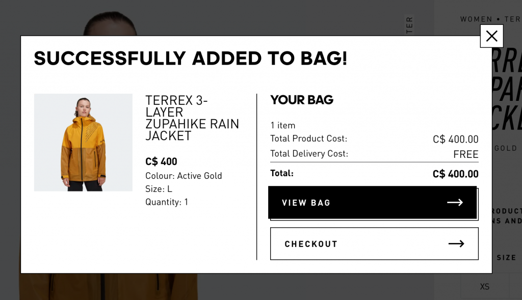
Credit: Author’s screenshot, Adidas Canada
Greats, one of the most successful Shopify stores in its niche, does this a bit differently.
When the customer adds to “Add to Cart” button, the message appears, letting them know that the additional costs are calculated at checkout.

Credit: Author’s screenshot, Greats.com
This way, the store gives a notification, so there are no “surprises” later.
So the takeaway here is: add functionality to show shipping costs before the customer goes to checkout. It can really give a better shot to hit the sales goals you’ve set.
7. Self-Service Tools
Customer self-service means providing customer support without requiring any interaction with service agents or representatives.
The most popular self-service tools are knowledge bases and chatbots.
A knowledge base is a collection of short articles addressing FAQs related to products, shipping, returns, loyalty program – everything that a customer might ask. So, it’s going to be a separate section on your website.
The best way to organize a knowledge base is to use FAQs.
RingCentral, a business that provides video conferencing solutions (a software that requires some learning) has a nicely organized knowledge base with questions.
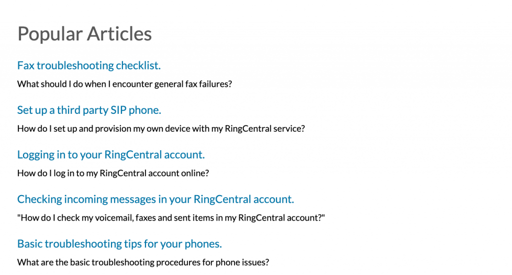
Credit: Author’s screenshot, RingCentral
Try designing your own knowledge base the same way. Determine FAQs, categorize them, and list them in one place. Highlight the most important FAQs, too, to help customers find answers quickly.
Next, a chatbot. It’s an app that simulates the conversation with a support agent and gives instant answers to pre-defined questions.
A chatbot can help:
- Receive immediate answers to FAQs
- Get to appropriate the knowledge base pages.
The best chatbot that allows customers to find answers quickly is called an FAQ chatbot. The name pretty much says it all: it provides answers to FAQs of your choice.
Here’s an example of such a chatbot, courtesy of Prime Liquor store. It greets the visitors with a welcome message and offers access to FAQs (the image to the left). If prompted, the chatbot displays the list of questions.
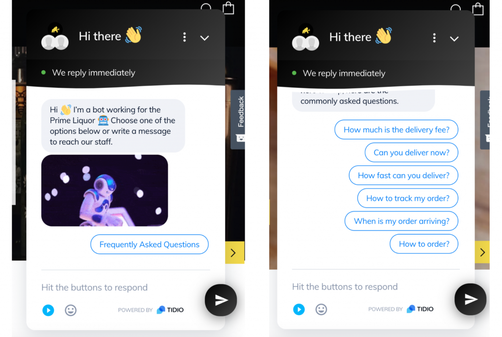
Source: Author’s screenshot, Primeliquor.sg
For customers, having such a chatbot is an opportunity to get help without having to wait for a representative to become available.
On top of that, chatbots work 24/7, which is another big advantage of online stores with this feature.
Conclusion
There you go, the features of the best eCommerce websites for online stores.
Each one helps to either improve customer experience or website design. Feel free to use this checklist to get your online shopping experience to the highest standard. Your customers will be glad you did.
How to Use AI-Powered SEO Tools for WordPress eCommerce
SEO is a critical factor in the success of any e-commerce WordPress store. As competition…
0 Comments11 Minutes
Why Short-Form Videos Are the Future of Content Marketing
Your Instagram customers spend over 50% of their time watching short-form videos and reels. Rather…
0 Comments12 Minutes
The Role of Digital Marketing in Business Growth
Online marketing touches every aspect of a business, whether it is initiating the idea or for an…
0 Comments3 Minutes
AI Meets Authenticity: Balancing Automation and Human Touch in Content Marketing
Is your brand starting to sound like a robot? In a world where algorithms write faster than any…
0 Comments8 Minutes
Essential Tools for Enhancing Web Design and UX Hosting
Have you ever visited a website that felt slow, clunky, or confusing? A website that is poorly…
0 Comments11 Minutes
How a Mini Cart Transformed My Store’s Shopping Experience
Okay, real talk—running an online store is hard. You think you’ve got everything figured out, you…
0 Comments9 Minutes
Balancing Your Security Initiatives With Industry Compliance Requirements
Managing a business today comes with a number of daily battles that need to be fought. Resources…
0 Comments11 Minutes
Best plugins to enhance the customer shopping experience
Customer experience is a key part of every online store. A good experience helps customers find…
0 Comments7 Minutes
1 Comment
Comments are closed.





Ecommerce websites need to focus on providing an engaging user experience while also gently nudging the visitor to make a conversion.