Psychology Behind A Modern Day Web Design
It shouldn’t come as a surprise to you that there is a strong connection between various psychological techniques and approaches and web design. After all, the whole idea of designing a website for your audience is to invoke certain emotions in them and drive them to take the actions that you want them to, and of course, and, of course, generate conversions and sales. So, it is more than just throwing together a pretty-looking website. It needs to have proper navigation, use every element attentively, and work fast enough so that your visitors don’t get bored waiting and bounce.
Quick Links
Therefore, it is crucial that you don’t just walk blindly into the whole process of designing your website. You need to be knowledgeable about the crucial psychological principles behind it, and play on them properly in order to truly interest your visitors, drive them to do what you want them to do, and generally, make yourself look like a professional business that they can trust and become loyal to.
So, in this article, we are going to discuss some of the most important approaches to web design based on psychological principles and techniques.
Choice
If there is something that every customer that comes across your website needs is the ability to choose. Still, the ability of choice is something that needs to be properly optimized. A lot of eCommerce businesses would just love to show off all of their amazing products on a page and let people browse and choose. However, this is hardly a good idea.
In fact, customers will downright refuse to make a choice if there is an abundance of options in front of them. This is most commonly referred to as choice paralysis. It can either make people think that they don’t need your product at all or result in dissatisfaction if they do force themselves to go through the process. So, don’t offer too much. Offer less. Make your website simple enough so that once a user is faced with choices, there is a limited number of options which makes it much easier for them to decide.
Familiarity and building trust
![]()
It is immensely important to keep in mind that when a visitor comes to your website, that they have particular expectations. It doesn’t really matter what kind of website you have. They want to come across certain aspects that they will find familiar so that they can quickly get a hold of how to navigate around. Otherwise, they will feel like they have found themselves in an unfamiliar place that confuses them, and, as a result, seems much less worthy of their trust.
There are two aspects that are most important regarding this – quick understanding of what your website’s purpose is, and proper navigation around it. If you want people to be aware of what kind of site they are on in a matter of seconds, you should highlight crucial taglines, but also make the design complement them. Let’s say that you are all about green solutions, recycling, and so on. If your pages are dark and moody, they will certainly confuse your audience. In this case, it is pretty logical that you are going to make your pages green and clean.
As for the navigation, your products need to take the forefront and already appear on the home page, and there should be a very intuitive path to purchasing them. If you have a blog running, your blog page needs to present your blog posts with a little chunk of text right away, so that they can easily find what they are interested in reading. Of course, you mustn’t forget about the search function. Of course, contact information is essential, because they will most often have questions for you.
Furthermore, you want to make your website be as mobile-friendly as it can be. According to anyone who is familiar with the way Google works, such as experts for SEO in Sydney, mobile-first indexing has made this aspect of web design crucial, not just in terms of your mobile visitors having the best possible experience, but also for ranking high on SERPs.
Imagery

It is pretty common amongst businesses and their web designers to decide to use top-notch stock images that are related to what their content is all about. However, if someone has truly made an effort to come up with that enticing piece of content, the best idea is to reinforce it with the kind of imagery that will emphasize the concepts and ideas that one can find in it.
Let’s say that one of your writers has come up with a great article about how to keep your computer safe from viruses, malware, and hackers. Some businesses will be satisfied with just throwing in high-quality stock images of people in panic in front of their monitors that show a “danger” sign. However, if you are a business that can solve your audience’s problem via a program or technical support, then it would be wise to use imagery that includes your logo visible as your software is being installed, or a member of your team wearing branded clothing. This is the best way to present your brand’s value, instead of just vaguely hinting at it with stock images.
The psychology of colour
Of course, there is also the often discussed psychology of colour. There is a lot of depth behind it, but essentially, the colours that you choose for every item of your website’s design will invoke a certain emotion within your audience. This is why you need to be careful about what colours you choose.
First of all, you need to choose the colours that are going to represent your brand properly and implement them as much as possible. Then, you need to pick colours for certain items, such as, for example, CTAs, which will cause the kind of reaction that you are looking for. In this particular case, you will want to go for a variant of red, because, next to being the colour of energy, passion, and action, it is also one that incites a sense of urgency.
So, as we have ascertained in this article, psychology and web design are closely intertwined. In order to design a website that will drive to visitors do what you want them to do, as well as make them stick around and come back, you need to implement certain psychological principles and techniques into your design. Think about the ones that we have discussed here and used them to your advantage.
Why WooCommerce is the Best Choice for Your Online Store?
WooCommerce stands out as a top option for anyone looking to build an online store. This platform…
0 Comments8 Minutes
How to Use AI-Powered SEO Tools for WordPress eCommerce
SEO is a critical factor in the success of any e-commerce WordPress store. As competition…
0 Comments11 Minutes
Why Short-Form Videos Are the Future of Content Marketing
Your Instagram customers spend over 50% of their time watching short-form videos and reels. Rather…
0 Comments12 Minutes
The Role of Digital Marketing in Business Growth
Online marketing touches every aspect of a business, whether it is initiating the idea or for an…
0 Comments3 Minutes
AI Meets Authenticity: Balancing Automation and Human Touch in Content Marketing
Is your brand starting to sound like a robot? In a world where algorithms write faster than any…
0 Comments8 Minutes
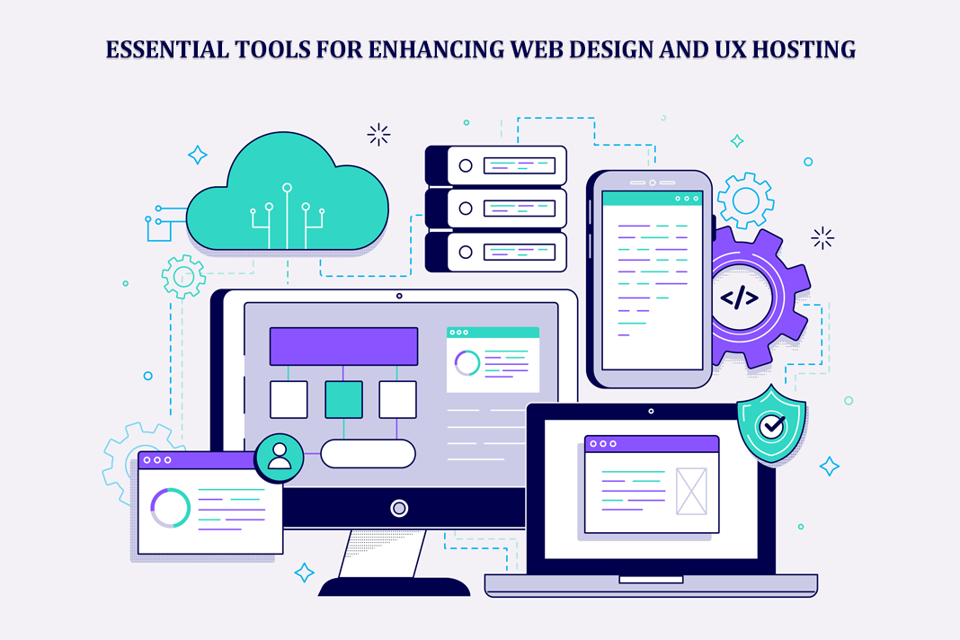
Essential Tools for Enhancing Web Design and UX Hosting
Have you ever visited a website that felt slow, clunky, or confusing? A website that is poorly…
0 Comments11 Minutes
How a Mini Cart Transformed My Store’s Shopping Experience
Okay, real talk—running an online store is hard. You think you’ve got everything figured out, you…
0 Comments9 Minutes
Balancing Your Security Initiatives With Industry Compliance Requirements
Managing a business today comes with a number of daily battles that need to be fought. Resources…
0 Comments11 Minutes


