Making Your Content Engagement Skyrocket: How to Choose the Right Images
When we think of website content, most of us still think of words. Yes, video and audio are becoming increasingly popular, and more and more websites are using them, but when we’re talking websites, it’s words and images.
Quick Links
And since words are much more difficult to construct, we often make the mistake of forgetting all about the images until we need to publish the page itself. At that point, we might just choose any ol’ image, and sort of hope for the best.
Today, we will be looking at the best way to choose the best images for your content, and why this matters.
Why are images important?
Content with good images attracts 94% more views than content without them. This fact alone speaks volumes, but here is another one. Between 65 and 85 percent of people describe themselves as visual learners, meaning images appeal to them more than words.
It’s easier to capture someone’s attention with an image – even if you format your text well and have your most prominent words stand out, images just work better. They’re also better for capturing our short attention spans, they’re more memorable, and they can tell a story in less space than any amount of words.
Now let’s look at how to choose the right ones:
Make sure they are a match
The images you use for any kind of content need to match the mood and voice of your brand and speak to your target audience. They also need to match the mood of the piece they’re accompanying.
Consider the emotions and thoughts you want to provoke with your piece of content, and what the message you want to drive home is. Then try to find images that match your intent perfectly.
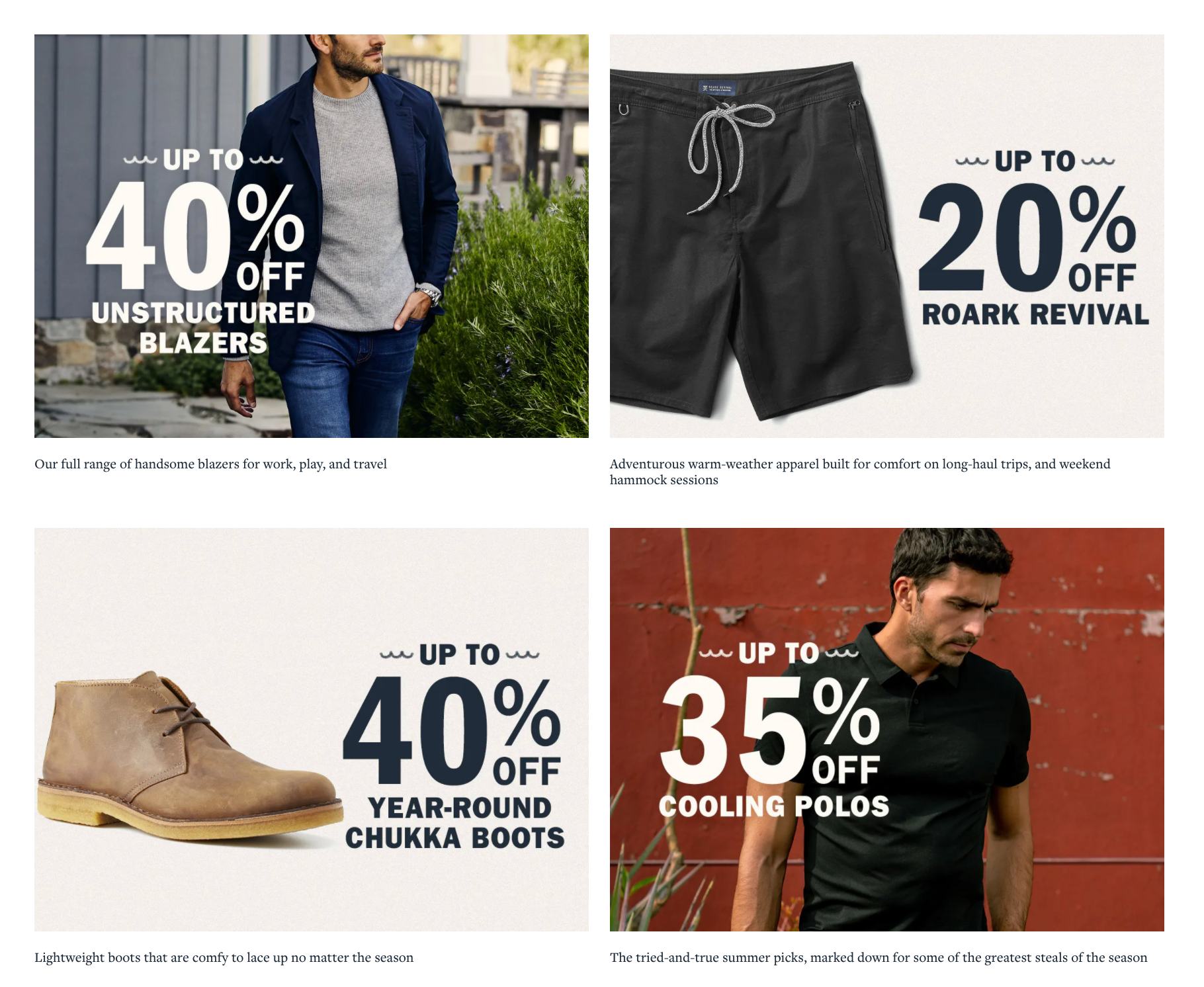
Source: huckberry.com
Huckberry is a great example of matching mood to target audience – just take a look at their website and Instagram, and you’ll instantly see who they are targeting and how. Their images are aligned with their brand and tell some great stories.
Illustrate the product the best you can
If you’re selling a physical product, make sure you use plenty of images of it, both in action and in still shots. The same goes for SaaS products – make sure you add plenty of screenshots that show what the product actually looks like, instead of just talking about it.
When adding product images, always try to use your own photos, as opposed to photos of the same product you’ve found online. This will lend much more authenticity and help you stand out, and it’s also good SEO practice.
This product page from Somnifix is a very good example of a company doing this well. They have many images of their product being used by people in a variety of different capacities. This helps to clearly demonstrate how the product is meant to be used and the benefits of using it.
Use your own images
While we’re on the subject of using your own images, this rule should be applied to all kinds of images, and not just for product ones. Even your blog posts should contain original images if this is possible.
If you’re hiring a designer to do these images for you, try to figure out a way to tie all of the images together. Stick to a similar design and the same color palette, and try to add some branding to them.
For example, look at what Smash Digital is doing – they feature the same character on all of their images, making them instantly recognizable and authentic.
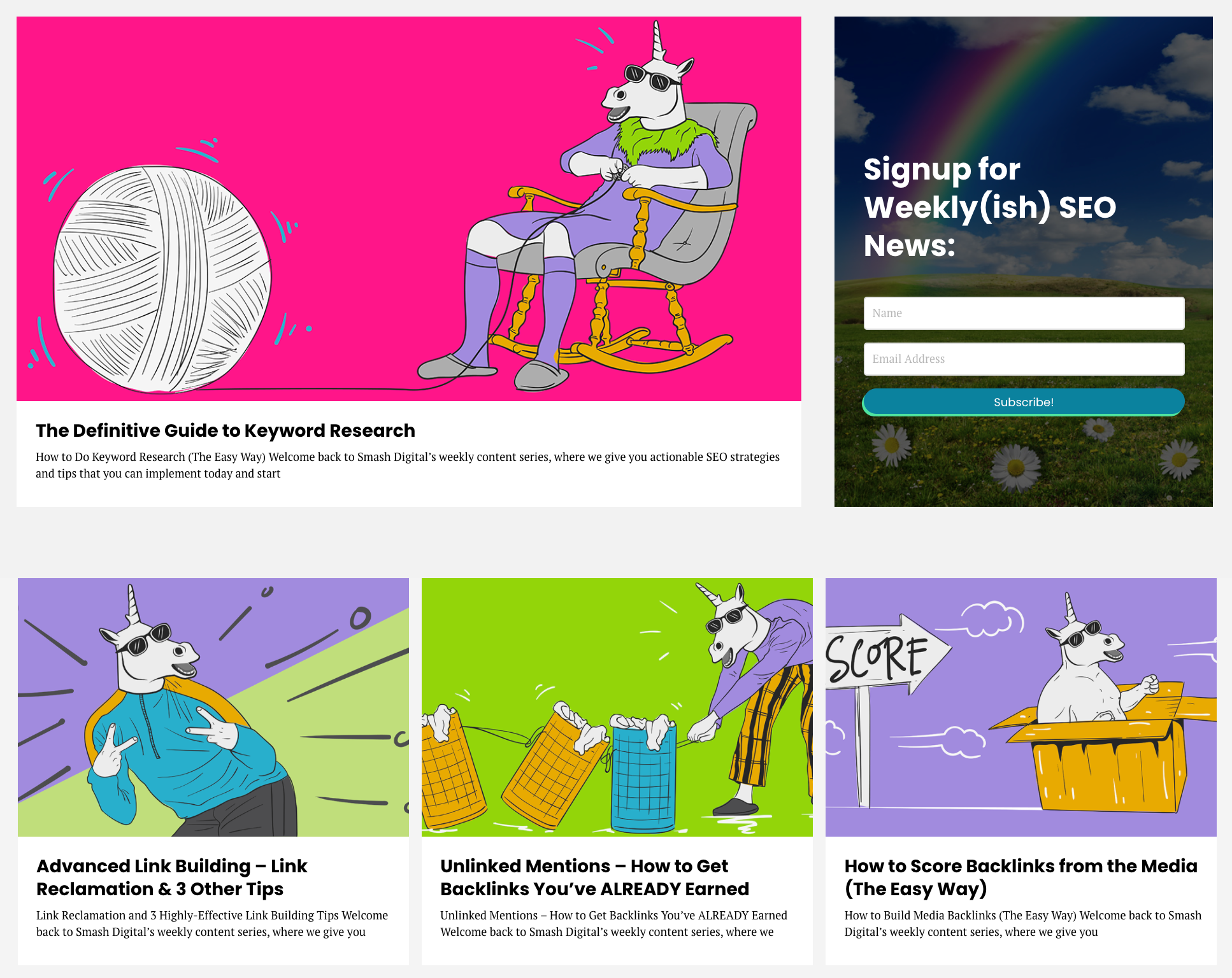
Source: smashdigital.com
Use images throughout the page
You may compose pages you feel don’t need to have images, or where you feel you don’t need to place too many images. However, in reality, you should place images throughout every page, in order to break up some of the text, make the page more visually appealing, and illustrate your points well.
There will certainly be posts for which it’s really difficult to come up with images, but you can always think of something if you try. In fact, you can think about the imagery you could use in the post while you’re writing the copy, and make notes for yourself on the kind of image you will need.
Even review and comparison pages need illustrations to make them work. This review page is a good example from Sleep Junkie because it has images for every section. While the copy would still work without the images, the page is more structured and simply more attractive with them.
Play with emotions
Images are your chance to evoke all kinds of emotions in your audience (after all, they do “speak louder than words). Using them to your advantage can help you immensely.
You will need to do some reading on image psychology and how best to choose different images to make people feel certain emotions, but the actual strategy is straightforward: think about the way you want to make people feel and why, and then find or create images that go extremely well with your desired emotional outcome.
Make sure they work on mobile
Finally, you need to consider your mobile visitors as well, and how you’re going to make your images appeal to them. It may take more than just optimizing your current desktop images for mobile – and you may need to rethink your entire use of images on different devices and different screen sizes.
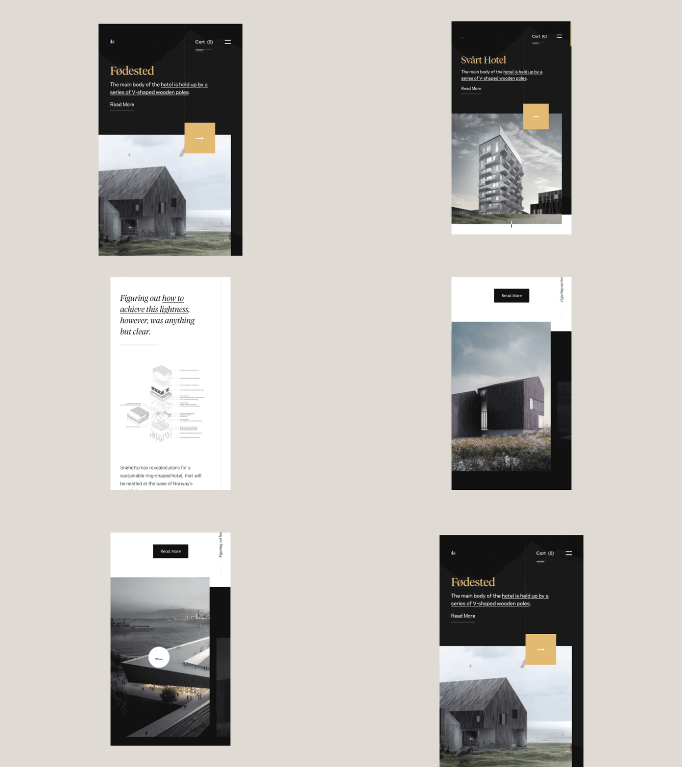
Source: dribbble.com
Waiting for an image to load, or having to continuously keep scrolling because images keep popping up and moving you up and down is the worst possible user experience. Make sure that:
- The images load properly on a smaller screen (i.e., that they actually fit on the screen in both landscape and portrait orientation).
- They don’t disrupt your text layout.
- They are small enough to load fast.
Final thoughts
It may take you some time to get used to image selection and give it as much attention as it deserves. But once you get the hang of it, you’ll notice how much easier the task becomes, and that you are also spending less time on it.
Don’t just slap any image onto your pages and hope for the best, and don’t forgo adding images altogether either. Take some time to find ones that will go best with your carefully crafted text. As a result of your effort, you’ll notice how your engagement rates start to climb, and your users become readier to convert.
Strengthening Brand-Customer Relationships Through Gamified Loyalty Programs
Creating lasting connections with customers has become increasingly vital as the marketplace grows…
0 Comments6 Minutes
How to Use SEO and SEA Together in Search Engine Marketing
In digital marketing, search engine marketing (SEM) plays a critical role in improving online…
0 Comments10 Minutes
Content Marketing Growth Hacks: Real Shortcuts to Drive Traffic
Are you still lagging in content marketing? Sticking to these old strategies seems…
0 Comments10 Minutes
How to Build a Strong Local Following Using Social Media Marketing
In the days of likes, shares, and stories, local businesses have a golden opportunity to create…
0 Comments9 Minutes
Why WooCommerce is the Best Choice for Your Online Store?
WooCommerce stands out as a top option for anyone looking to build an online store. This platform…
0 Comments8 Minutes
How to Use AI-Powered SEO Tools for WordPress eCommerce
SEO is a critical factor in the success of any e-commerce WordPress store. As competition…
0 Comments11 Minutes
Why Short-Form Videos Are the Future of Content Marketing
Your Instagram customers spend over 50% of their time watching short-form videos and reels. Rather…
0 Comments12 Minutes
The Role of Digital Marketing in Business Growth
Online marketing touches every aspect of a business, whether it is initiating the idea or for an…
0 Comments3 Minutes


