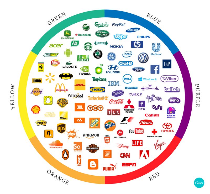
Nothing best represents a brand better than its logo, and this is especially true when it comes to the top dogs in their respective industries and logo design companies in the Theymakedesign blog know this very well. Logos are what makes us instantly recognize popular brands and, more often than not, logos have a part in contributing to these brands’ popularity. As you can see, a logo plays the role of representing a brand, and that’s usually the case is that logos tend to have a deeper, hidden meaning that has so much to do with the brand’s identity; its history, its offers, and the attitude the brand intends to project are just a few of the many things that make up their iconic representations.
Logos essentially tell stories of how brands came to be and what they wish to offer to the world. While logos hold much symbolism that represents the brand’s many different aspects, the very first thing that many of us would notice is the logo’s colour. A single hue or a combination of different colours can easily say a lot about the brand. In this post, the graphic design tool website Canva tackles the different colours used by the most popular brands, their meanings, and the psychology behind the use of colour for branding purposes.
Image source: Canva

