Landingi For Leads
Unless you’re the luckiest business owner on the planet, you’ll no doubt spend a fair amount of your time finding and chasing leads. Depending on how you go about it, this can be hugely rewarding or, hugely frustrating and, there are good ways and bad ways of going about it. In this article, I am going to be talking about using Polish tool, Landingi to score leads but, first, let’s touch on what I mean by leads.
Quick Links
A leading question
In the past, the term ‘leads’ would be used widely just to describe somebody who may be interested in your product or service. Although this is still sort of the case, in 2020, the term is most commonly used to describe visitors to your website. In this context, your lead is somebody that you have lured to your website through advertising, social media or other forms of promotion.
It’s a process
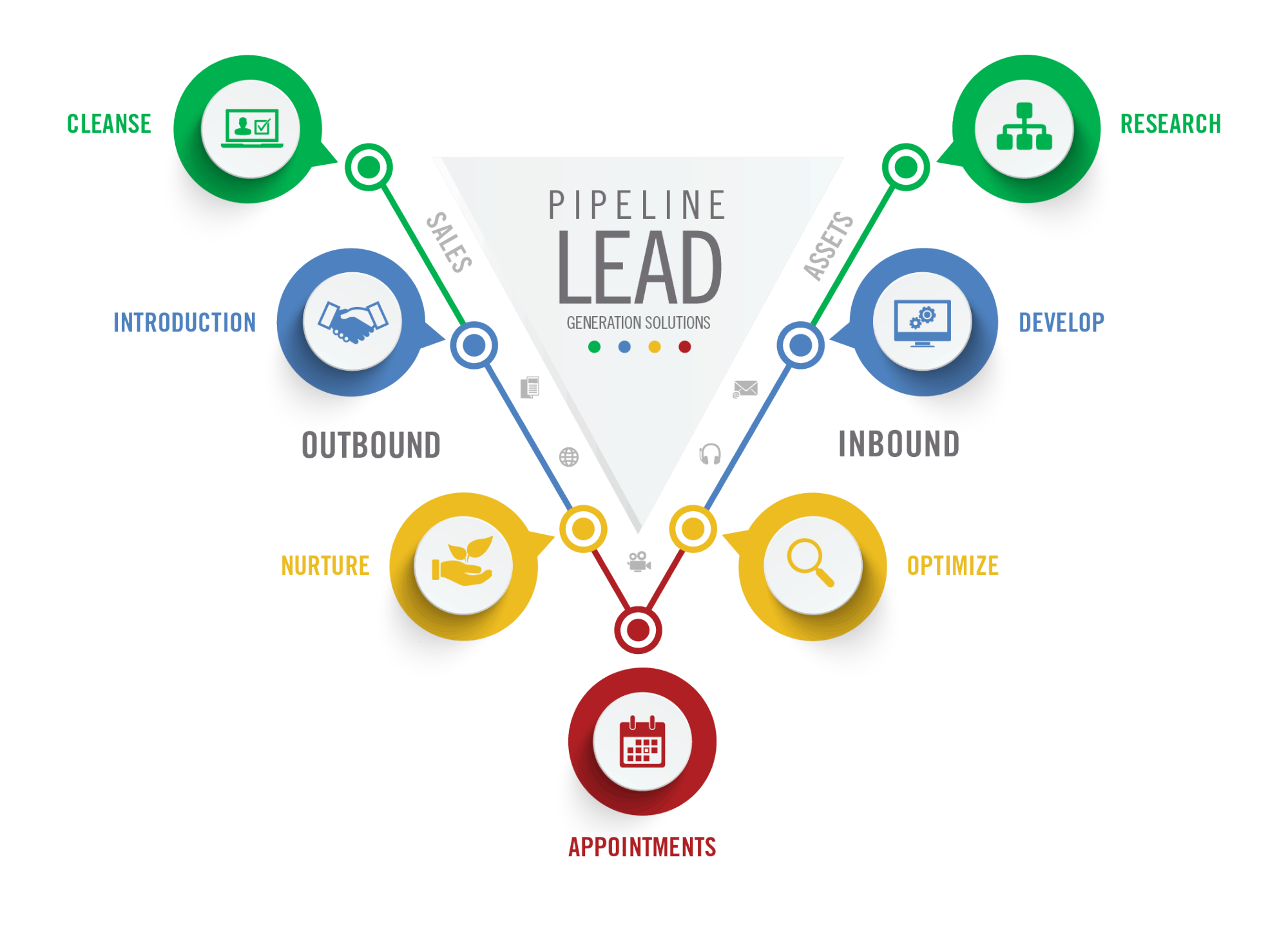
When I think about generating leads, this follows quite a natural four-step process which is:
Attracting leads – The act of creating content and running promotions to grab the attention of potential customers.
Converting leads – The act of guiding a visitor to your site through to potentially making a purchase
Closing leads – Sealing the deal in terms of a purchase made.
Delighting leads – Turning a new lead into a regular customer through quality product/service and excellent customer support.
Although this may sound simple, it can be a complex and time-consuming process – with a high rate of failure if you don’t know what you’re doing.
The land of opportunity
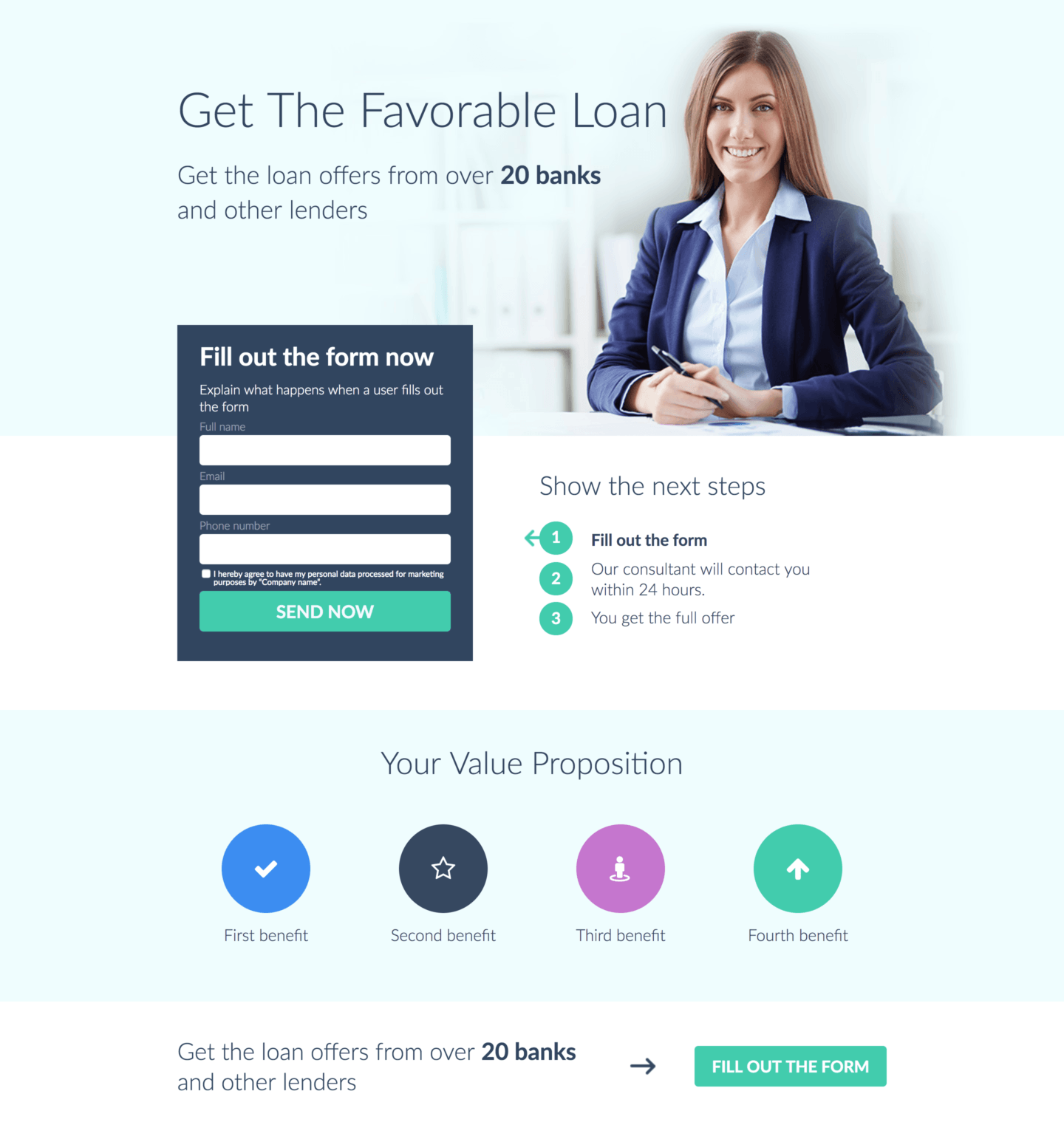
One of the most important aspects of lead generation is having a great landing page. Many brands make the mistake of believing that they simply need to send new visitors to the home page of their website but, this won’t work for a couple of reasons:
- Firstly, there’s usually too much going on within a brand’s home page to successfully keep the attention of potential customers.
- Secondly, when a potential customer clicks onto your ad or promotion, they expect to be taken to a page relevant to the content in the ad. In most cases, the content of your home page won’t fulfil this need and, you’ll lose the interest of your potential customer.
So, what you need is a dedicated landing page which mirrors the content of your advert or promotion and, the following is our guide to doing just that with Landingi.
Launched in 2013 by Blazej Abel, Landingi is a tool which allows even the least techy among us to build professional landing pages for their business. Landingi has several funky features including:
- Templates
- Drag & Drop Editor
- Image & Icon Libraries
- Collaboration
- Analytics
- Lead Management
Landingi offers a free trial for new customers, after which users can choose between three paid packages: Core at $29 per month, Create at $45 per month and, Automate at $59 per month.
On the same page
I’ll begin by walking you through the process of creating your first landing page with Landingi.
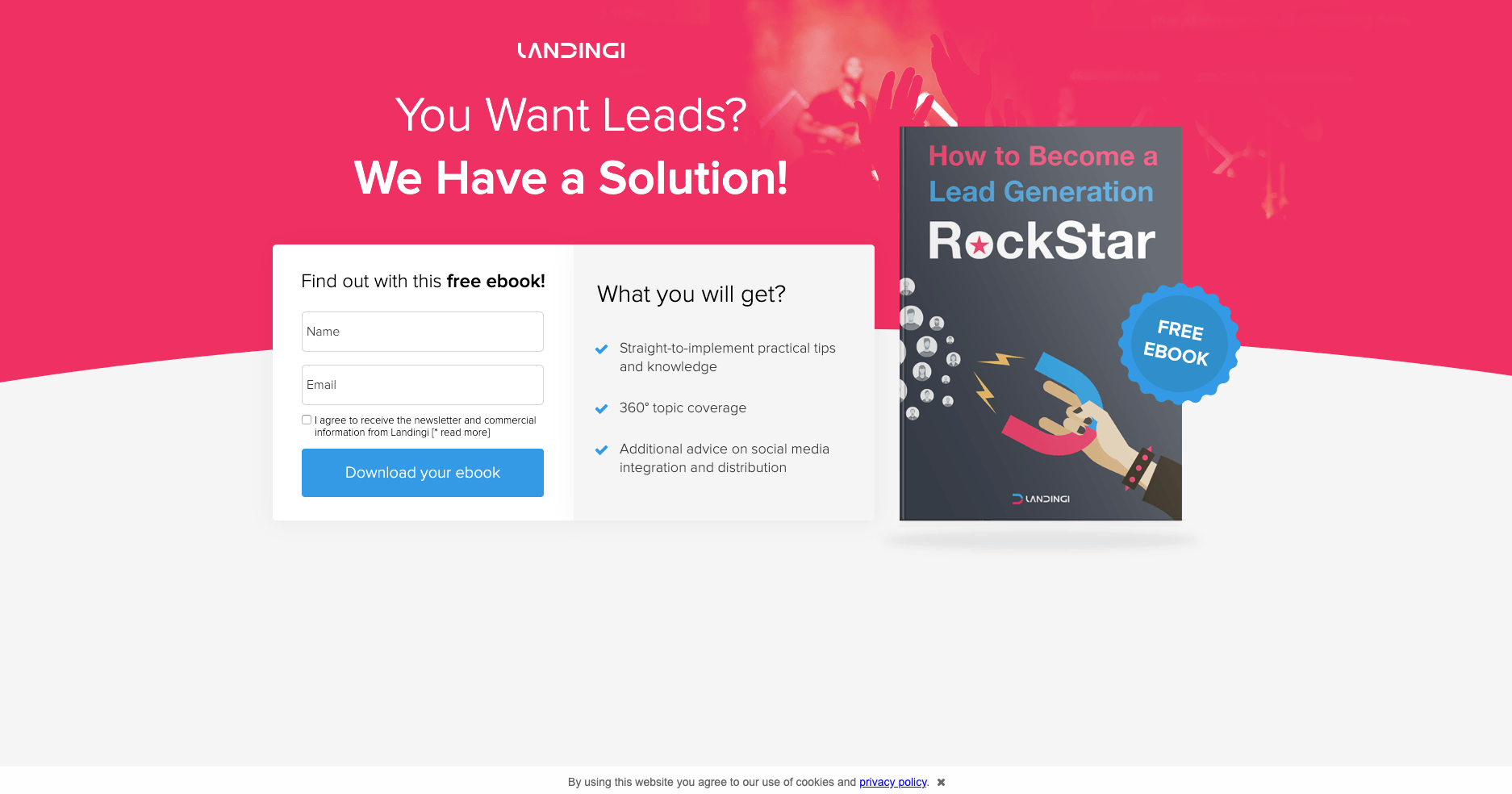
Signing up with Landingi
- Head on over to https://landingi.com
- In the top right-hand corner, you’ll see a button ‘Start Your Free Trial’, click onto this
- You’ll now be asked to sign up via your email or your social media accounts, choose your method
- Enter your telephone number and a couple of bits of info about your business
- A verification code will be sent to your mobile – enter this code into the box you’ll now see on your screen
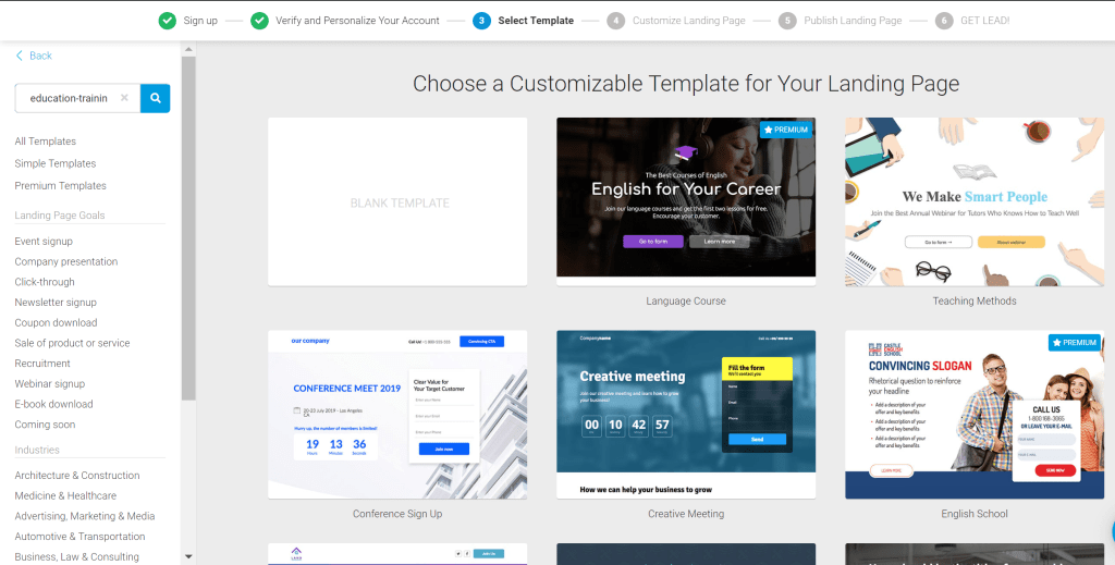
- You’ll now be directed to the Landingi template screen
Creating your page
- Choose a template from the options provided by clicking onto ‘Use Template’
- Pick a name for your landing page
- Click onto ‘Start Editing’
- Depending on which template you’re going with, you’ll be asked to enter various pieces of information
- Use the tools on the right-hand side to edit fonts, heading names, colours and more
- You can also use the gallery tool on the right-hand side to add images – you have the option to use Landingi’s free images or, to upload some of your own
- On the toolbar at the top of your working screen, you’ll see a preview button – you can use this at any time to see how your landing page is looking
- You can save your work at any time by choosing ‘Save’ from the top toolbar
- Once you’re happy with your page, click onto the green ‘Publish’ button
Choosing your content
So, the above gives you the nuts and bolts of creating your page but, what should you be including? First and foremost, when creating the page, always keep the customer / potential lead in mind and, ask yourself what they may want/need. Next, it’s time to take a look at your content:
Design – The design of your page should be relevant and appropriate. For example, if your brand is a serious financial company then you probably want to avoid cartoon style imaging.
Messaging – The messaging on your landing page should do two things; inform and convince. Without being too ‘wordy’, you need to add to the information contained within your promotion and then convince the customer that they’ve made the right choice by visiting your page.
Call To Action – Your CTA is, of course, the reason for creating your page in the first place and so this needs to be compelling and prominent. As a rule, your CTA should take up at least 15% of your page.
Response Form – Keep your form simple but effective. If you’re able to, offer an incentive for completing the form.
There’s a train of thought that says that, on average, only 4% of website visitors arrive ready to buy so, it’s a good idea to perform A/B testing on two or three pages to see what works best for you. Although you may feel that your product or service is outstanding, you might want to consider incentives such as discounts, free ebooks and coupons to help seal the deal. If you’re able to, video demos of products also work well on landing pages.
Leading the way
Now that you’ve got your landing page and, have hopefully started collecting those all-important leads, you’ll need to know how to manage them.
You can do this within your Landingi platform. You can view your leads from the ‘Leads’ tab on the sidebar of the platform or collect them from the level of a certain landing page or pop up. Even if you’ve used an external system for your lead management, you’ll be able to see your leads from your Landingi platform.
Managing your leads
As I’ve mentioned, you can do this from your ‘Leads’ tab found on the sidebar.
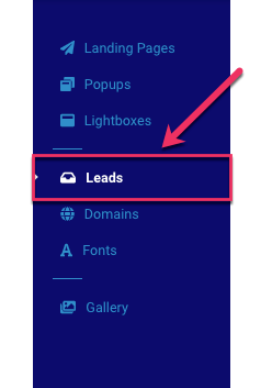
Here, you’ll find a full list of leads gathered from your landing pages and popups. A highlighted lead means that it is, as yet, unread and, you can click onto ‘Details’ to view the lead and delete if you wish (be careful with this as deletion is irreversible).
You can also export your leads to a CSV file using the ‘Export All’ button
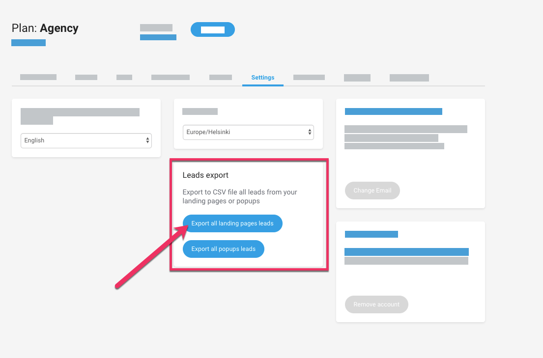
You’ll see that each landing page or pop up on your dashboard has its very own leads tab for easy and convenient viewing. Simply click onto the lead tab to view, edit, export or delete.
To Landingi or not to Landingi
Landingi is one of our favourite tools for creating landing pages for lead generation and, I’ve taken you through some of the features and the process of creating a landing page. Now, let’s delve into the pros and cons of this tool:
To Landingi
The price is right – Landingi starts at an affordable $29 per month for which you get access to some pretty great features.
User friendly – You don’t need any super special skills to get started with Landingi and, site navigation is sensible and straight forward.
SEO specific – Many of Landingi’s 200 templates are goal and industry-specific; which means that you can always find one which is appropriate to your business.
The knowledge – The Landingi website features lots of really useful tips, tutorials and a handy knowledge base to stop you coming unstuck when using the tool.
Not To Landingi
The need for speed – As great as Landingi is, it’s publishing speed leaves a little to be desired. Although this isn’t a massive issue, it can be frustrating when you’re in a hurry.
Support system – If you’re after super-responsive support, you may end up disappointed unless you choose Landingi’s more expensive packages which feature Premium Support. Whilst the site boasts 12-hour support in both English and Polish, waiting times are long and the support isn’t always comprehensive.
Branding – Landingi does allow for unbranded emails but, at the moment, you can only get your hands on these with the more pricey packages.
Conclusion
If you’re a techy-whizz and are used to doing lots of clever things online then you may feel that Landingi’s offering isn’t quite at the level of sophistication that you’re after. If, however, you’re simply looking for an easy to use, professional-looking landing page for lead generation, Landingi is quite possibly the one for you. The builder and drag and drop editor is a joy to use. With very little effort, it’s possible to create a great looking page which can very much help to attract and convert those all-important leads
Why WooCommerce is the Best Choice for Your Online Store?
WooCommerce stands out as a top option for anyone looking to build an online store. This platform…
0 Comments8 Minutes
How to Use AI-Powered SEO Tools for WordPress eCommerce
SEO is a critical factor in the success of any e-commerce WordPress store. As competition…
0 Comments11 Minutes
Why Short-Form Videos Are the Future of Content Marketing
Your Instagram customers spend over 50% of their time watching short-form videos and reels. Rather…
0 Comments12 Minutes
The Role of Digital Marketing in Business Growth
Online marketing touches every aspect of a business, whether it is initiating the idea or for an…
0 Comments3 Minutes
AI Meets Authenticity: Balancing Automation and Human Touch in Content Marketing
Is your brand starting to sound like a robot? In a world where algorithms write faster than any…
0 Comments8 Minutes
Essential Tools for Enhancing Web Design and UX Hosting
Have you ever visited a website that felt slow, clunky, or confusing? A website that is poorly…
0 Comments11 Minutes
How a Mini Cart Transformed My Store’s Shopping Experience
Okay, real talk—running an online store is hard. You think you’ve got everything figured out, you…
0 Comments9 Minutes
Balancing Your Security Initiatives With Industry Compliance Requirements
Managing a business today comes with a number of daily battles that need to be fought. Resources…
0 Comments11 Minutes






Comments are closed.