How to Optimize UX Design for Your Ecommerce Store
When thinking of your e-commerce store design, put yourself in the shoes of the end-user. What are some of the things you would be looking out for? The utility would probably be one of the critical factors. You want a platform that is easy to use and helps you make choices quickly.
Usability is also critical. How long would you stay on a website that is not user-friendly? You may even leave without completing the purchase because of a complicated checkout process.
Finally, there must be something that grabs your attention from the get-go. You will find that you gravitate more towards those that are aesthetically pleasing.
We may have summarized what you need to do to optimize the UX design for your e-commerce store. However, please allow us to share a more in-depth explanation of some of the salient points.
Optimizing Your E-Commerce Store UX Design
If you sign up for an expert training course in digital marketing, one word that will come up a lot is user experience or UX.
UX refers to any experience a visitor will have when they visit your online store. It has an emotional component because it evokes particular feelings. Such could include things like satisfaction, frustration, happiness, and ease.
The reality is a good user experience will keep people on your platform. In return, you achieve high conversion rates. You will also see a significant rise in purchase frequency. Most importantly, retention rates will improve significantly.
So, what do you need to do to optimize your UX design?
- It Starts With a Responsive Website Design
Many things go towards a responsive website design. They include:-
- Ability to Adapt To All Devices
We live in a digital world. Everything we do- work, school, socialization, entertainment, etc.- has been defined by digital technologies and the internet. The smartphone is a big reason why this has happened. The smartphone has put the internet and all its might within arms reach at all times. According to the research, three-quarters of all Americans own a smartphone, which means near all of us have one. Overall, 96 percent of Americans have access to a smartphone.
Check that your website does not lose some functionality depending on the screen size. Mobile optimization is critical because a large percentage of internet traffic comes from such devices. For the best UX, design for mobile and then optimize for desktop. Make sure everything works on it, including links and relevant buttons. It should adjust accordingly depending on the screen size.
A good UX design, for example, includes rotation and content repositioning. Images and font sizes may also change depending on the size of the screen.
- Support for All Browsers
You do not have a say about the browser your audiences use. Neither should you restrict them to a particular one. Ensure a fantastic UX on all browsers. You need visibility on the different search engines. It helps create greater brand awareness resulting in more organic traffic.
- Fast Loading Speeds
Choose the right web host provider. They should be able to give you sufficient bandwidth to handle any amount of traffic. Make sure you optimize images to reduce file sizes. Heavy images will consume a lot of space and may impact loading speeds. Caching can help reduce redirects, thus faster page loading.
- Ease of Navigation
When optimizing for UX, aim for ease of use and responsive pages. A customer will not spend time on a website that seems more like a labyrinth than an online store. Think about every time you have to shop at the supermarket. You like that the aisles have signs all over to guide you. The shop assistants are also around if you need help. The same should apply to your e-commerce store.
It should be intuitive and allows for easy movement within. The menu should be simple and straightforward. Utilize dropdowns for categories. Have subtle visual guides to direct the visitor. Also, invest in technologies like chatbots to help with customer service. Such operate 24/7 and provide prompt responses to any queries.
- Collect and Utilize Customer Feedback
Before you start investing in the latest automation, gauge customer feedback. It helps to take the simple route to get information. The best source of information you will get is directly from the customers. Feedback forms and surveys are critical in UX optimization. But it is not as simple as uploading a form and hoping for feedback.
Pay attention to the design; no one has time to fill lengthy forms that ask for too much information. Get the customers interested by offering incentives or rewards for participation.
But, collecting the information is all good. The next step is to ensure that you respond to any concerns appropriately. Customers like to know that you care about them and not only their money.
- Simplify the Checkout Process
You may have taken the time to ensure a pleasant shopping experience. Products are in clear to see categories. You have invested in high-resolution images. The page loading speeds are fast, and the website is responsive.
But, you did not pay that much attention to the checkout. When the customer gets to the final stage, it becomes more like an exam than a pleasant shopping experience.

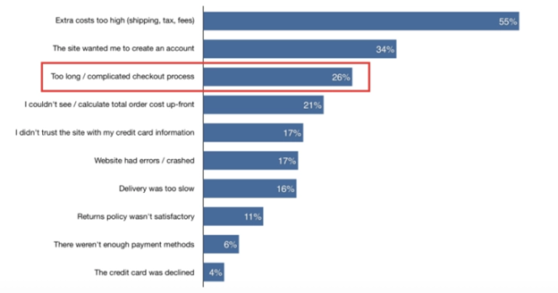
26% of customers will abandon carts due to complicated checkout processes. Yet, by optimizing the checkout design, you can get up to a 35.26% increase in conversions.
You can improve your checkout design with the following tips.
- Avoid too many distractions on the page. A call to Action button is critical. But, you can do without other elements. Links to the contact page, about us, newsletter signup are not necessary here.
- Consider having everything on one page. Also, avoid having too many steps that the customer must complete to make a purchase
- The checkout should also be seamless on mobile devices. Research shows that 79% of smartphone owners have made an online purchase using their phones within the last six months.
- Have relevant trust signals on the page as a show of credibility and trustworthiness
- Provide customers with multiple payment options
- Be upfront about pricing. Extra or hidden costs are the number one cause of abandoned carts.
- Give the option of guest checkout. Customers do not need to create an account if they don’t wish to. This is the number two reason for abandoned carts.
Final Thoughts
An e-commerce UX design should focus on the customer. You want to do everything to increase interaction and engagement. Fast loading pages are critical. The online customer wants speed, accessibility, and convenience.
Mobile optimization, ease of navigation, and a seamless checkout process are also critical.
How to Use AI-Powered SEO Tools for WordPress eCommerce
SEO is a critical factor in the success of any e-commerce WordPress store. As competition…
0 Comments11 Minutes
Why Short-Form Videos Are the Future of Content Marketing
Your Instagram customers spend over 50% of their time watching short-form videos and reels. Rather…
0 Comments12 Minutes
The Role of Digital Marketing in Business Growth
Online marketing touches every aspect of a business, whether it is initiating the idea or for an…
0 Comments3 Minutes
AI Meets Authenticity: Balancing Automation and Human Touch in Content Marketing
Is your brand starting to sound like a robot? In a world where algorithms write faster than any…
0 Comments8 Minutes
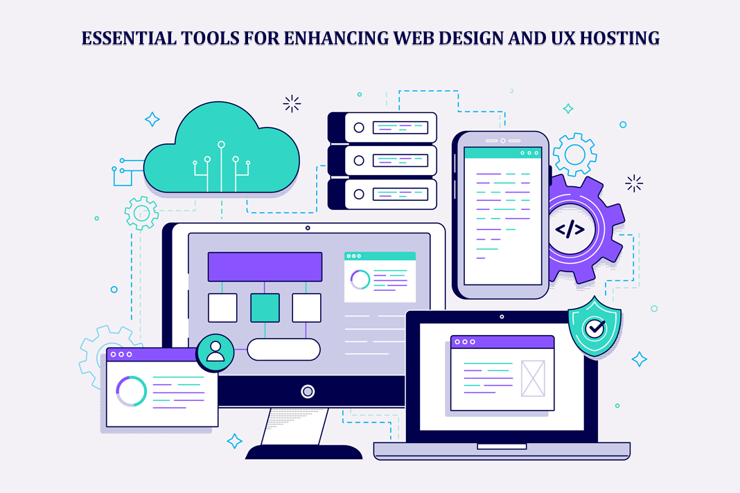
Essential Tools for Enhancing Web Design and UX Hosting
Have you ever visited a website that felt slow, clunky, or confusing? A website that is poorly…
0 Comments11 Minutes
How a Mini Cart Transformed My Store’s Shopping Experience
Okay, real talk—running an online store is hard. You think you’ve got everything figured out, you…
0 Comments9 Minutes
Balancing Your Security Initiatives With Industry Compliance Requirements
Managing a business today comes with a number of daily battles that need to be fought. Resources…
0 Comments11 Minutes
Best plugins to enhance the customer shopping experience
Customer experience is a key part of every online store. A good experience helps customers find…
0 Comments7 Minutes


