How To Make Your eCommerce Website More Attractive
Did you know that 94% of online shoppers’ first impression of an eCommerce brand is related to design?
Quick Links
And we all know first impressions play a significant role in a shopper’s buying decision.
An estimated 12–24 million online shops currently operate worldwide, and this figure is rising rapidly. A staggering number of 119.9 billion visits to online stores occurred in 2021, and by this year, it is anticipated that sales made via eCommerce will have reached 5.5 trillion!
If you are planning to start an online store, these numbers must look pretty enticing, right?
However, not even a million of those eCommerce stores can earn more than a thousand dollars a year. In a market saturated with seemingly identical products, cutthroat competition, and empty promises, launching a new online store is no easy task.
It requires meticulous planning, great design and content, creative marketing ideas, and a sustainable implementation strategy to make a store successful.
And suppose your eCommerce website/product pages fail to grab the attention of your target audience. In that case, all your hard work coming up with new ideas, developing cutting-edge concepts, and effective marketing strategies will be for naught.
Therefore, it is imperative to make eCommerce website more attractive. In this article, we will discuss why you need to make an attractive eCommerce website and find out ways to make your website attractive.
Let’s get started.
Why do you need to make attractive eCommerce websites?
Let’s quickly check some stats to find out why you need to make an attractive eCommerce website.
- More than half (59%) of online users would rather spend their time on aesthetically pleasing websites than those with a less polished design.
- Design accounts for 94% of users’ initial perceptions of a website.
- The design of a website is cited by approximately half of all internet users as an important consideration when making a judgment about a company’s product or service.
- Web design is the top reason for low conversion rates.
- 38% of people will leave your eCommerce website if they find the layout unattractive.
Therefore, you must emphasize your eCommerce store design if you want to grab the attention of your customers, earn their trust and increase conversions.
Now let’s find out the ways to make your website attractive.
How to make eCommerce website more attractive
Here are some tips to make your website attractive.
High-quality images

75% of online shoppers rely on product images when making purchasing decisions. Nobody is going to buy something they haven’t seen first. High-quality images of your products are crucial if you want to convince customers to make a purchase.
Investing in professional product photography and providing photos of the product from a variety of angles can do wonders for gaining your customers’ trust. Customers are more likely to buy when they have faith in the legitimacy of the product.
Your conversion rate will suffer if customers can’t see the product they want to buy on your site or if the image quality is poor. It is in your best interest to stock your e-commerce website with a large number of high-quality images of the products you are offering for sale.
Keep it simple

In a survey, 84% of web designers cited cluttered web design as the most typical error made by local businesses.
It’s best to keep things as simple as possible when designing an online store site. Websites that stick to a minimalist design are universally praised for their superior aesthetics and credibility.
When you add more elements to a page, such as colors, banner ads, and pop-up windows, it becomes increasingly difficult to accomplish the primary goal of the website, which is to make a sale.
When designing an online store, you don’t need a lot of extra features that visitors might get distracted by. Don’t clutter up the design with unnecessary elements; instead, put all of your emphasis on closing the deal.
In simple words, in order to maximize sales, the design of your e-commerce website should be simplified.
Think like a website visitor
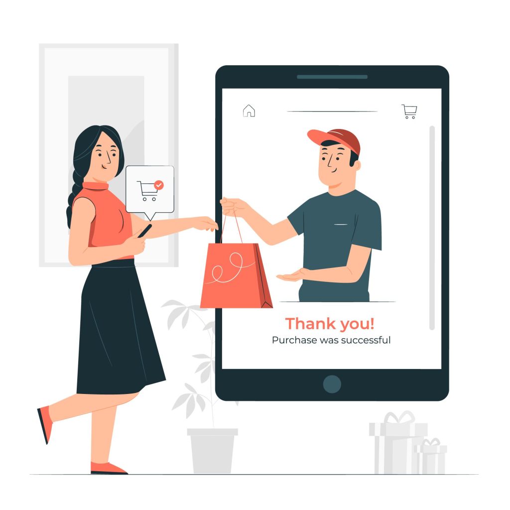
The quality of the user experience plays a pivotal role in influencing first-time visitors to become paying customers.
You need to put yourself in your customers’ shoes if you want your eCommerce website design to resonate with them. When you put yourself in the shoes of the customer, you will be able to anticipate what it is that they want from your online retail store and then design your website to cater to those desires.
Don’t know whether your website provides a good user experience or not?
You should get a second opinion by asking a friend for help or even hiring someone to check the user-friendliness of your website. Ask them to rate your website on how easily it can be used, how easy it is to navigate, how appealing it looks, and how satisfied it makes them feel overall.
Use the right colors
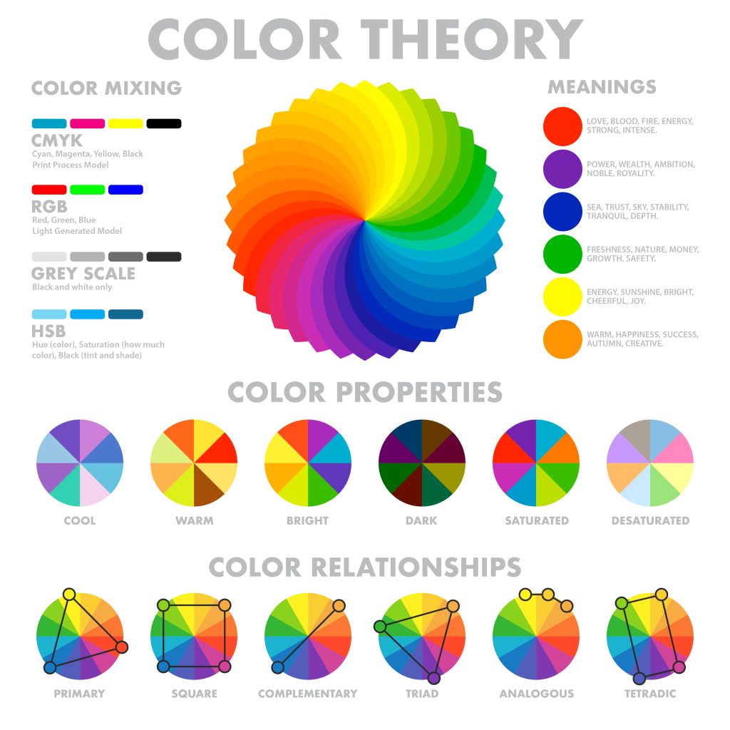
There is more to selecting the color scheme for your eCommerce website than simply picking out your favorite color and basing the design of your site on that color. The meaning behind your brand, as well as the type of customer you intend to attract, should guide the selection of both the color palette and the background colors.
Color is an extremely powerful tool, and if you are able to gain an understanding of the psychology that underpins color, you will be able to use that knowledge to your advantage and, in the process, drive significant sales.
For example, the color blue increases the feeling of trust, and red inspires the feeling of excitement and passion. On the other hand, the black shades represent luxury and elegance.
Easy navigation

Clumsy product pages are the fastest way to lose a customer. Your customers will quickly leave your website for a competitor’s if they have to navigate through ten different menus before they find the product they’re looking for.
Create simple navigation structures for your product sub-categories and individual product pages. Make it simple for customers to find what they’re looking for and to refine their results by selecting specific criteria like color, size, and product type.
Store visitors are more likely to make a purchase if they can quickly and easily locate the products they need within your categorical framework.
Make your content scannable
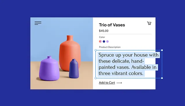
Source: Wix
According to studies, most people only read about 20% of the text on a webpage. Therefore, make your content easy to scan so that you can get your point across and increase conversions even if readers don’t read every word.
If you want your content to be read, whether it’s a product description, a blog post, or an “about us” page, you should make it scannable, which means breaking up your content into sections. Keep your sentences and paragraphs brief, emphasize necessary details by bolding them, and break up long text passages with bulleted lists.
Content that is easy to scan increases the likelihood that your audience will absorb your key messaging, which in turn increases the likelihood that you will make a sale.
Mobile responsive design
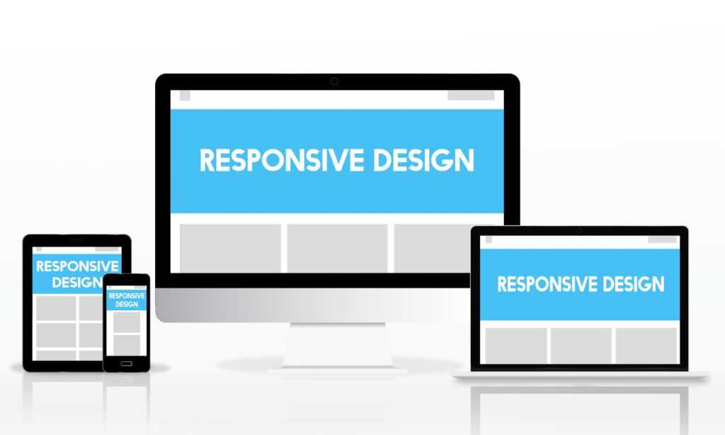
- 62% of smartphone owners have made a purchase online directly from their handset in the past 6 months.
- Customers are 67% more likely to make a purchase on a mobile-friendly website.
- 50% of smartphone users prefer to use a company’s or brand’s mobile site over downloading an app when they shop or browse on a mobile device.
Therefore, you must have a responsive eCommerce website that is accessible through any type of device and any screen size. To put it simply, all devices, from desktops and laptops to tablets and smartphones, must be able to properly display your website.
Include social proof/reviews/testimonial

According to research, 73% of online shoppers check reviews before making a purchase.
Make sure that the positive feedback you’ve received from your current customers is displayed prominently on your e-commerce site. You should add a star rating system so customers can rate their purchases, and you can collect as many 5-star reviews as you can.
Put in a section for customer reviews, where they can upload photos and leave comments about their positive experiences. Involve your customers by having them write positive product reviews that you can post on your blog.
Reviews and testimonials from satisfied customers can go a long way toward building trust with new customers and encouraging them to make a purchase on your site.
Add product videos

- 80% of business owners say that using video helped boost sales.
- Nearly nine in ten consumers (86%) say that brand videos have influenced their purchasing behavior.
- A majority of buyers (66%) say they favor watching a video rather than reading text when researching a purchase.
Including a video in your product listings is a great way to show off your merchandise, explain how it works, and promote your business. It boosts visibility, motivates sales, and enriches the user experience.
Easy checkout process
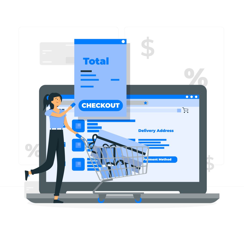
- 70% of shoppers agree that if the checkout process is quick, they are more likely to make a purchase.
- When customers encounter difficulties during the checkout process, 17% of them give up and abandon their purchases.
Customers will leave if the purchasing process is cumbersome. Making a purchase from you should be as easy, quick, and stress-free as possible if you want to attract customers.
Keep the design of your checkout page uncluttered, basic, and straightforward. Customers should be able to choose between registering with your site and checking out as guests.
Clarify everything from the information you need to process the purchase and where they need to enter it. Clearly state the shipping options available, how much they cost, and the steps to take if there is a problem with their order or if they need to return.
After a customer makes a purchase, they should be taken to a confirmation page.
If you have a WooCommerce store, you can quickly create a direct checkout link for your customers to jump directly to the checkout page. This will make your customer’s buying experience with your store smother and satisfactory.
Product recommendations/Displaying related products

The “related products” are the suggested purchases that show up near where the shopper is right now. When a customer visits one of your product pages, they will see a list of related or suggested products.
The related products section is a great place to highlight related products, whether they are upsell, cross-sells, new arrivals, hot sellers, or clearance items.
You can increase sales and click-through rates by including product recommendations on eCommerce pages. The products you suggest to your clients, however, must be suitable to their requirements and make sense in light of their buying habits.
Proper execution of this strategy can strengthen your bonds with customers, increase your AOV, and keep site visitors engaged for longer.
Consistent branding

While it’s important to follow best practices for eCommerce website design to increase traffic and sales, you also need your site to stand out from the crowd. Consistency in branding across your entire site will help it stand out.
Consistent use of brand colors and fonts across your site is essential. No one likes to open a web page and then be confused as to whether they have been redirected to the same or a different website.
If you keep your site’s menu and color scheme uniform, you come across as reliable and professional.
Wrap up
In order to attract more qualified leads and actual paying customers, having a website that is both attractive and easy to use is essential. Therefore, designing a website that looks professional and is fully responsive is a must. Failure to do so will reflect poorly on your website and, by extension, your brand.
Even if you promote your products primarily on price comparison engines, your customers will still land on your product pages when they decide to buy from you. So, you need to design your eCommerce website following our tips to make your website more attractive.
And when you have a professional website with appealing product pages, you can confidently list and promote your products in different marketplaces and price comparison sites from your WooCommerce admin panel with the help of this plugin.
Let us know in the comments if you have any questions or suggestions on the topic.
FAQ
What every eCommerce website should have?
The following are the top essential things every eCommerce website must have,
- User-friendly and aesthetic design
- Mobile responsiveness
- Easy to navigate
- Easy checkout process
- User reviews and ratings
- Personalization
- Helpful product information
- High-quality images
- Transparent terms and return policy
What makes a website bad?
These are the things the bad websites have in common,
- Cluttered layout
- Complex navigation
- Lack of color contrast
- Non-responsive design
- Inconsistent typefaces
- Complex product pages
- Low-resolution images
- Outdated design
How to Use AI-Powered SEO Tools for WordPress eCommerce
SEO is a critical factor in the success of any e-commerce WordPress store. As competition…
0 Comments11 Minutes
Why Short-Form Videos Are the Future of Content Marketing
Your Instagram customers spend over 50% of their time watching short-form videos and reels. Rather…
0 Comments12 Minutes
The Role of Digital Marketing in Business Growth
Online marketing touches every aspect of a business, whether it is initiating the idea or for an…
0 Comments3 Minutes
AI Meets Authenticity: Balancing Automation and Human Touch in Content Marketing
Is your brand starting to sound like a robot? In a world where algorithms write faster than any…
0 Comments8 Minutes
Essential Tools for Enhancing Web Design and UX Hosting
Have you ever visited a website that felt slow, clunky, or confusing? A website that is poorly…
0 Comments11 Minutes
How a Mini Cart Transformed My Store’s Shopping Experience
Okay, real talk—running an online store is hard. You think you’ve got everything figured out, you…
0 Comments9 Minutes
Balancing Your Security Initiatives With Industry Compliance Requirements
Managing a business today comes with a number of daily battles that need to be fought. Resources…
0 Comments11 Minutes
Best plugins to enhance the customer shopping experience
Customer experience is a key part of every online store. A good experience helps customers find…
0 Comments7 Minutes
