
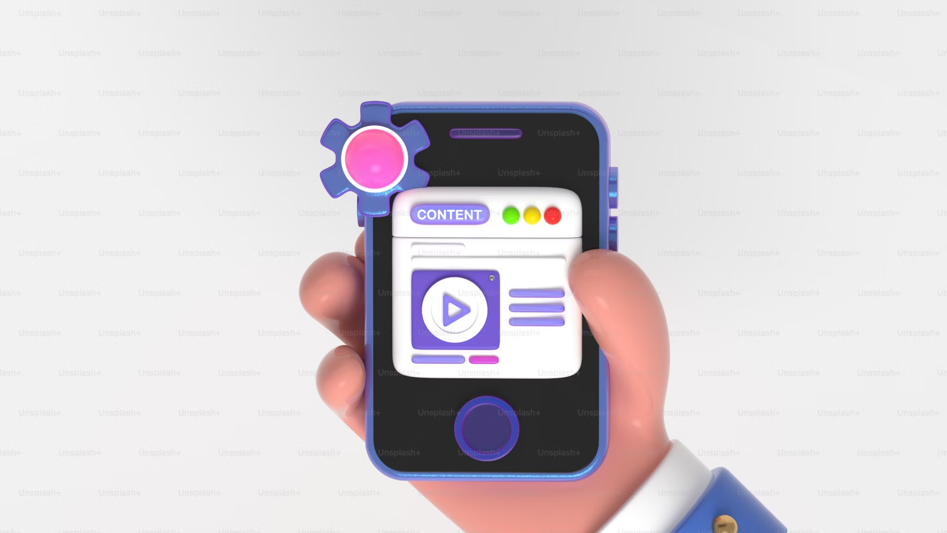
How To Improve Blog Readability
Keywords, meta descriptions, and titles get people to click on your links in the SERPs. However, it’s the user experience that makes them stay.
Quick Links
People don’t like sticking around websites that are buggy and hard to use. It doesn’t matter how good and informative your content is if people won’t read it in the first place.
Aside from basic site design musts like easy navigation, fast loading speeds, and optimized images, you also need to pay attention to the content itself. Your blog could still be keywords-optimized, fast, and smooth, and people will still find it hard to read and consume the content that’s in it.
So yes, seemingly small details such as white space, fonts, and text formatting can affect how users experience your website. After all, if it’s hurting your readers’ eyes or confusing them, then you haven’t optimized your site design to the fullest extent.
Let’s talk about text readability, why it’s essential, and how you can quickly improve it on your website.
Tip #1: Avoid Custom Fonts
Custom fonts are undeniably attractive. Some would even use it as part of their brand, like Disney. You can also use them as attractive headlines and spice up important sections of your site.
However, you should avoid using these custom fonts in every available text. Like I said, using them isn’t necessarily bad, but custom fonts can hamper readability in many ways.
Since the point of posting blogs (or any other SEO content) is to get site visitors to read and consume them, using unfamiliar fonts can affect people’s ability to read them. For example, squiggly lines, flourishes, and the strange width of certain letters can really throw off readers.
While some fonts might be comfortable for you personally, it’s not always a great idea to assume everyone else feels the same. If you look at a few sites and check on their content, you might notice that a lot of them are using the same font style or family. This is because some fonts are so widely used that people have grown familiar with and are comfortable reading with them.
If you go on Disney’s website, you’ll see that they’re using standard fonts more often than they use their signature one. Again, custom fonts can be used for branding, not as a go-to font for every text associated with your business.
Tip #2: Use White Space
White space is often also referred to as “negative space.” In the simplest definition, it is the spaces between elements of a page. An example of white space would be the spaces between the paragraphs of this post. Likewise, the space between the image and the text of this post is also considered white space.
Do note that white space doesn’t have to be white. For darker-themed websites, any space between elements—no matter its color—is considered white space.
So, what’s white space for?
White space is often used to reduce clutter and emphasize specific elements. Here are some examples of how they can be used:
- Example 1 (Reducing Clutter): having too many elements—like images, text, buttons, or graphics—can make a page look too packed and distracting. In the case of blog posts, giant walls of text make it hard to skim or read the content.
- Example 2 (Emphasis): Every page has a purpose, so if you’re cluttering your landing page with unnecessary images, links, and text, it might take focus away from the CTAs. Likewise, if there is a crucial phrase or paragraph in your blog post, you can emphasize it through the strategic use of white space.
A popular design trend right now is more laconic page designs. Having a lot of open spaces on your pages makes it look more professional and intentional. Additionally, pages with a lot of clutter and fully packed with elements are often associated with spam and clickbait.
Tip #3: Break Up Your Content
As I briefly mentioned in the last tip, large walls of text often make it hard for people to read or skim your content. For example, if you have a 1000-word article, keeping it in a long, winding paragraph can easily bore the reader.
So, section off your content. This makes reading and consuming it easier for your readers. Here are a few ways to break up large walls of text:
- Use Headings. Notice that this article uses headings to separate each tip. If this were just a post with long paragraphs, you wouldn’t know which tip starts and ends. It would also make it hard for a returning site visitor to remember which sections of the post discuss which.
- Additionally, this also allows people to find what they need. Sometimes, they just need a portion of your content, so adding headings will enable them to skim and skip to the section they need.
- Use Lists. Any portion of the content that can be put on a numbered list should be presented as such. Not only will this make a list easier to find, but it’ll also be easy to read compared to a string of phrases separated by commas.
- Use Bullet Points. Like the one we’re doing here, bullet points allow you separate ideas and themes. It’s easier to read, and the sections can help you manage the flow of the content.
- Using this post as an example, if I didn’t use bullet points here, this would be just a series of paragraphs that don’t denote which example starts and ends. Using bullet points makes it much easier for the reader to follow the flow of the ideas.
Bottom-line
If you post blogs and text-based content, you need to pay close attention to readability. You don’t just want to attract people through high SERP rankings and great keywords; you want them to stick around and explore your site.
Make sure your text (and all the other elements surrounding it) is pleasant to look at, easy to read, and easy to find. The more effortless content can be consumed, the faster and longer the information sticks.
Author’s Bio

JC Serrano is the founder of 1000Attorneys.com, one of the very few private enterprises certified to process lawyer referrals by the California State Bar. His marketing strategies have continuously evolved since 2005, incorporating ever-changing SEO strategies into lawyerleadmachine.com.

Why WooCommerce is the Best Choice for Your Online Store?
WooCommerce stands out as a top option for anyone looking to build an online store. This platform…
0 Comments8 Minutes

How to Use AI-Powered SEO Tools for WordPress eCommerce
SEO is a critical factor in the success of any e-commerce WordPress store. As competition…
0 Comments11 Minutes
Why Short-Form Videos Are the Future of Content Marketing
Your Instagram customers spend over 50% of their time watching short-form videos and reels. Rather…
0 Comments12 Minutes

The Role of Digital Marketing in Business Growth
Online marketing touches every aspect of a business, whether it is initiating the idea or for an…
0 Comments3 Minutes

AI Meets Authenticity: Balancing Automation and Human Touch in Content Marketing
Is your brand starting to sound like a robot? In a world where algorithms write faster than any…
0 Comments8 Minutes
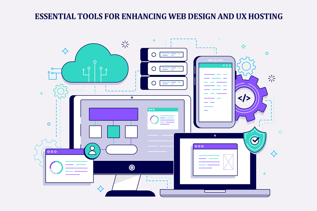
Essential Tools for Enhancing Web Design and UX Hosting
Have you ever visited a website that felt slow, clunky, or confusing? A website that is poorly…
0 Comments11 Minutes

How a Mini Cart Transformed My Store’s Shopping Experience
Okay, real talk—running an online store is hard. You think you’ve got everything figured out, you…
0 Comments9 Minutes

Balancing Your Security Initiatives With Industry Compliance Requirements
Managing a business today comes with a number of daily battles that need to be fought. Resources…
0 Comments11 Minutes