How to Communicate Your Value Proposition to Web Visitors
It’s easy to overestimate a website visitor’s appetite for learning about our products. We presume that if someone made the effort to come to our site, they’d also be willing to scroll through pages and pages of content just to find out exactly what we offer them.
Quick Links
At the same time, we also make assumptions about what visitors already know about us. We’re so close to our businesses – and the value they provide – that we forget there are people who’ve never even heard of us and what we do. These people often don’t know that products like ours exist or that they even have the problem that our business solves.
This complacent approach to communication can and will result in lost opportunities.
No matter how invested a visitor is in solving a particular issue, if they don’t see a reason to stay on your site within eight seconds (or 28 words), you’re going to lose their business.
In this article, we’ll take a look at methods website owners can use to effectively communicate their value propositions in this ridiculously short space of time.
What Is a Value Proposition?
A value proposition is the reason someone should do business with you. Potential customers need this communicated to them clearly and instantaneously.
It’s also a statement that differentiates you from your competition.
Once someone has read through your value proposition, they need to be under no illusions about what you offer and why your offering is better for them than other options.
How to Communicate Your Value Proposition Clearly and Effectively
1. Keep It Simple
Use short sentences. Use simple words. Make statements. These three concepts are arguably the most concepts to bear in mind when you communicate about your company’s value proposition.
Visitors don’t want to unpack or interpret long sentences. They want to see a simple idea communicated to them in as few words as possible.
They also don’t want to wonder what a specific word or term means. Not everyone is as educated about your industry as you are. Avoid jargon and use words that everyone can relate to.
Tell your visitors what they want to know. Don’t ask them questions like “Wouldn’t it be great if…” Don’t expect them to draw conclusions here. This is a space for clarity, not ambiguity. You do not want your visitors to process complex thoughts when they read your value proposition.
For an example of a company that took this approach, look no further than Unbounce. The landing page builder’s main home page headline simply rotates between the text: “Convert more leads/sales/customers” above a 24-word description of their service.
2. Be Upfront About Benefits
There’s telling what your product does functionally, and then there’s telling what it does for your customers. Some value propositions are bolstered with reasonable, believable promises regarding what the product will mean for them.
These benefits are best expressed as specific outcomes you know your prospects want to see – benefits they will experience in their lives.
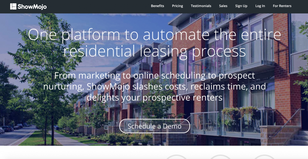
Take a look at ShowMojo, an automation platform for leasing agents.
Right after some pretty great descriptive content, the company says the magic words all potential customers want to hear: “ShowMojo slashes costs, reclaims time, and delights prospective renters.”

image source: web.showmojo.com
This is a company that knows their customers’ pain points, and they’re addressing them head-on on their value proposition.
That’s just excellent communication.
3. Use Functionality to Communicate
It’s not always going to be words that communicate your value proposition. Some websites that offer an online service may use components of their user interface for this purpose.
Button labels and field types are great at telling visitors what your service is all about. Often these are more effective than a line or two of text could ever be.
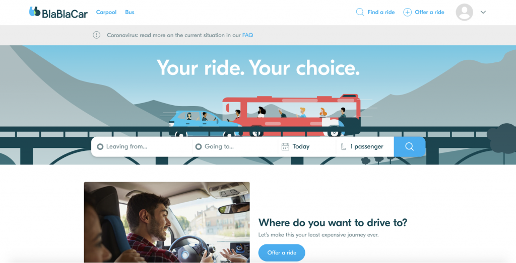
Take a look at BlaBlaCar’s home page for an excellent example of web functionality as a value proposition description.

image source: blablacar.co.uk
The site’s hero header contains text that’s catchy but not super descriptive: “Your ride. Your choice.” Sure, that gives me some idea what their service is about, but the magic happens just below this text.
To input fields labeled “Leaving from” and “Going to” respectively, alongside a date-picker, tell me all I need to know. This company will get me from one location to another on a date of my choosing.
4. Show Your Product in Action
If a picture paints a thousand words, a simple animated explainer paints a gazillion words.
Obviously, it may not be a great strategy to omit words entirely. But supplementing a brief description with an animated illustration of your software product’s user interface is an incredibly powerful way to create clarity and be super memorable.
Take a look at SaaS company Compstak’s home page for an example of how to combine text and animated content.
Next to an exceptionally effective headline reading: “Nationwide Commercial Real Estate Data. One Platform,” the company has placed a looped animation of their product’s key features.
It’s an ingenious way to supplement value proposition text that’s already incredibly effective. Personally, I’m a huge fan of this approach if you’re selling a service that many potential customers can’t quite build a mental context or use-case for.
5. Speak Your Audience’s Language
Despite what I said earlier about being upfront and using simple statements, there is definitely space for creative language use in a value proposition, provided it doesn’t detract from your message.
Getting cute with words and sentences is especially effective if it resonates with your target audience. Most online businesses have a very clear idea of their typical buyer personas. In fact, most marketing teams don’t develop a strategy without understanding exactly who they’re selling to.
If you feel that your customers will respond well to something subtly different, something that isn’t your average sterile business-speak, then, by all means, give it to them!
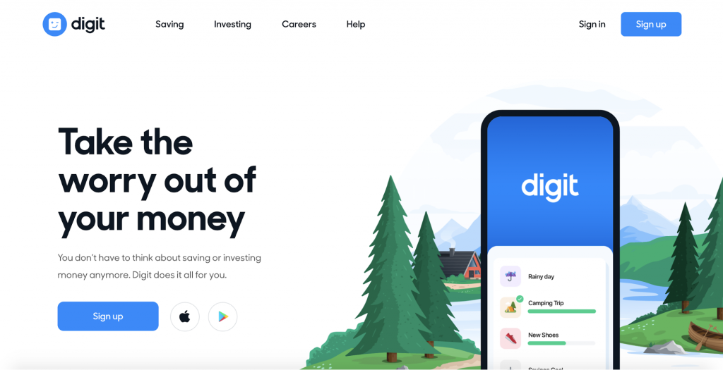
Digit nails this approach with their super simple, creative value proposition. The main headline of their home page reads: “Take the worry out of your money.”

image source: digit.co
It doesn’t get more to the point than that. Seven words, a bit of a rhyme, and a clear indicator of who they’re selling their service to – people who don’t know much about finance and don’t take the topic too seriously.
Some Final Thoughts
The main reason for making changes to your homepage’s value proposition is so that you’ll see improved engagement with your website.
If you get better at “hooking” your visitors with content, you’ll be able to see this in their behavior.
After implementing a new value proposition, has your bounce-rate decreased? How about the average length of time a visitor spends on your site, or the average number of pages viewed by each visitor? Have these metrics improved?
Before making changes to your homepage, it’s critical that you have a good sample size of these metrics. If you don’t have this, how will you know if your changes helped or harmed your site’s ability to sell your service?
So, before you rush out and make wholesale changes to your site, be sure that you’ve got Google Analytics set up. The last thing you want is to guess whether a new value proposition is effective or not. Acknowledge the importance of measuring the outcome of changes to your site.
Why WooCommerce is the Best Choice for Your Online Store?
WooCommerce stands out as a top option for anyone looking to build an online store. This platform…
0 Comments8 Minutes
How to Use AI-Powered SEO Tools for WordPress eCommerce
SEO is a critical factor in the success of any e-commerce WordPress store. As competition…
0 Comments11 Minutes
Why Short-Form Videos Are the Future of Content Marketing
Your Instagram customers spend over 50% of their time watching short-form videos and reels. Rather…
0 Comments12 Minutes
The Role of Digital Marketing in Business Growth
Online marketing touches every aspect of a business, whether it is initiating the idea or for an…
0 Comments3 Minutes
AI Meets Authenticity: Balancing Automation and Human Touch in Content Marketing
Is your brand starting to sound like a robot? In a world where algorithms write faster than any…
0 Comments8 Minutes
Essential Tools for Enhancing Web Design and UX Hosting
Have you ever visited a website that felt slow, clunky, or confusing? A website that is poorly…
0 Comments11 Minutes
How a Mini Cart Transformed My Store’s Shopping Experience
Okay, real talk—running an online store is hard. You think you’ve got everything figured out, you…
0 Comments9 Minutes
Balancing Your Security Initiatives With Industry Compliance Requirements
Managing a business today comes with a number of daily battles that need to be fought. Resources…
0 Comments11 Minutes


