Bubble Elements in Websites Makes Your Website More Attractive
As design tools and materials become more and more abundant, designers begin to use elements such as bubbles, spots and liquids more flexibly in Web pages. So how do we use these elements in Web graphic design? Today, I’m going to share some useful tips with 9 examples of web pages.
Quick Links
Creating visual focus with bubble elements
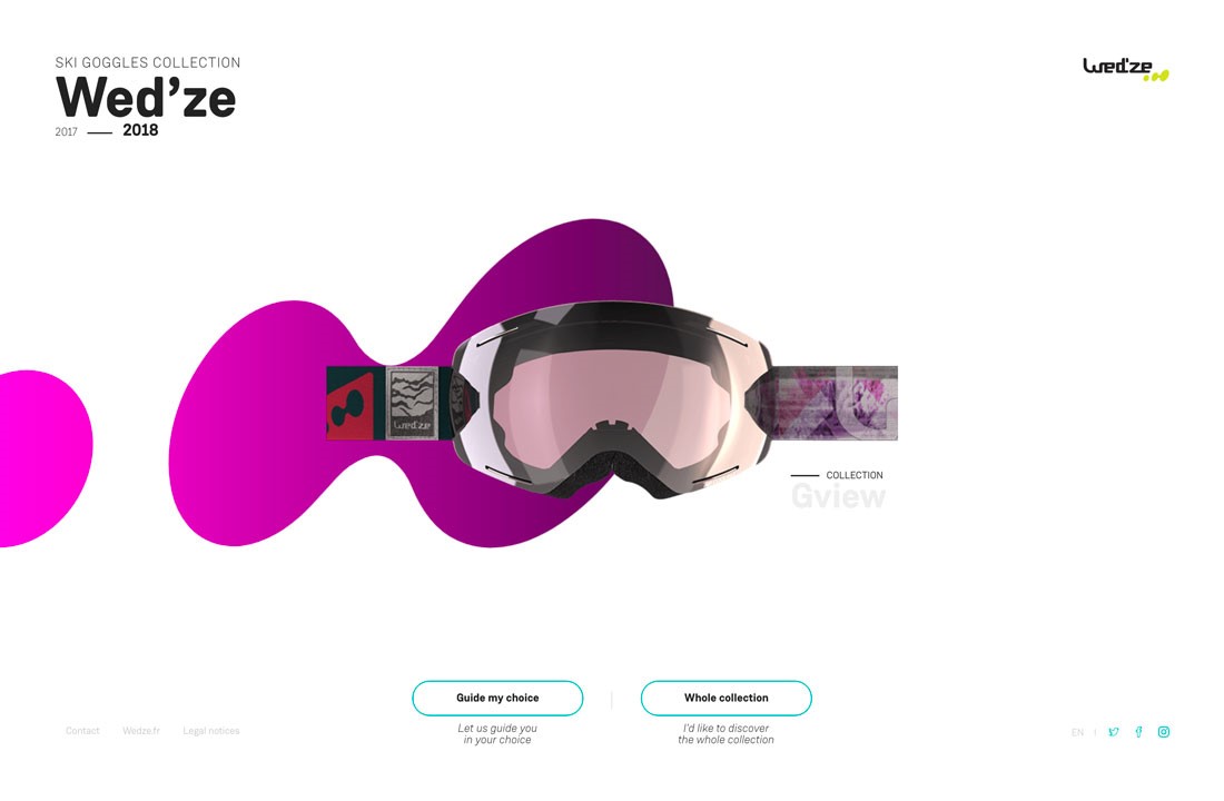
In the context of simplicity and refreshment, the use of bright colours and natural bubbles to create visual focus, bubbles and image materials need to be highlighted together, and then can effectively attract users’ attention to key elements, ultimately to enhance the conversion rate.
Driving interaction with concise linear bubble animation
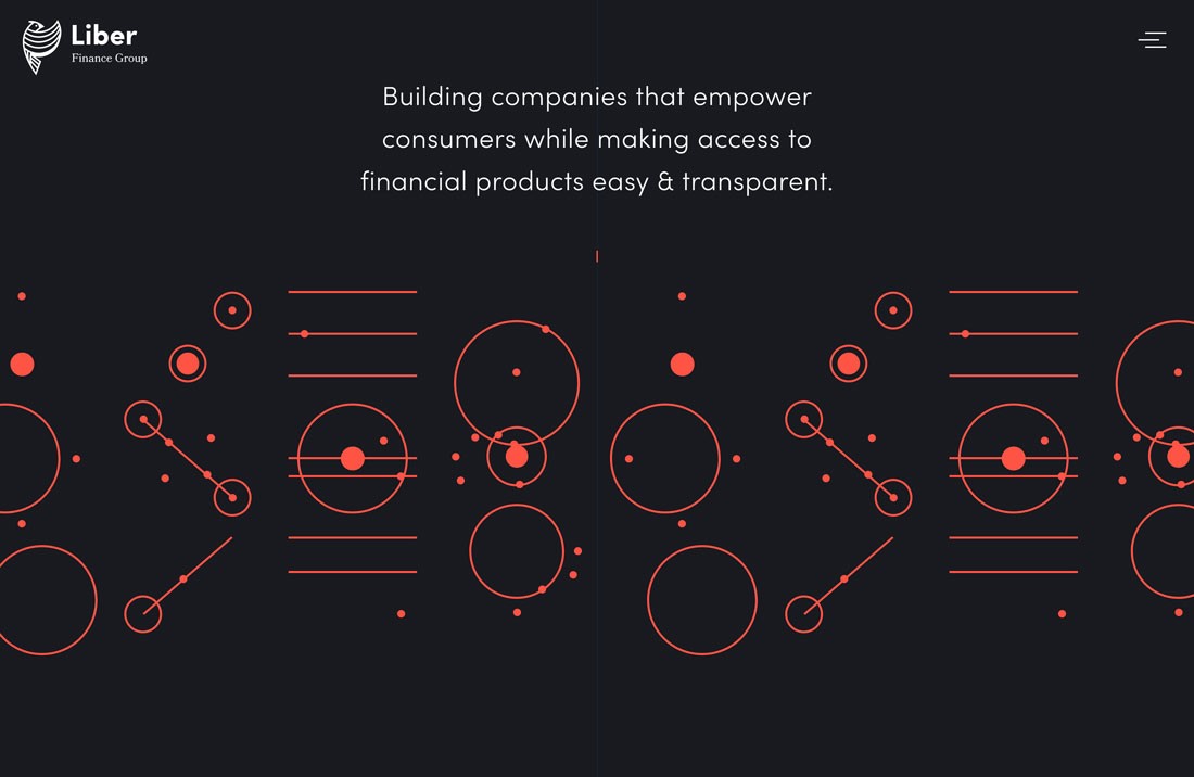
It is a relatively low-cost method to construct animation by using simple bubble elements with geometric features. The animation tends to change as users scroll through pages. This design can also enhance the participation of web pages by prompting users to scroll and browse down to see more content.
Strengthen brand impression with irregular graffiti spots
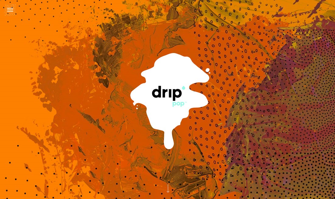
Colourful background and strong contrast of graffiti spots are also a strategy to guide vision, but more importantly, it is through this style to create a wild and rough brand temperament. It helps users get to the unique atmosphere and spirit of the brand more quickly and directly.
Using liquid colour blocks to convey fashion
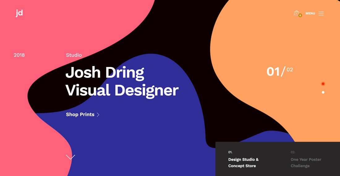
Flowing patches are similar to spotted elements and are also full of uncontrolled natural mental aura. Contrast-filled colour matching gives these liquid colour lumps fashionable temperament, thus creating a unique visual experience.
Using Gradient Bubbles to Create Stereoscopic Sense
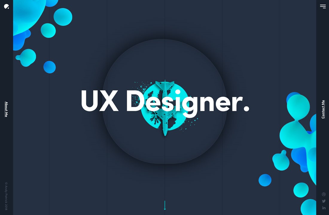
Delicate gradients often give elements a certain 3-D stereo feel. Variable bubble elements with gradient colour will seem to have a depth of field and level, making the page more stereoscopic. Of course, if you start using animation software to model and render to generate animation, it will be more in place.
Using Flattened Bubble Element to Render Modern Sense
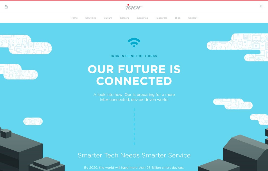
Flat design is still the mainstream at present. In many pure flat web pages, bubble elements can play a very good role in embellishing. This makes the background no longer monotonous, geometric bubble edges and refreshing colours, can give the page a good sense, clean and contemporary sense.
Make a Unique Impression as a Carrier of Pictures
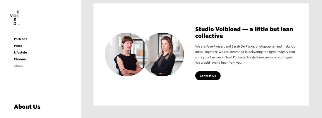
The bubbles themselves are unconventional geometric elements, so they are less likely to appear than the usual circles, rectangles and triangles. Therefore, when they are used as carriers of pictures, this unique visual experience is easier to impress users.
Create fun with bubble animation
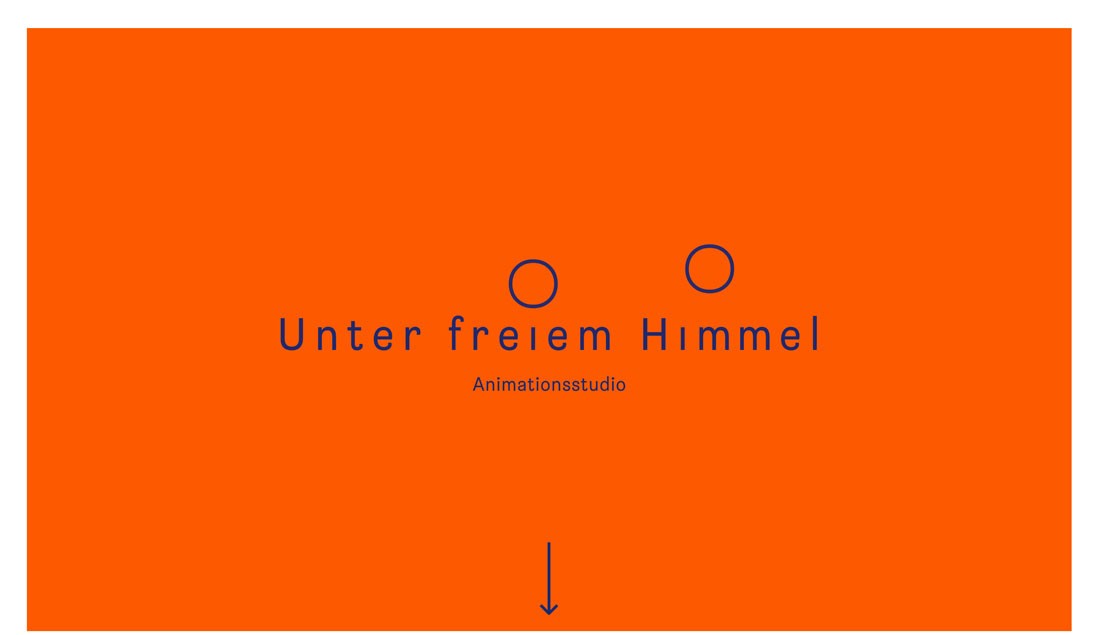
Bubble animation can have a cool sense of technology, or it can be soft and cute and full of fun, depending on how the animation designers do. The use of interesting bubble animation in the page can make the page more intimate, so that users will smile when loading and transferring, and remember your design.
Using Bubble Animation to Build Brand LOGO
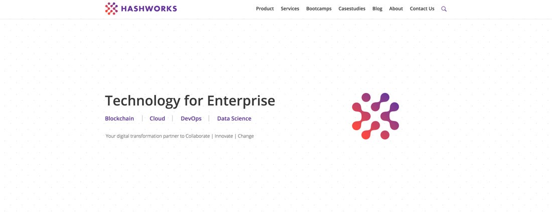
This is also a clever way to attract users and promote the brand at the same time, of course, if your brand LOGO is suitable to use such a way of expression. Bubble animation is full of vitality, which can eventually become the advantages of the brand while leaving users with more profound memories.
Conclusion
Organic sense is a hot design direction in recent two years, but its presentation is not so specific. Elements such as spots and bubbles are the most commonly used way to present organic sense. With the popularity of new design tools, designers began to use these elements to create organic design.
Why WooCommerce is the Best Choice for Your Online Store?
WooCommerce stands out as a top option for anyone looking to build an online store. This platform…
0 Comments8 Minutes
How to Use AI-Powered SEO Tools for WordPress eCommerce
SEO is a critical factor in the success of any e-commerce WordPress store. As competition…
0 Comments11 Minutes
Why Short-Form Videos Are the Future of Content Marketing
Your Instagram customers spend over 50% of their time watching short-form videos and reels. Rather…
0 Comments12 Minutes
The Role of Digital Marketing in Business Growth
Online marketing touches every aspect of a business, whether it is initiating the idea or for an…
0 Comments3 Minutes
AI Meets Authenticity: Balancing Automation and Human Touch in Content Marketing
Is your brand starting to sound like a robot? In a world where algorithms write faster than any…
0 Comments8 Minutes
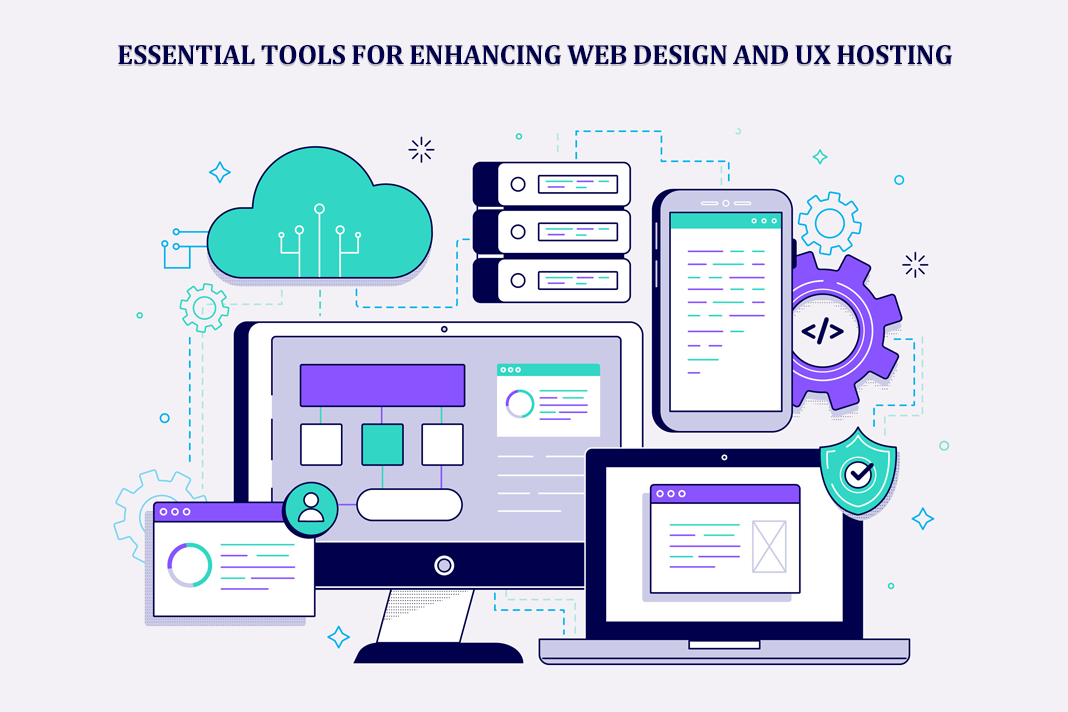
Essential Tools for Enhancing Web Design and UX Hosting
Have you ever visited a website that felt slow, clunky, or confusing? A website that is poorly…
0 Comments11 Minutes
How a Mini Cart Transformed My Store’s Shopping Experience
Okay, real talk—running an online store is hard. You think you’ve got everything figured out, you…
0 Comments9 Minutes
Balancing Your Security Initiatives With Industry Compliance Requirements
Managing a business today comes with a number of daily battles that need to be fought. Resources…
0 Comments11 Minutes

