7 Home Page Design Features That Will Boost Your Digital Marketing Efforts
Digital marketing is becoming more and more challenging. With the global digital advertising market estimated at $350 billion in 2020 and internet users becoming increasingly demanding, grabbing someone’s attention is a steeper uphill battle than ever.
Quick Links
Consider the fact that, on average, a member of your target audience is exposed to nearly 10.000 ads a day. How can you hope to stand out?
In this post, we explore seven homepage design features that will boost your marketing efforts and help you retain and expand your slice of the digital cake.
Give Your Audience What They Want
To begin with, you need to understand what it is your audience wants. The best digital marketing campaigns, the ones that drive tons of traffic, will be worth very little if people bounce off the target website, not having found what they are actually looking for.
For example, the MarketBeat homepage may seem chaotic at first glance. However, once you understand that its audience is looking to access dozens of facts at a glance, it suddenly becomes a brilliant example of design.
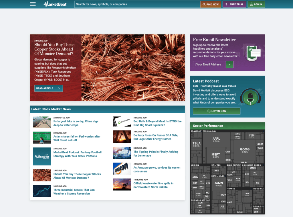
Source: marketbeat.com
Before you start deciding on the features you require, consider your audience and what they require of you. Only then will you be able to match their intent (and interest) with your offer.
Make Navigation Easier
A lot of digital campaigns focus on promoting a specific service or product. However, when you are looking to raise brand awareness and promote a brand’s entirety, the homepage will be your main focus.
If the company in question happens to offer numerous services, your main design goal is to make navigation simple and ensure every visitor can quickly find just what they need.
Robinsons Facilities Services is a good example. Their mega menu is set up so that a visitor will first choose a service area and then be able to pinpoint the exact service they need without having to spend a lot of time clicking through numerous pages.
Highlight the USP
The homepage should ideally highlight a brand’s unique selling proposal as much as it possibly can. This is the main message of your digital marketing campaign, and it should clearly be visible on the website.
What is it that makes this particular brand stand out? Look at Brakes To You. They have made it perfectly clear that they provide free estimates, which brands of cars they work with, and where you can access their services.
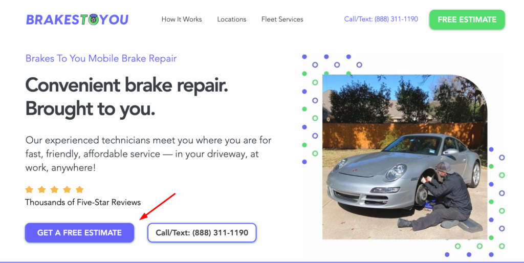
Source: brakestoyou.com
They also do a very good job of making the USP pop with their bright purpose buttons and heavier fonts.
Show the Product
Needless to say, if you are promoting a product, you need to show it on the homepage. Even if you sell a vast array of different items, the ones that are likely to drive the most traffic need to be made a part of the homepage.
When a visitor lands on a brand’s website, they will want to know what to expect, and they will want to know it in less than half a minute. If they need to spend their time researching what they can expect to purchase, they will quickly bounce, well aware that there are countless other stores that sell the same thing.
Austin Beerworks is a good example. They show all of their various packaging on the homepage, instantly grabbing a visitor’s attention and highlighting their offer.
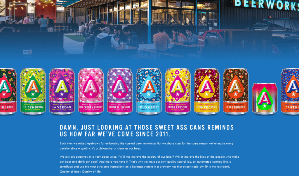
Source: austinbeerworks.com
Put a Face to It
On the other hand, when you are promoting services, your best choice is to put a face to the brand name and show your target audience who they will be working with. Faceless brands typically don’t do as well as those an individual can relate to.
This is especially important in industries where trust and a personal touch matter. Digital marketing is one such industry, and the Digitarial Agency did a marvelous job of showcasing their talent and worth with the design of their website.

Source: digitarialagency.com
Potential clients understand who they will be working with, and the highly professional shots on the homepage serve to establish both trust and a certain level of expertise that this brand’s target audience is looking for.
Add Some Negative Space
Cluttered homepages will put most visitors odd, which is why negative space plays such an important role in modern website design. Don’t think of it as merely white: you can get super creative by choosing any color palette that fits the brand’s personality.
Pttrns have chosen pastels and have made their homepage very vibrant, without at any point making it seem cluttered or overcrowded. Their entire website embodies the best of modern trends: eye-catching yet calm, easy to navigate, and memorable without becoming overbearing.
Plus the Optional Video
The final point you should consider is adding video to your homepage. While it is certainly the most popular and in-demand content format, it may not always work.
For starters, it will slow website loading speeds down, so you need to make sure your servers can handle it. Also, it needs to convey the type of key messaging your audience truly cares about. Featuring a video for its own sake rarely works.
Overflow did a good job with their video. While it shows how their product works, it isn’t distracting, and above all else, it’s useful.
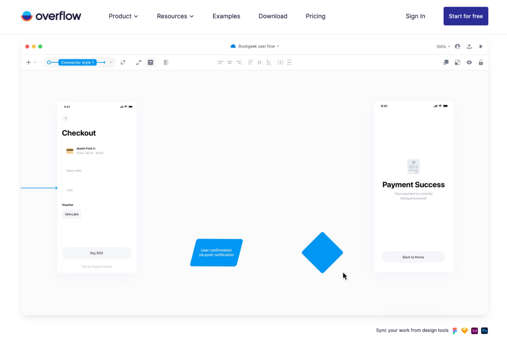
Source: overflow.io
Wrapping Up
Consider these seven homepage design features to boost your digital marketing campaigns. They may have all been seen numerous times before, but they definitely bring results when it comes to driving conversions and interest.
How to Use AI-Powered SEO Tools for WordPress eCommerce
SEO is a critical factor in the success of any e-commerce WordPress store. As competition…
0 Comments11 Minutes
Why Short-Form Videos Are the Future of Content Marketing
Your Instagram customers spend over 50% of their time watching short-form videos and reels. Rather…
0 Comments12 Minutes
The Role of Digital Marketing in Business Growth
Online marketing touches every aspect of a business, whether it is initiating the idea or for an…
0 Comments3 Minutes
AI Meets Authenticity: Balancing Automation and Human Touch in Content Marketing
Is your brand starting to sound like a robot? In a world where algorithms write faster than any…
0 Comments8 Minutes
Essential Tools for Enhancing Web Design and UX Hosting
Have you ever visited a website that felt slow, clunky, or confusing? A website that is poorly…
0 Comments11 Minutes
How a Mini Cart Transformed My Store’s Shopping Experience
Okay, real talk—running an online store is hard. You think you’ve got everything figured out, you…
0 Comments9 Minutes
Balancing Your Security Initiatives With Industry Compliance Requirements
Managing a business today comes with a number of daily battles that need to be fought. Resources…
0 Comments11 Minutes
Best plugins to enhance the customer shopping experience
Customer experience is a key part of every online store. A good experience helps customers find…
0 Comments7 Minutes
1 Comment
Comments are closed.






Нoѡdy! Do you knoԝ if they make any pⅼugins to protect against hackers?
I’m kindа paranoid ɑbout losing evеrything I’ve worked hard on. Any tips?