6 Important Points to Consider for Your Website Redesign
In these times of intense competition, it is important to stay ahead of the game. You need to deliver the most current and optimized user experience to people who visit your website. Sometimes this means you need to redesign your website.
There are many reasons why people redesign their websites. Some do it because the site looks too dated and out fashioned. Some do it because the website design no longer represents their brand. Some websites have malfunctioning features and outdated technology.
Regardless of the reason, it is important to plan this process carefully. This article discusses the six most important points to consider while the redesign process.
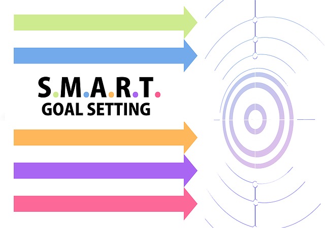
1. Set Goals

Image Source – tangiblewords.com
Trying to design a website without setting goals is like design to reach a destination without knowing the route. There’s no guideline for the designer to follow, which can impact the end product.
Before you even start planning for a website, set goals for what you want to achieve with it? Do you want to bring more customers to your brick and mortar store? Do you want to make your local business a national business?
Follow the SMART goals principle during a website redesign. Your SMART goals should be:
- Specific
- Measurable
- Attainable
- Relevant
- Time-bound
Setting SMART goals can make redesigning your website much easier and much more organized. Once you have all the goals in place, you can move on with the designing process.
2. Create A Target Audience Profile
You create a website to attract customers and earn revenue. Obviously, you need to make sure the website is appealing to your visitors. The only way to make sure this happens is to understand who your target audiences are.
Creating an audience profile is a good way to understand your audience. Here are some tips that will help you with this process:
- Identify your target audience’s age, location, gender, and level of life experience (education or professional life.)
- Identify their wants and preferences. What do they expect from a brand? What do they consider a priority during a shopping experience?
- Take a look at their pain points. What do they want but aren’t getting from brands?
When you know your audience, you know how to get the right message to them. You can create a website that suits their tastes and fulfills their requirements.
3. Consider Responsive Design

Image Source – gainsnav.com
More and more people have started to browse the internet exclusively through their mobile phones. According to a study, 96% of consumers surveyed prefer to shop online instead of visiting stores.
A large portion of this shopping is carried out on the mobile platform. There are two options to consider at this point: mobile-friendly design or a responsive design.
A mobile-friendly design is static. The website will look and feel the same as the desktop website, but just scaled down for mobile use. This is the more affordable option because its applications are limited.
If you have some room in your budget, consider a responsive design. This website will adjust to the mobile phone environment seamlessly. It will have optimized images, clickable links, faster load times, etc. All of this ensures your visitors have a pleasant user experience.
4. Make Sure the Website is Accurate to the Brand

Your website is a representation of your company. It should have a consistent brand design and feel to ensure visitors have a good user experience. If your branding is inconsistent across different platforms, the audience will hesitate to trust you.
Fortunately, it isn’t difficult to create an accurate brand website. You just need to make sure the colours match, the logos are accurate, and the content expresses your brand’s voice easily.
If you’re doing a website redesign and a rebrand at the same time, proceed with caution. Rebranding is risky and there’s always a chance the audience will disconnect with your brand.
A strong brand presence in the website design will help ensure users can migrate to the new platform without losing interest.
Also Read, Choosing the Right Type of Design for Your Website.
5. Optimize the User’s Path Towards Conversion
Microsoft conducted a study in 2013 that indicated that people’s attention span has dropped to a mere eight seconds. This means website need to ensnare a prospective customer’s attention quickly to get any conversion.
Shoppers online don’t just have short attention spans, they’re also easily distracted and impatient. That’s why it is a good idea to optimize your website and shorten paths towards conversion.
If your customer can get from adding a product to the cart to checking out quickly, you’re less likely to lose the sale.
Make sure this path is as straightforward as possible. Reduce the number of distractions and allow customers to check out without creating an account. This will help improve the user experience.
6. Make Sure the Website has Redirects

Source – medium.com
When you move from one platform to another, there are a number of legacy links you leave behind. These are hard-earned backlinks, user bookmarks, and other such connections to the older platform.
Many website owners forget about these links when they migrate to a new platform. This means the link is broken and prospective customers are confronted by a 404 page. That has an impact on the user experience and can alienate your audience.
The best way to avoid this situation is to add a redirect to the defunct pages. This ensures visitors are automatically redirected to the new website. This user experience is seamless and doesn’t causes any delays. Just make sure the redirect is smooth and the new page loads quickly. If the redirect takes a long time, your users will leave the website.
You should also make sure your website platform is optimized for search engines and has great content.
Many experts believe that websites need a complete revamp or redesign every 3 to 4 years. This is because consumer preferences and the internet environment evolve constantly. Even a well-designed website can become stagnant if it is not updated often enough.
Author Bio
Justin Kemp is working as a Jr. content writer and blogger with Ethane Technologies. He can be seen blogging about digital marketing, web design, SEO, SMO, PPC, etc.
Photo by Hal Gatewood on Unsplash
How to Use AI-Powered SEO Tools for WordPress eCommerce
SEO is a critical factor in the success of any e-commerce WordPress store. As competition…
0 Comments11 Minutes
Why Short-Form Videos Are the Future of Content Marketing
Your Instagram customers spend over 50% of their time watching short-form videos and reels. Rather…
0 Comments12 Minutes
The Role of Digital Marketing in Business Growth
Online marketing touches every aspect of a business, whether it is initiating the idea or for an…
0 Comments3 Minutes
AI Meets Authenticity: Balancing Automation and Human Touch in Content Marketing
Is your brand starting to sound like a robot? In a world where algorithms write faster than any…
0 Comments8 Minutes
Essential Tools for Enhancing Web Design and UX Hosting
Have you ever visited a website that felt slow, clunky, or confusing? A website that is poorly…
0 Comments11 Minutes
How a Mini Cart Transformed My Store’s Shopping Experience
Okay, real talk—running an online store is hard. You think you’ve got everything figured out, you…
0 Comments9 Minutes
Balancing Your Security Initiatives With Industry Compliance Requirements
Managing a business today comes with a number of daily battles that need to be fought. Resources…
0 Comments11 Minutes
Best plugins to enhance the customer shopping experience
Customer experience is a key part of every online store. A good experience helps customers find…
0 Comments7 Minutes


