5 Superior UI/UX Design Trends in eCommerce in 2021
Impeccable user experience, ease of navigation, mobile-friendliness, modern functionality, fast page opening times, and overall visual appeal are a couple of the design “must-haves” for every successful eCommerce store. These principles are even twice as relevant if you’re planning on building a progressive web application for your store (PWAs are a real thing in 2020-2021, by the way).
Quick Links
Let’s face it, having an outdated design, or not getting rid of some simply bad UX/UI choices only backpedal the store and lead to a loss of clients and business revenue. This is why on this page, I’d like to introduce you to the hottest design trends in eCommerce, give tips, and share my findings on real examples from renowned online retail websites. Let’s roll!
1. Rethink Your Product Galleries
Without any doubt, product presentation starts with images. This is exactly why designers have to give product galleries additional thought.
As of recent, the following layout has become somewhat conventional: large and high-quality product images are generally placed on the left side of the product page (occupying about ⅔ of the first visible screen) and the short product overview is placed on the right (taking up the remaining ⅓ part). This is the choice that’s used by most eCommerce sites now. An example of this can be seen in the screenshot below from the official Nike website.
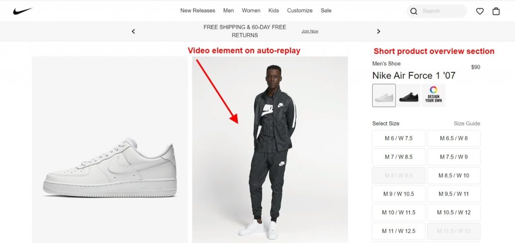
Screenshot taken from the official Nike website
The galleries themselves seem to share similarities as well. As such, pop-ups in which a user can take a closer look at a picture if clicking on it are now becoming replaced with more convenient image zooms that enlarge parts of the picture when being hovered on. Do I have to mention that all the pictures should be optimized so as to not slow down the site? Moreover, galleries become more and more often equipped with 3D configurator to provide 360 degree product view and even contain embedded video content that’s shown in auto-play mode..
But speaking of more or less unusual design trends, I really like the product gallery layout that’s used on the official Gucci website. The designers have used page space very rationally, splitting the gallery pictures to the right and to the left sections of the page, and placing the static product overview information in the center. When the user clicks on the arrows of the gallery, the pairs of pictures move from the left side of the screen to the right, or vice versa, like a carousel. This is a pretty neat and rather nonstandard choice that you can take note of.
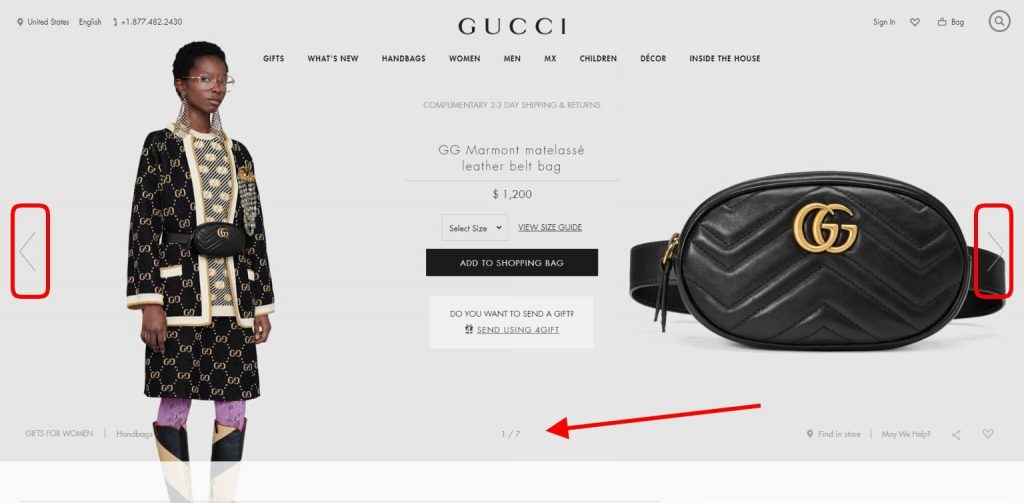
Screenshot from the official Gucci website
2. “Before-After” Product Features Visualization
In many cases, it’s very difficult to describe or present how a product can look like, what effect it gives, or how the features work when they’re in use. Of course, good-old videos or tutorials can be a way out here but what can they be replaced with? With interactive “before-after” features.
A wonderful example of such functionality is the “See it in action” block that’s available on the official Maybelline New York website. This tool gives the users an opportunity to see how a foundation changes the model’s look and complexion. The central element is dragged left or right, it shows the difference in the skin tone with and without the product.
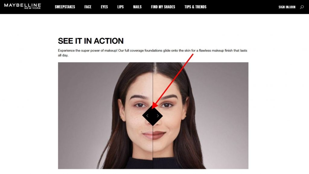
Screenshot taken from the official Maybelline New York website
To provide another example where this idea can be applied, the official Ray-Ban website has also designed a similar solution. The main point is to illustrate how a person will see the surroundings through the lenses of their glasses. The visual effect that the lens gives can also be compared by moving the central element of the block from side to side. Types of lenses are selected via a drop-list.
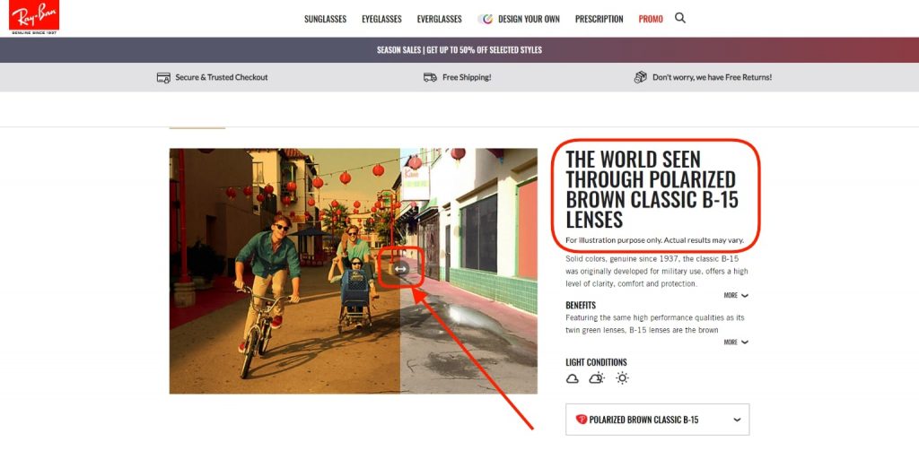
Screenshot taken from the official Ray-Ban website
3. Lasso Cross-Selling Blocks
Every eCommerce store ultimately wants to sell more. This gives a solid reason to have great upselling blocks that offer really good product options that’ll go well together with the currently browsed item. The actual choice of items is highly important, of course, but the way they’ll be pitched on the page matters no less. I’ll show what I mean by this on examples of such blocks that we can compare.
Below is such a “Pairs perfectly with” section on a product page on the official Victoria’s Secret website. Don’t get me wrong, I don’t lay any claims to the design choice that the team has opted for regarding this section. The design is clean, simple, and, most importantly, the section performs its cross-selling function for increasing average order sizes.
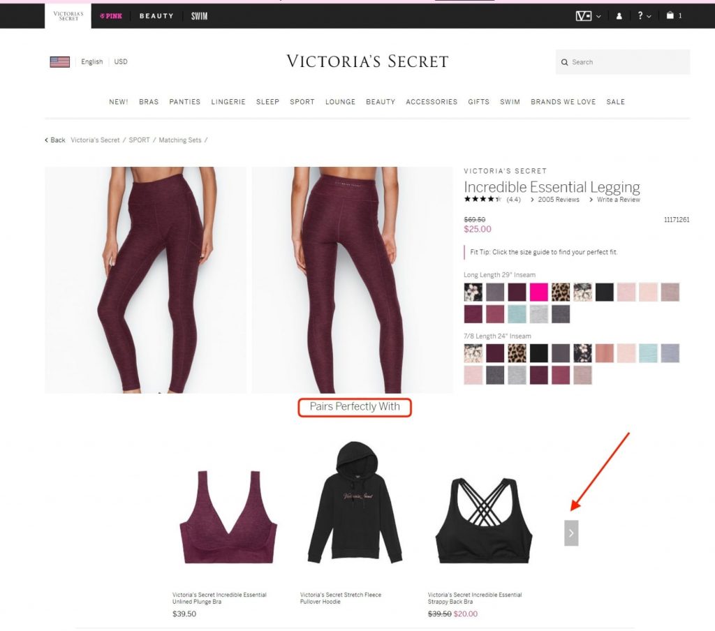
Screenshot taken from the official Victoria’s Secret website
But the design that I really like for this section is the one that the official Puma website uses. This “Complete The Look” block actually showcases how the currently browsed item can look like when matched with other products. As you can see, there are three full looks pitched and there are 12 items as opposed to just 2 or 3. Furthermore, if clicking on the “Show Now” buttons, the looks and cross-sell items appear in a pop-up. Users can then click through the looks or scroll the items. I believe that the greatest thing about this approach is that it increases the chances of the customer adding more than one additional item to their cart which can grow sales and average checks.
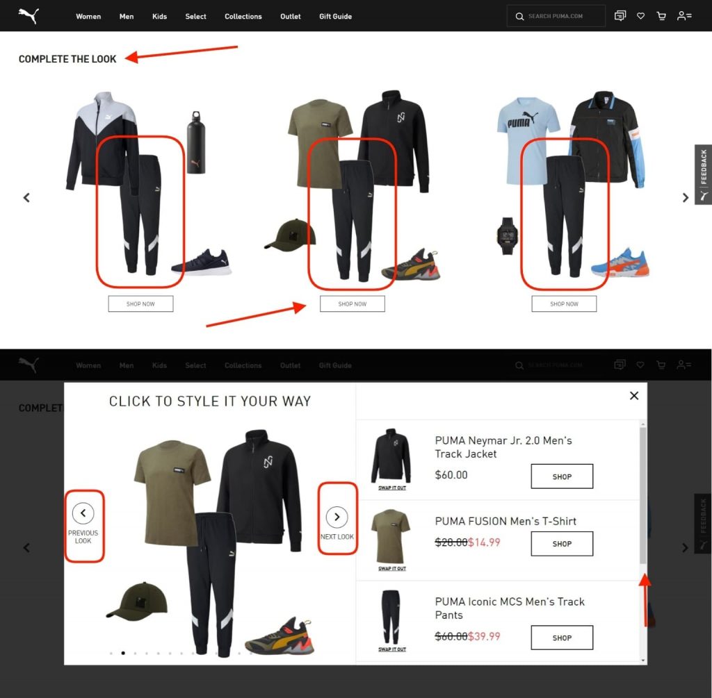
Screenshot taken from the official Puma website
4. Give Product Customization a Go
Among the coolest trends in the eCommerce field deals with the step forward that was taken with product constructors. If an item can come in different variations and in cases when a customer has the freedom to modify the product to make an individual order, there’s much you can do in terms of design.
The implementation that caught my eye was the product customizer on the official Converse website. The product pages of those items that can be changed are fitted with a “Customize” tool, vividly offering the user inspiration ideas and a chance to edit the ongoing design according to their taste.
The builder (or configurator if you like) is broken down into tabs, each devoted to a specific changeable element. The shoes are shown from different angles, and the results of the selected options appear on the main design as you make your choices step by step.
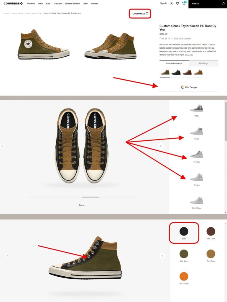
Screenshot taken from the official Converse website
5. Time-Saving & Minimalist Product Checkout
The fifth trend that deserves being overviewed deals with the product checkout optimization. User behavior on the final purchase stage doesn’t differ that much in the online retail field from an actual shopping experience in a physical store.
The thing that matters most in both cases is time. Yes, being an online shopper, you don’t have to wait as you’re queuing at the cash desk. But the logic stays the same: people don’t wish to waste their time.
Just imagine the reaction of a shopper who has a bunch of stuff in their shopping basket but sees a very long queue that they’ll have to spend a lot of time in, the chances that they’ll walk out buying nothing since they don’t wish to stand in the line is quite high. Similarly, when seeing a lengthy and complex multi-step product checkout page, customers, in way too many cases, react the exact same way: they get disappointed, abandon their cart, and leave the online store empty-handed.
Therefore, the designer’s task here is to cut down the fields that are to be filled out to their bare minimum. The same applies to the number of steps (the current trend is placing the whole checkout in just a single step). Every choice you make at this point needs to be aimed at simplifying the checkout process regardless if the user is logged-in or is a guest user. This is also why you shouldn’t overlook data auto-fill functionality.
I find that the product checkout of the official Hugo Boss website is a pretty nice example. There are no excessive fields or elements. The order overview shows the product, and the order total displays how the sum was calculated and what it includes (no hidden taxes, for instance).
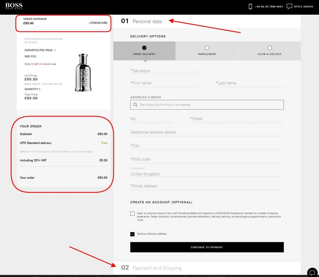
Screenshot taken from the official Hugo Boss website
Over to You
Whatever your design choices are, they do impact the success of an eCommerce store in one way or another. And if it’s up to you to be creative, improve the way the site looks like currently and end up with a boost in conversions. Don’t waste your time. Hope that you’ve found the trends that were covered in this article handy and got some inspiration or ideas from the examples!
—
About the Author
Alex Husar

Alex Husar, CTO at Onilab with 8+ years of experience in Magento migration and Salesforce development services. He graduated from the Czech Technical University and obtained a bachelor’s degree in Computer Software Engineering. Alex’s expertise includes both full-stack dev skills and a strong ability to provide project-critical guidance to the whole team.
How to Use AI-Powered SEO Tools for WordPress eCommerce
SEO is a critical factor in the success of any e-commerce WordPress store. As competition…
0 Comments11 Minutes
Why Short-Form Videos Are the Future of Content Marketing
Your Instagram customers spend over 50% of their time watching short-form videos and reels. Rather…
0 Comments12 Minutes
The Role of Digital Marketing in Business Growth
Online marketing touches every aspect of a business, whether it is initiating the idea or for an…
0 Comments3 Minutes
AI Meets Authenticity: Balancing Automation and Human Touch in Content Marketing
Is your brand starting to sound like a robot? In a world where algorithms write faster than any…
0 Comments8 Minutes
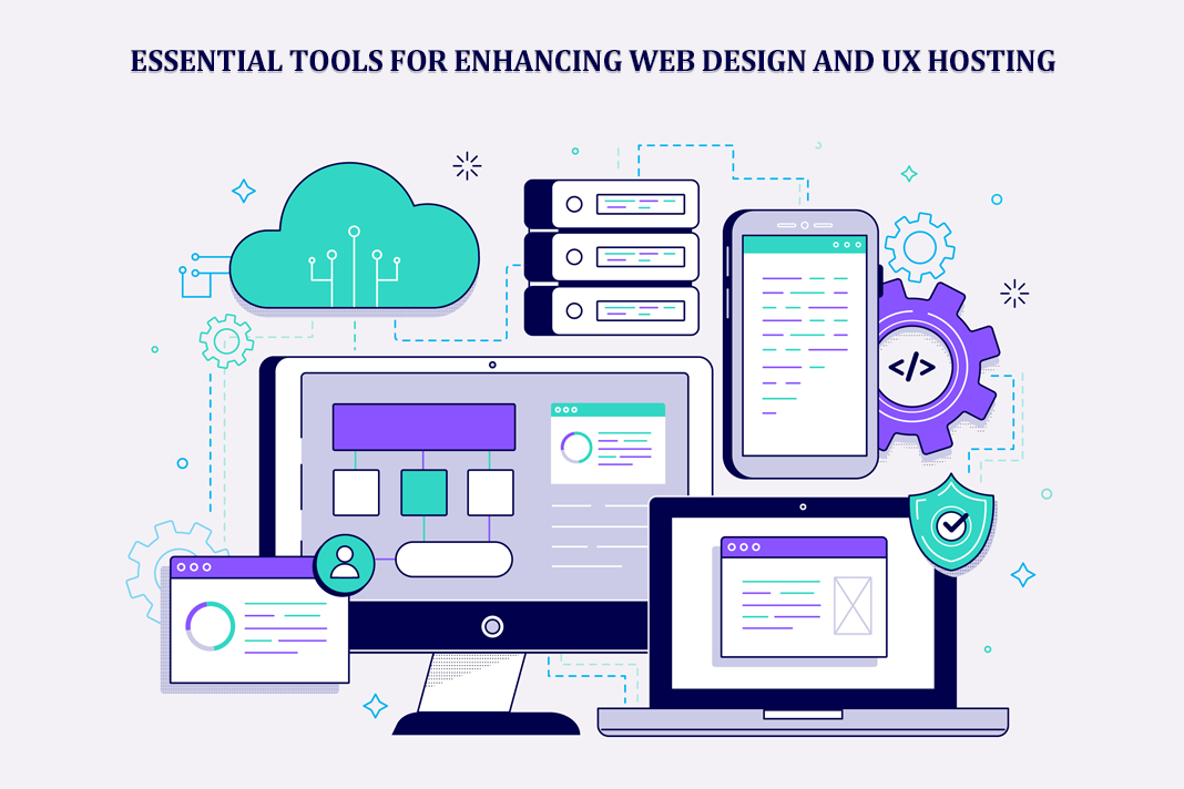
Essential Tools for Enhancing Web Design and UX Hosting
Have you ever visited a website that felt slow, clunky, or confusing? A website that is poorly…
0 Comments11 Minutes
How a Mini Cart Transformed My Store’s Shopping Experience
Okay, real talk—running an online store is hard. You think you’ve got everything figured out, you…
0 Comments9 Minutes
Balancing Your Security Initiatives With Industry Compliance Requirements
Managing a business today comes with a number of daily battles that need to be fought. Resources…
0 Comments11 Minutes
Best plugins to enhance the customer shopping experience
Customer experience is a key part of every online store. A good experience helps customers find…
0 Comments7 Minutes
