5 Design Tips to Increase Conversions on Your Pop-up Forms
One of the most straightforward ways to increase the number of leads is to grow an email list. However, this process is not as simple as it seems.
Marketers use different ways to get their email list larger – browse social media channels, buy email lists on third-party resources, ask their business partners to share this data.
All these methods take time, effort, and money.
But what about using pop-ups?
Do they work in terms of collecting emails?
Email popups are an effective way to enrich your email list with new contacts. However, you can benefit from using email pop-ups if they catch people’s attention.
And the best way to make email pop-ups visually attractive is to design them properly.
In this guide, you will find out five design tips that will help you increase conversions on your pop-up forms.
The Essence of Email Pop-ups and Why to Use Them
Email pop-up is a quick notification that the users can see on the web page while browsing a site.
Email pop-ups help you gather new email leads, newsletter subscribers, collect feedback, or nudge people to do some action. It is strictly important to use email pop-ups in practice. They increase your ROI and improve an overall inbound marketing strategy.
Now, let’s review the benefits of using pop-ups in more detail.
- Catch the user’s attention
This form of notification appears on the page rapidly. Hence the name “email pop-ups”.
Because they can’t ignore it completely. The main goal of this pop-up is to catch the user’s attention.
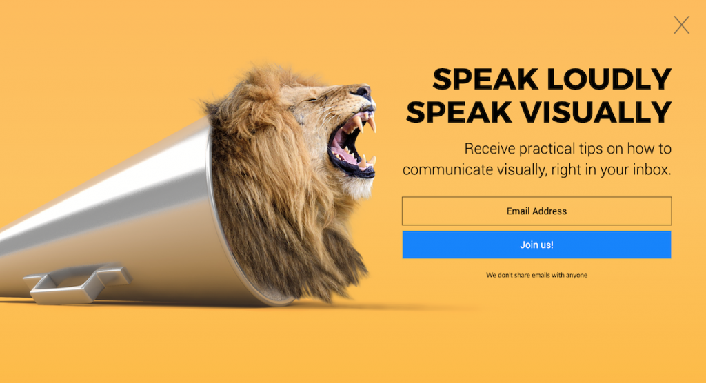
On the downside, website visitors may find these annoying and want to close them ASAP. Nevertheless, email pop-ups provide people with information that can be useful for them.
When users see pop-ups, they decide whether they want to interact with your site or not. That’s why email pop-ups should be eye-catchy.
Don’t use a static form of pop-ups. It won’t help you convince people to sign up. Instead, create a dynamic form of a pop-up that would interact with the audience.
- Targeting specific users
Why do people visit your website?
Guessing is not an option in this case. You need to understand what individuals want and how you can help them personally.
Therefore, you can’t reach out to your entire audience with the same message.
Likely, email pop-ups use targeting technology. This technology helps you target specific users and reach out to them with a personalized message.
This personalized approach will show your attitude towards the issues people have. Eventually, you will get more conversions.
- Underline your branding
Brand design plays a crucial part in company recognition. If people don’t have visual associations with your brand, they won’t become your customers. Just because they don’t remember anything related to your company’s brand identity.
Incorporate brand design into email pop-ups as well. It will help your company stand out among the competitors.
- Grow an email list
The main idea of creating email pop-ups is to collect the email addresses of your users. This information will help you get in touch with people directly and build strong customer relationships.
As you can see, email pop-ups are worth your attention.
But how to design them properly?
Let’s find out!
- Base a Pop-up Design on Your Users
Email pop-up design revolves around your customers. You can’t create pop-ups that won’t interact with the users. It makes no sense.
The main idea behind email pop-ups is to draw people’s attention to what you want to offer them. Afterward, the next step is to make them take action.
However, it is merely possible if you don’t know who you are targeting using email pop-ups. Thus, you must adopt a customer-focused approach for an email pop-up campaign.
A few rules to follow:
- The design process is focused on catering to the audience
- The message should be easy to understand
- The sign-up process isn’t complicated
- Understand what a specific target audience wants to get from you
Don’t overload an email pop-up form with extra fields. It will harm your email pop-up performance.
Why?
Because people don’t like tons of information in simple things like pop-ups. If your purpose is to make users take action, do not ask about anything else. People are more likely to close your email pop-up rather than read it and sign up.
Keep your call-to-action short and to-the-point, whether it’s to join a newsletter, sign up for a webinar or to join a waiting list for a product launch.
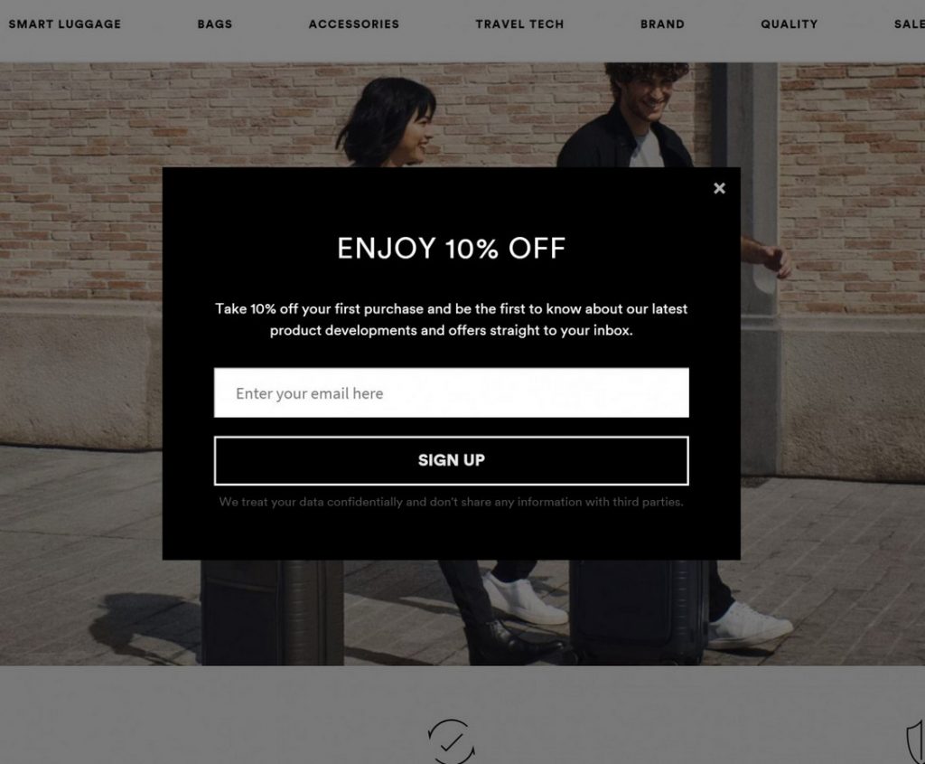
Instead, tell about the benefits the users may get by signing up to your email pop-up form.
For instance, you have just released a new eBook. It would be great to promote it straight away. You can offer this eBook for free once people sign up for your newsletter that you have created before using a newsletter maker. Also, it makes sense to offer discounts, free trials, and a whole bunch of different offers.
- Think About a Pop-up Format to Choose
Email pop-up formats vary. You can choose whatever format you like. The only thing you should remember – an email pop-up format should be right for your campaign.
Let’s review the most common email pop-up formats:
- Sidebar – email pop-up appears in the sidebar of the site
- Slide-In – email pop-up slides in from the corner of the site (from left, from right)
- Fullscreen – email pop-up covers the screen and user can’t see anything else except to pop-up
- Floating Bar – email pop-up is always visible and it follows the scrolling
- Lightbox – email pop-up is displayed in the center of the page making the background content fades away
- Inline Forms – email pop-up that user can see when reading a blog post
How to choose the right email pop-up format?
It depends on your campaign goals. Ask yourself what you want to achieve and apply the format that meets the requirements of your needs.
- Implement Consistent Branding for Email Pop-ups
Follow brand consistency in every aspect of marketing. It means that your visual content, brand image, and marketing message should be the same on your channels.
Email pop-ups are not an exception to the rule.
Make sure an email pop-up represents your brand identity accurately. This should be well-reflected both in the message and design aspects.
Don’t forget to include the following design elements in your pop-ups:
- Message
- Tone
- Voice
- Images
- Colors
- Logos
Brand consistency is another way to make your brand more memorable to your customers.
Even if you find some cool fonts online, that doesn’t mean you should use them. Use your brand’s fonts, colors, and images for consistency.
- Mobile Optimization is a Must
It is a well-known fact that websites drive tons of traffic from mobile devices. Consequently, it makes total sense to optimize email pop-ups for mobile users.
Especially, an email pop-up mobile optimization is a top priority for eCommerce websites. Lots of people make online purchases using their mobile devices. Hence, you can’t miss a chance to notify them with your optimized pop-ups.
A mobile user experience has a few specifications like limited screen space, control, and bandwidth. Keep these nuances in your mind when designing pop-ups.
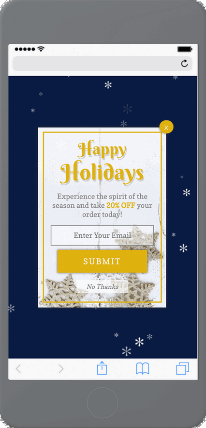
Source
Try to create email pop-ups that would be easy to sign up and close. This is the only major condition to adhere to when optimizing email pop-ups for mobile users.
- Email Address Validation
Email pop-ups serve as the method of collecting contacts. If your email list grows, it is a good sign. However, are all the emails you’ve collected valid?
When people subscribe they tend to use fake email addresses. Also, the subscribers can make typos writing their emails. Your task is to protect your email list from these invalid emails. Otherwise, it can result in a high percentage of bounces.
How does a high bounce rate affect your email marketing activity?
It harms your reputation. Your email will end up in the spam folder.
So, how to protect your email list?
The best way is to use double opt-in and email verification API on the sign-up forms. Apart from this, you can test your email list using a bulk email verifier.
To Sum Up
Email pop-ups have a direct bearing on the level of conversions you can increase with your site.
If you take care of an email pop-up design, you will definitely impress website visitors with your brand offer. As a result, the more people opt-in, the more potential customers you will get in return.
There is no one-size-fits-all design hack for email pop-ups. As like there is no one universal email pop-up type to use in your marketing strategy.
Listen to your audience.
If you know what people want to get from your brand, you’ll understand how to design the next email pop-up campaign.
How to Use AI-Powered SEO Tools for WordPress eCommerce
SEO is a critical factor in the success of any e-commerce WordPress store. As competition…
0 Comments11 Minutes
Why Short-Form Videos Are the Future of Content Marketing
Your Instagram customers spend over 50% of their time watching short-form videos and reels. Rather…
0 Comments12 Minutes
The Role of Digital Marketing in Business Growth
Online marketing touches every aspect of a business, whether it is initiating the idea or for an…
0 Comments3 Minutes
AI Meets Authenticity: Balancing Automation and Human Touch in Content Marketing
Is your brand starting to sound like a robot? In a world where algorithms write faster than any…
0 Comments8 Minutes
Essential Tools for Enhancing Web Design and UX Hosting
Have you ever visited a website that felt slow, clunky, or confusing? A website that is poorly…
0 Comments11 Minutes
How a Mini Cart Transformed My Store’s Shopping Experience
Okay, real talk—running an online store is hard. You think you’ve got everything figured out, you…
0 Comments9 Minutes
Balancing Your Security Initiatives With Industry Compliance Requirements
Managing a business today comes with a number of daily battles that need to be fought. Resources…
0 Comments11 Minutes
Best plugins to enhance the customer shopping experience
Customer experience is a key part of every online store. A good experience helps customers find…
0 Comments7 Minutes
1 Comment
Comments are closed.






Increasing conversions is always going to be a priority for businesses. Adopt the best design practices and you’ll notice real change in your results.