5 Common Website Design Mistakes and How to Avoid Them
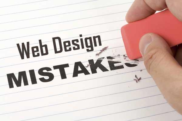
For a successful business, your company websites must be aesthetically pleasing, professional-looking, and user-friendly. Because poor website designs will frustrate and disappoint your customers. You wouldn’t want to let your customer down now, will you? More and more people are utilizing online platforms to discover new businesses, to buy and sell products. The reason why in today’s highly competitive and digitized world, you need to have a website to stand out from the rest. Almost 75% of website credibility comes from the design. And there are many web designing and development services available that are providing custom designs at affordable prices. Additionally, they know all the ins and outs of a well-designed website.
Quick Links
In this article, we will explore the website design problems such as what are some common mistakes in web design and things to avoid when creating a website. Because according to studies, 94% of first impressions are related to your website’s design. So let’s jump in!
Crowded Designs Are Overwhelming
Overwhelming is ‘very huge in amount’. The term is self-explanatory when we see it in terms of website design. Your business website should directly portray the message that it is supposed to. Because website visitors will leave if they do not understand the brand or service within the first few seconds, which can consequently increase the bounce rate, and bounce rate is definitely not good for your website’s health. Crowded websites are more overwhelming such as websites with too many images, loaded with text and animations; are never considered pleasing.
Inconsistency Across Web Pages
Using different fonts, inconsistent images, color palettes, and varying themes can lead to inconsistency, which can have a pretty negative impact on your website and be deemed as highly unprofessional. One of the most common reasons behind inconsistency can be a lack of idea about the brand and expertise followed by inexperienced website designers. In order to stay ahead of the competition, it is better to outsource web design services because they just don’t have the right expertise but also can guide you about which theme to choose, which typeface can complement your brand, and help your brand to stay consistent and competitive across multiple web pages.
Lack of Focus on Navigation
A lot of web designers often ignore the navigation and gauge it as less important but it is one of the most common mistakes on websites during the design phase. A poorly planned and designed navigational structure can result in high customer drop-off rates because no one wants to waste time scrolling through unstructured websites. So if you are developing websites that have multiple webpages, group them together through a single navigation bar separated by categories which makes it easier for website visitors to quickly visit any page they are looking for.
Responsive Design Approach
Your design should be responsive across multiple platforms such as desktop and mobile. Design separate layouts, if need be. The responsiveness and flexibility of the design not only make the navigation easier despite the varying screen resolutions but also leaves a good first impression. It provides an optimal user experience meaning if the website visitor can easily navigate the website without disruption, they are most likely to return as a result your audience will grow bigger in number.
Missing out on CTA Buttons
Websites are used for marketing purposes and act as your sales funnel. If you want your website visitors to convert into paying customers, give clear ‘call-to-action buttons on every landing page. The absence of CTAs can make you miss out on your potential leads. But do not overdo it because then it can irritate prospects. Just keep in mind that ‘excess of everything is bad’ before planning out the design.
Other Design Mistakes Include:
- Missing favicon
- Poorly designed 404 pages
- Heavy design leading to low website load time
- Unethical design practices
- Unclear fonts
- Inconsistent alignments
- Too much or too little negative space
- Missing contact information
- Unclear content and brand messaging
Above mentioned pointers are some of the important variables to avoid when designing a website. Now, how can designers avoid mistakes during the development of a website? With careful planning and consideration.
Choosing the Right Website Design Company
Outsourcing web designing and development services can make or break your business. So how do you find the right fit for your company? Below are some of the tips that can assist you:
- Make a list of potential leading web design and development companies
- Compare the quotations and ensure whether you are getting the ‘value for money.
- Dig deeper into their existing clients, reviews, and testimonials.
- Be clear about your requirements; what are you planning to develop, your preferred approach, and your target audience.
- Check out their portfolio and complete work experience.
- Know about their design tools and techniques.
- If you are getting the ongoing maintenance and support.
- Make sure to do the paperwork for legal binding and security.
What do you think are the most common errors when designing websites? Share your thoughts.
What Is WooCommerce Product Slider and Why Your Store Needs It
Why Do Product Images Matter So Much in Online Stores? When someone visits an online store the…
0 Comments9 Minutes
How to Streamline Your Customers’ Shopping Experience?
The goal for any online store is to make shopping as smooth as possible. When visitors move…
0 Comments8 Minutes
Strengthening Brand-Customer Relationships Through Gamified Loyalty Programs
Creating lasting connections with customers has become increasingly vital as the marketplace grows…
0 Comments6 Minutes
How to Use SEO and SEA Together in Search Engine Marketing
In digital marketing, search engine marketing (SEM) plays a critical role in improving online…
0 Comments10 Minutes
Content Marketing Growth Hacks: Real Shortcuts to Drive Traffic
Are you still lagging in content marketing? Sticking to these old strategies seems…
0 Comments10 Minutes
How to Build a Strong Local Following Using Social Media Marketing
In the days of likes, shares, and stories, local businesses have a golden opportunity to create…
0 Comments9 Minutes
Why WooCommerce is the Best Choice for Your Online Store?
WooCommerce stands out as a top option for anyone looking to build an online store. This platform…
0 Comments8 Minutes
How to Use AI-Powered SEO Tools for WordPress eCommerce
SEO is a critical factor in the success of any e-commerce WordPress store. As competition…
0 Comments11 Minutes


